Tokyo Drugstore
品牌創研 BRAND 視覺設計 VISUAL DESIGN 空間設計 SPACE
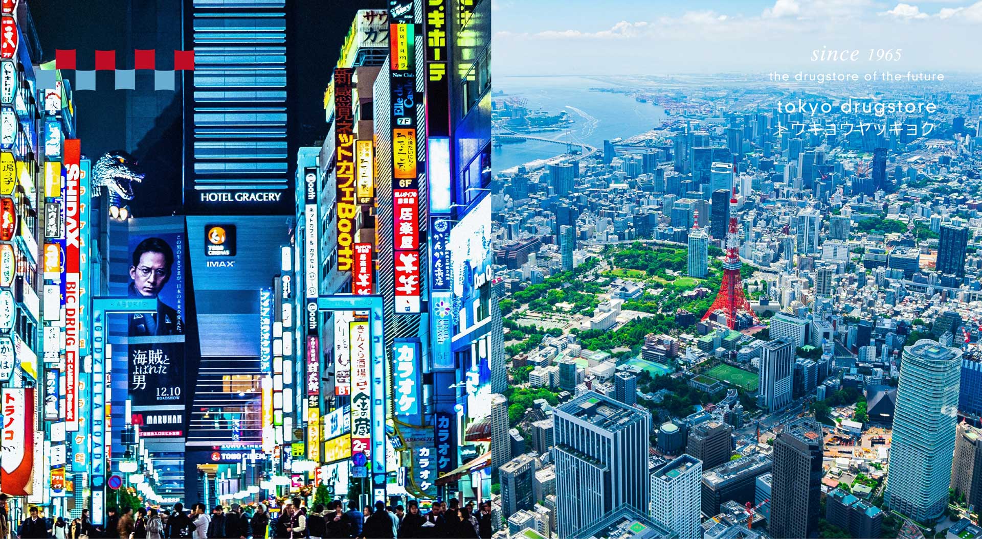
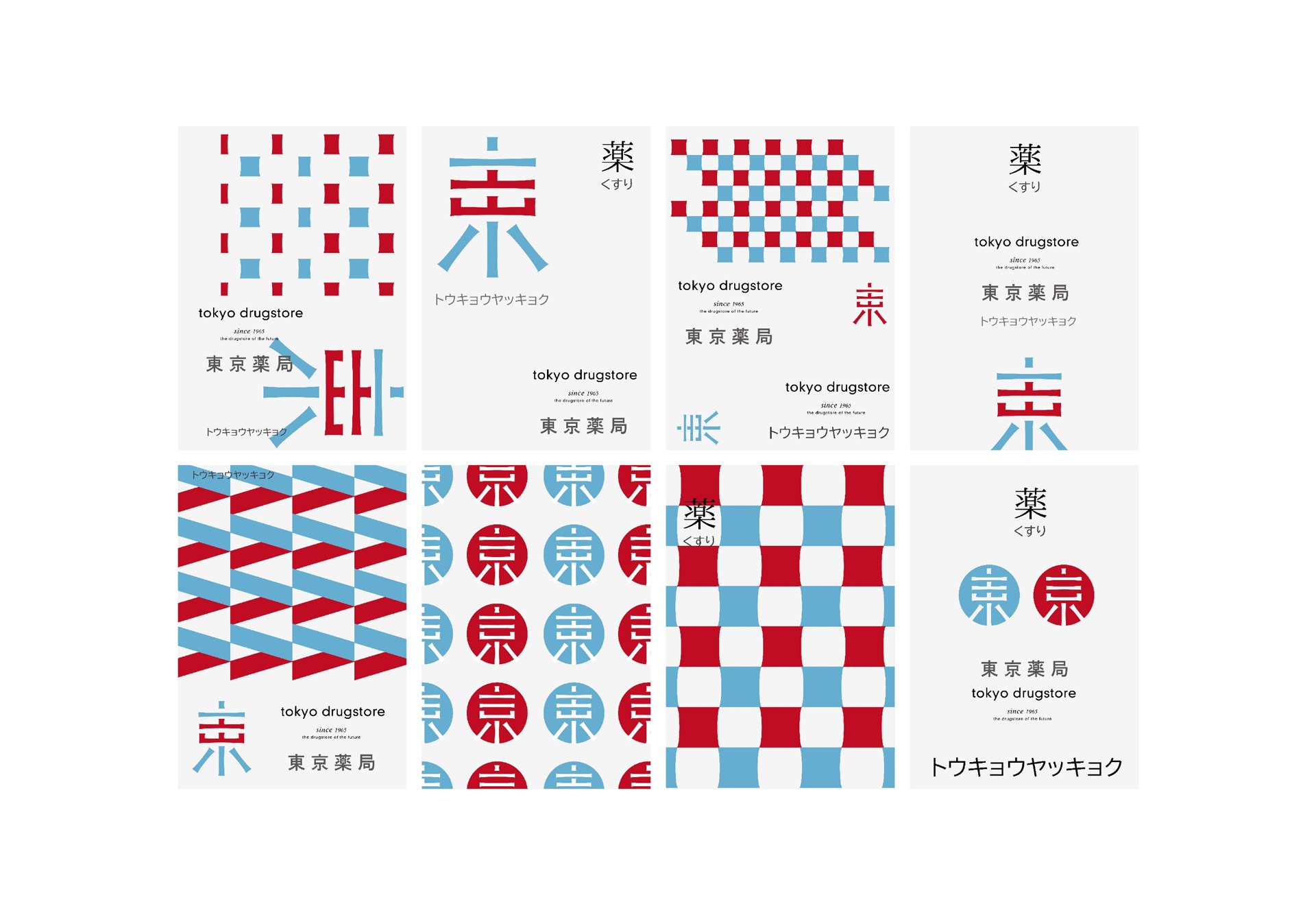
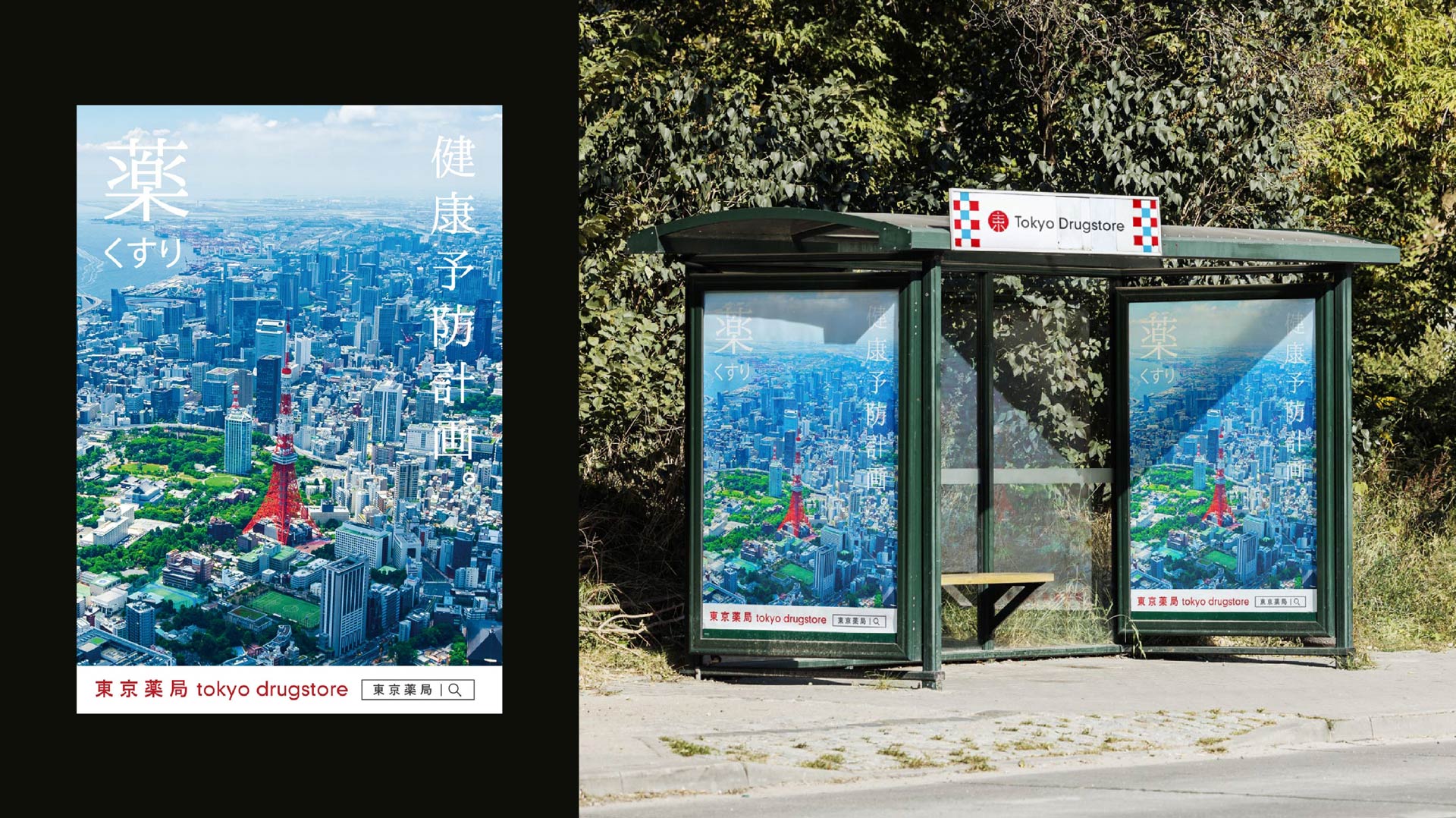
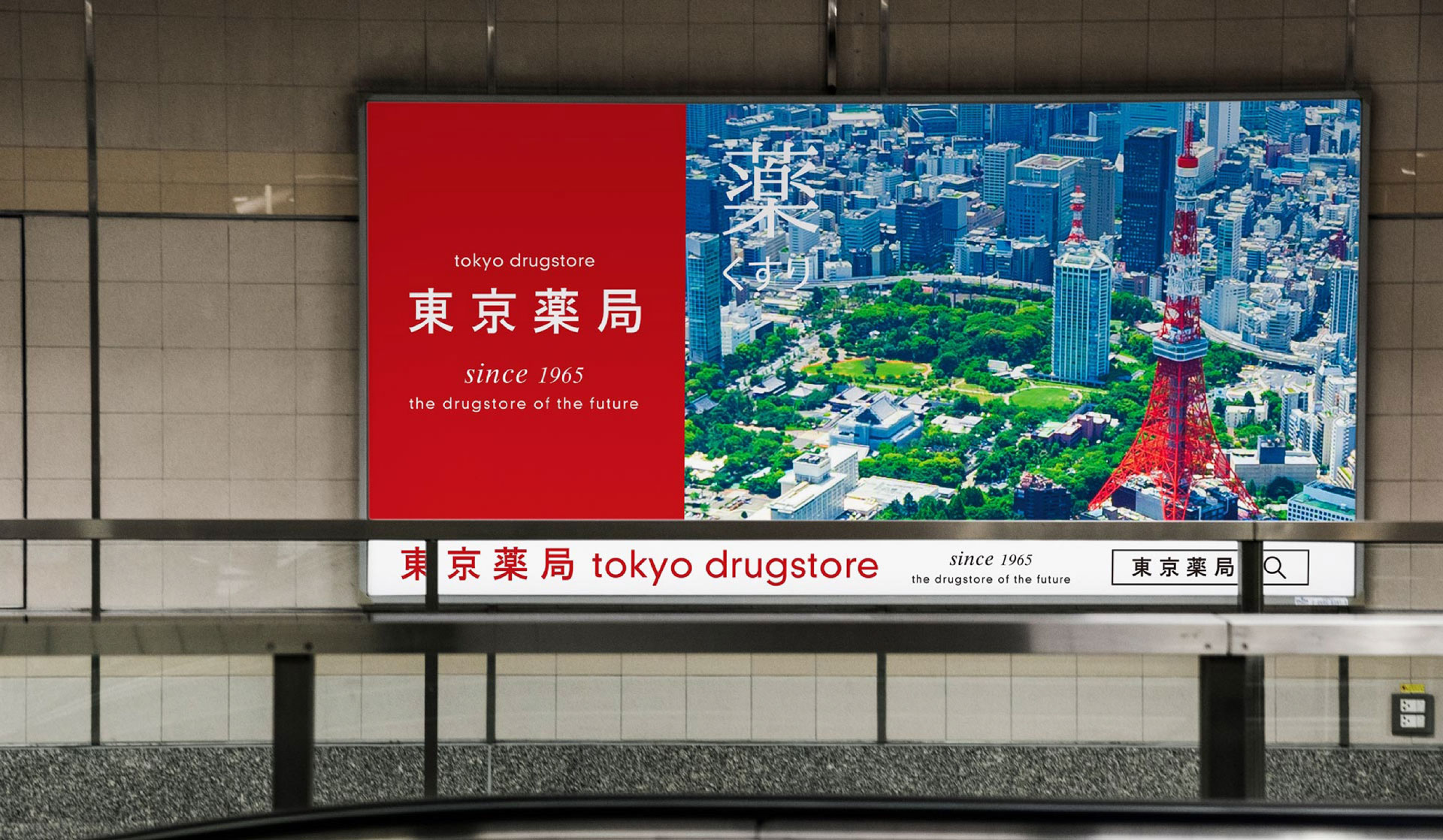
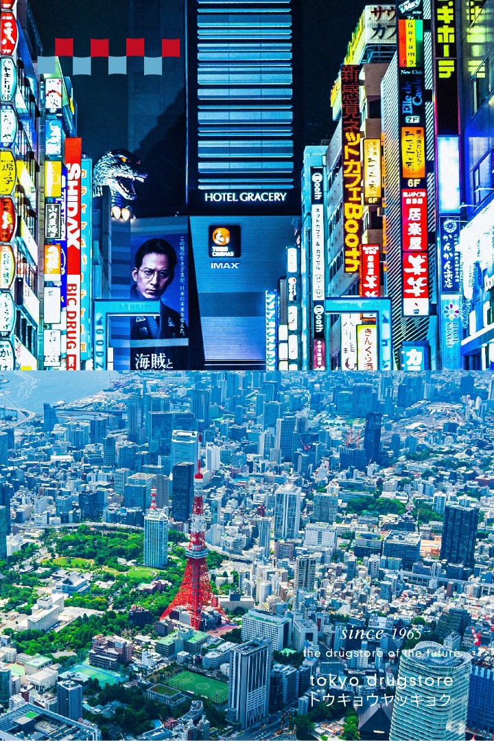
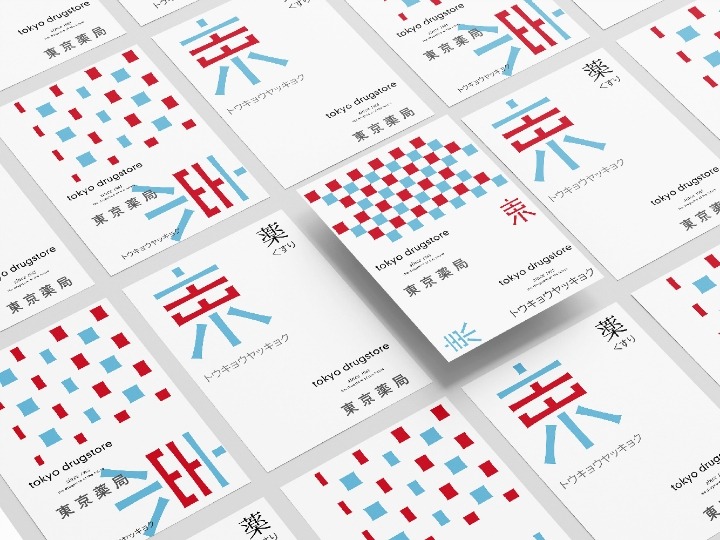
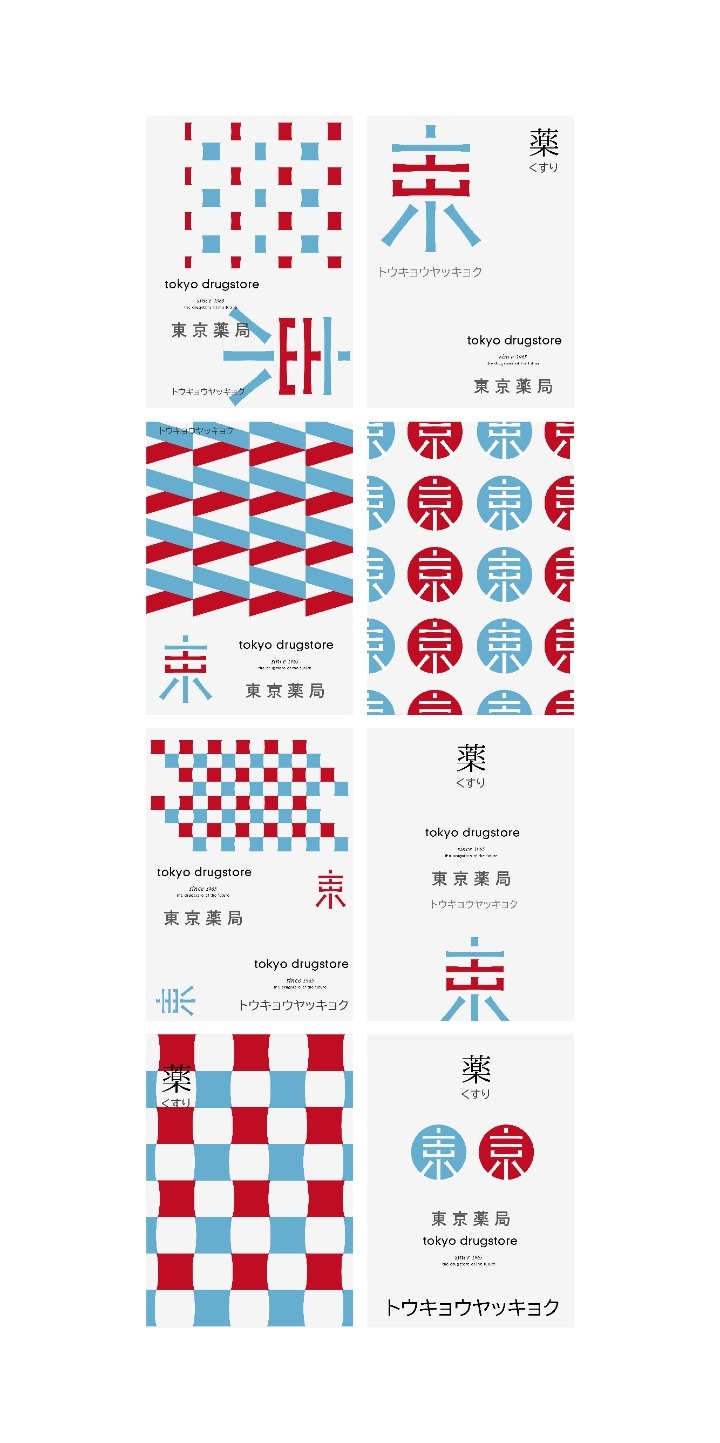
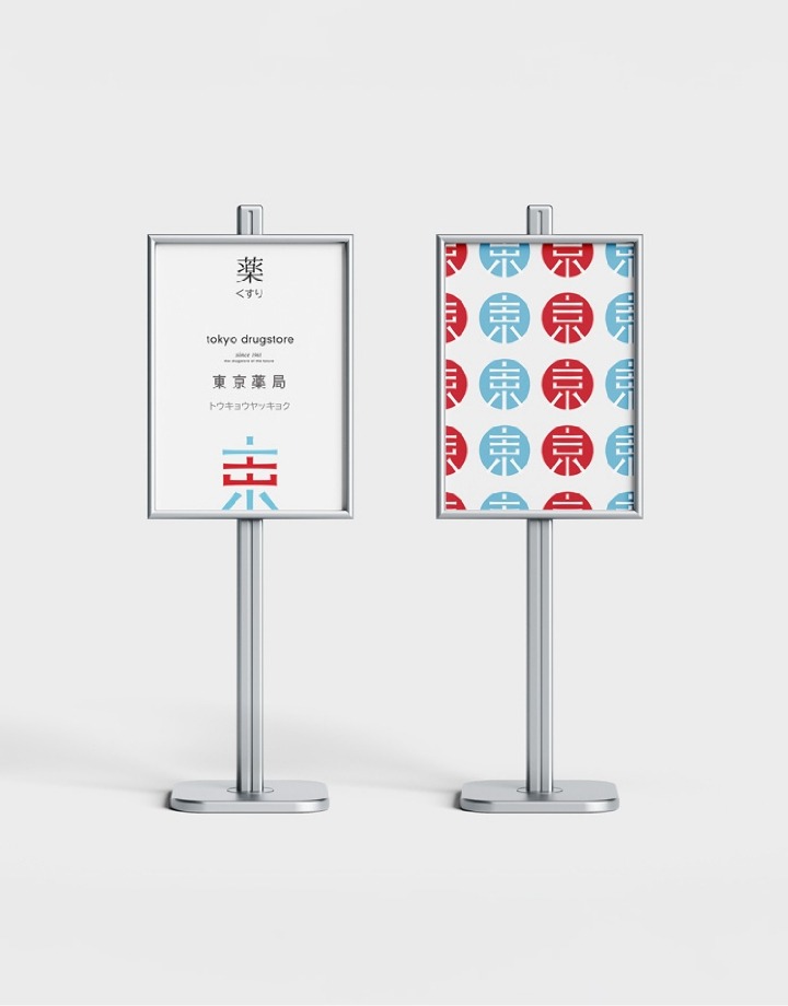
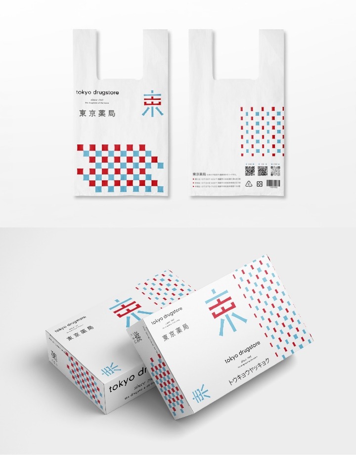
以光束為筆,描繪未來藥局藍圖
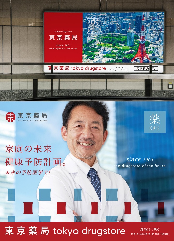
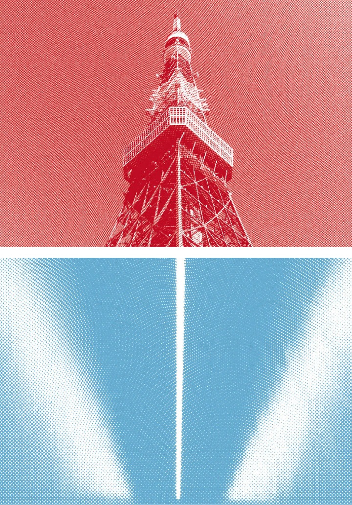
東京藥局的品牌識別設計,將傳統與未來的元素巧妙融合,體現其穩定性與創新精神。標誌的靈感來源於「東京」、「未來」、「光束」及「東京鐵塔」,這些元素不僅象徵著東京繁華都市的現代感與動感,也呼應了品牌面向未來發展的願景。光束的運用傳達了品牌對未來的探索與無限可能,而東京鐵塔則象徵著品牌在長久歷史中的穩定與承諾。
The brand identity of Tokyo Drugstore seamlessly blends elements of tradition and the future, reflecting both stability and a spirit of innovation. The logo draws inspiration from “Tokyo,” “the future,” “light beams,” and “Tokyo Tower.” These references symbolize not only the modern vibrancy of Tokyo as a metropolis, but also the brand’s forward-looking vision. The use of light beams conveys a sense of exploration and endless possibility, while Tokyo Tower represents the brand’s longstanding history, stability, and commitment.

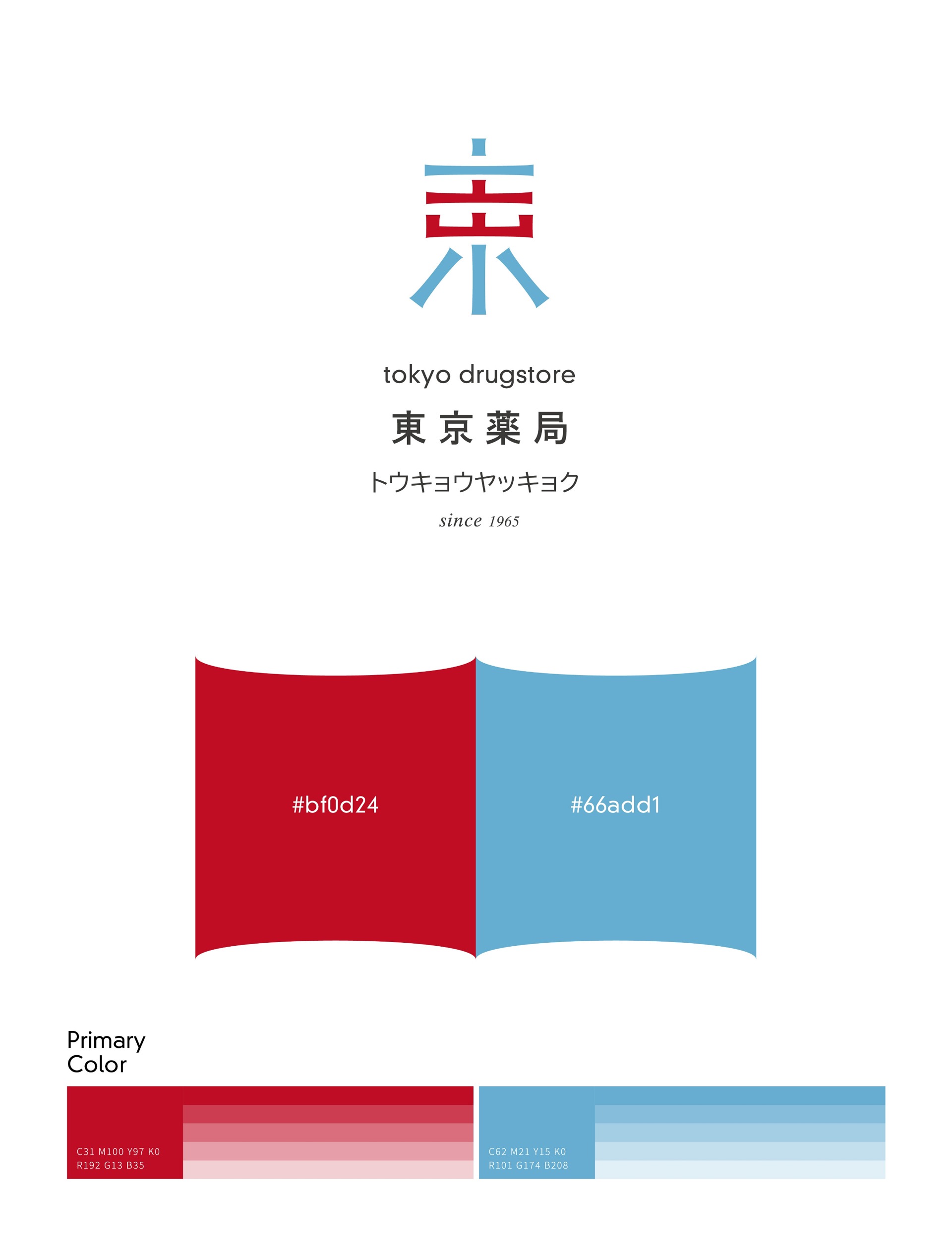
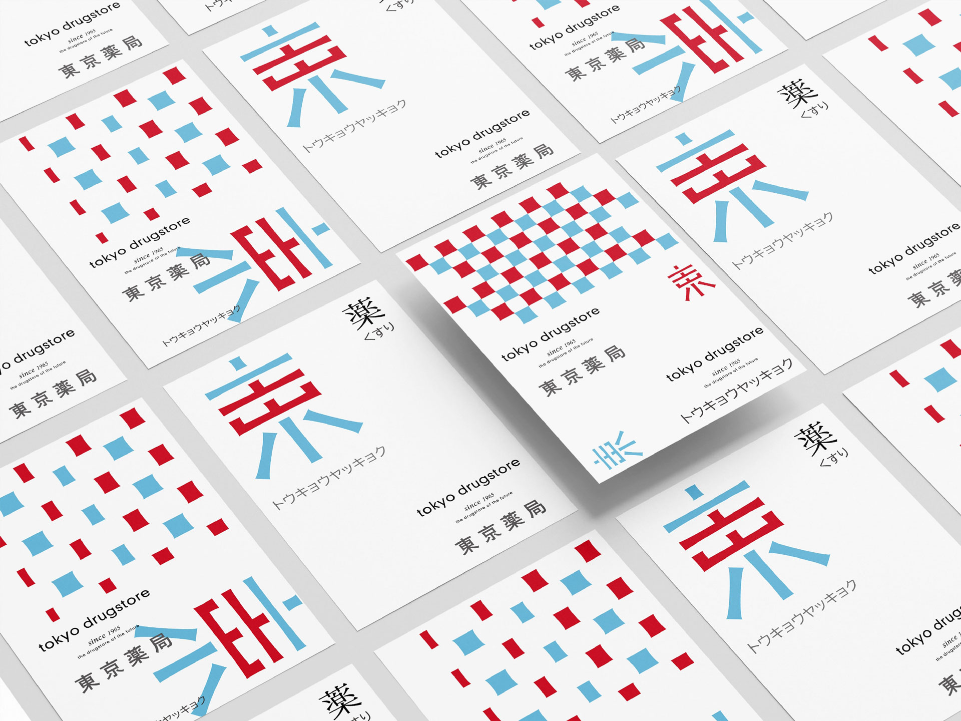
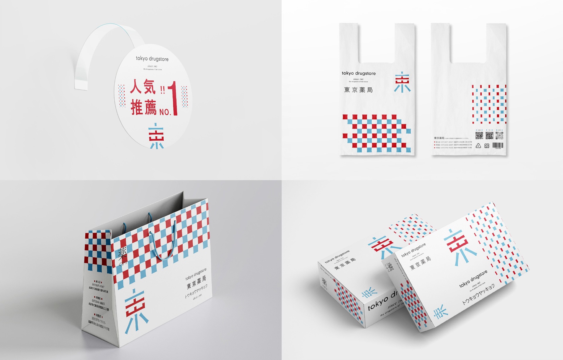
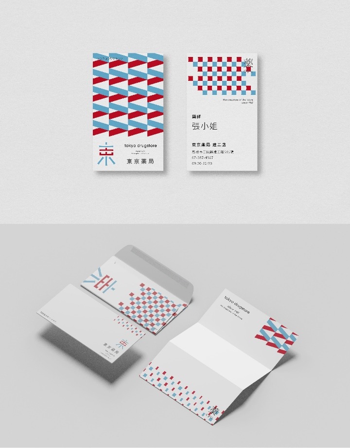
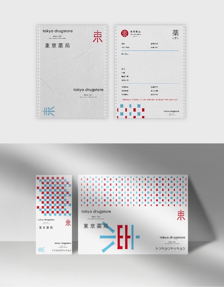
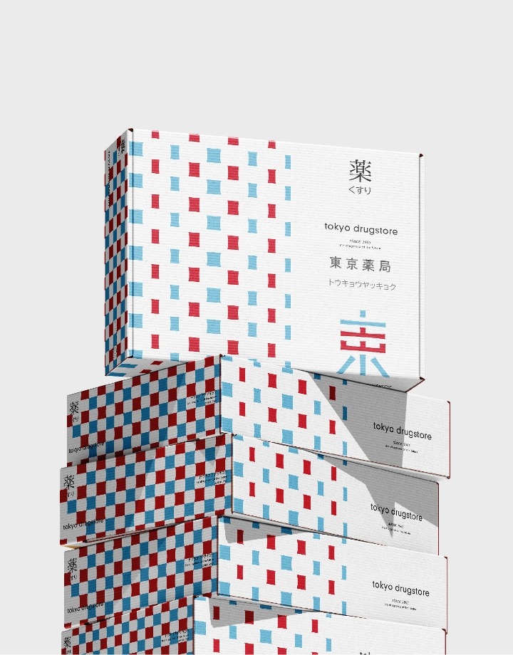
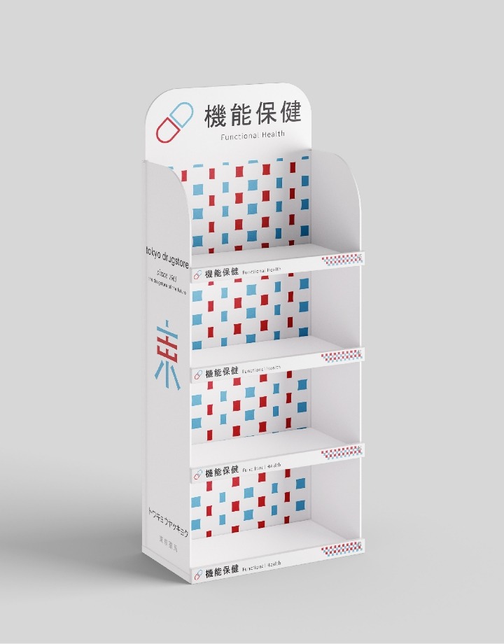
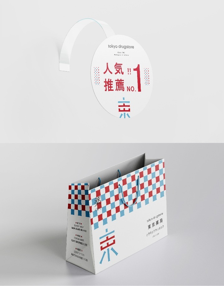
從格紋到光束,藍紅交會的設計語言
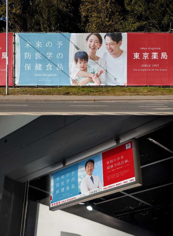
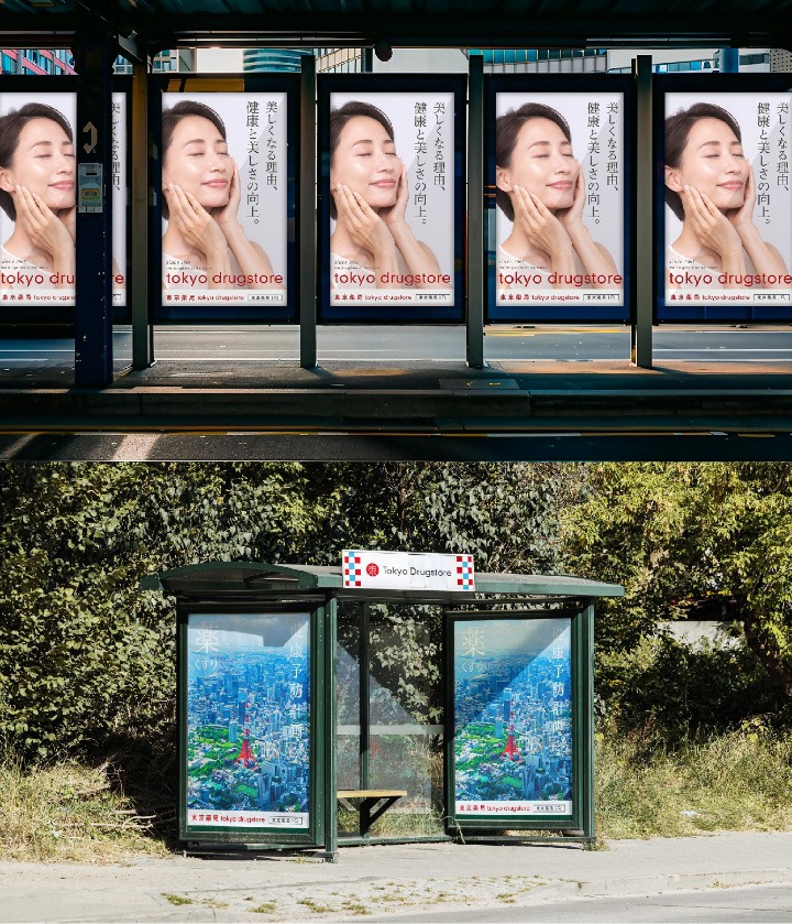
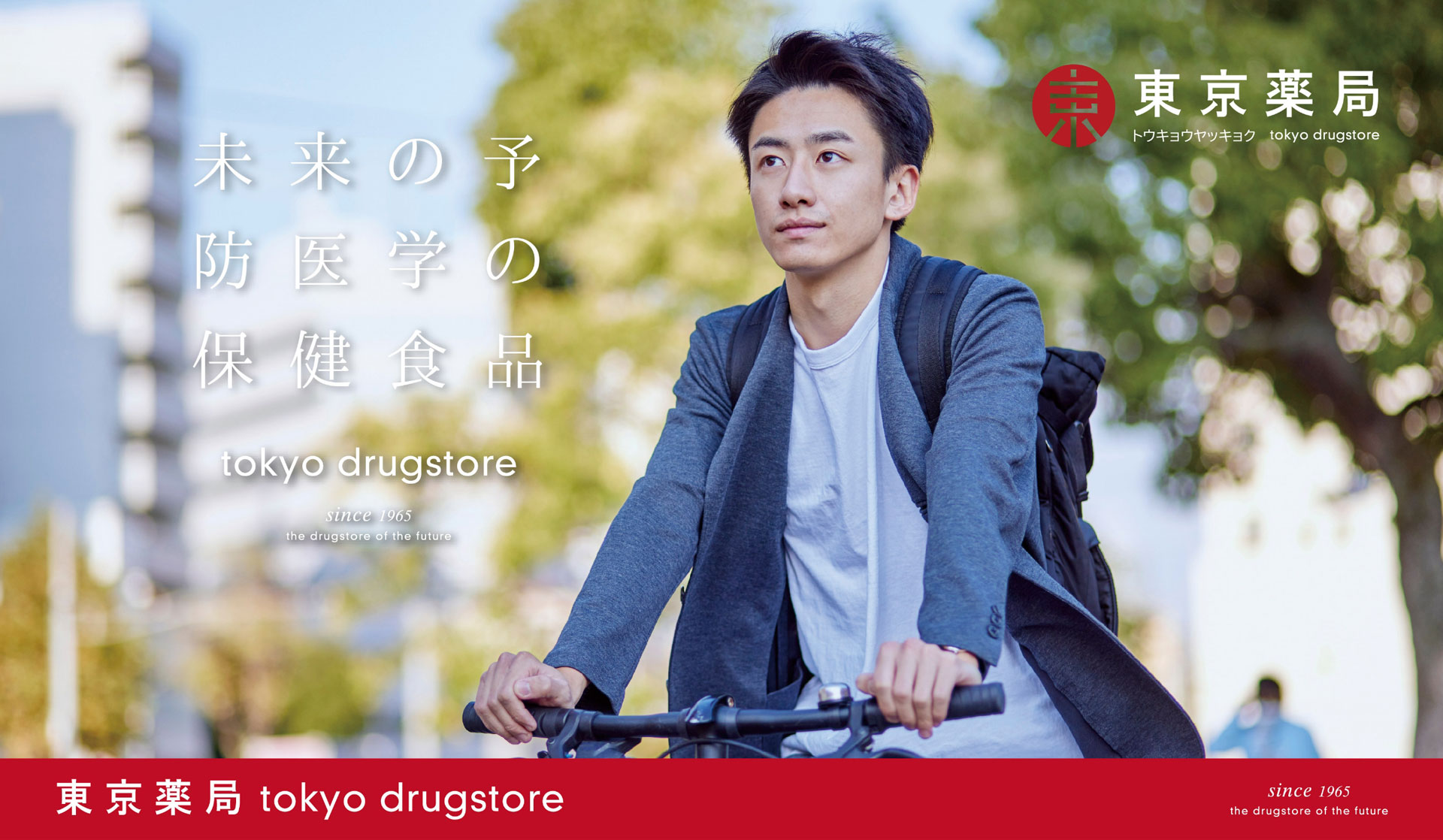
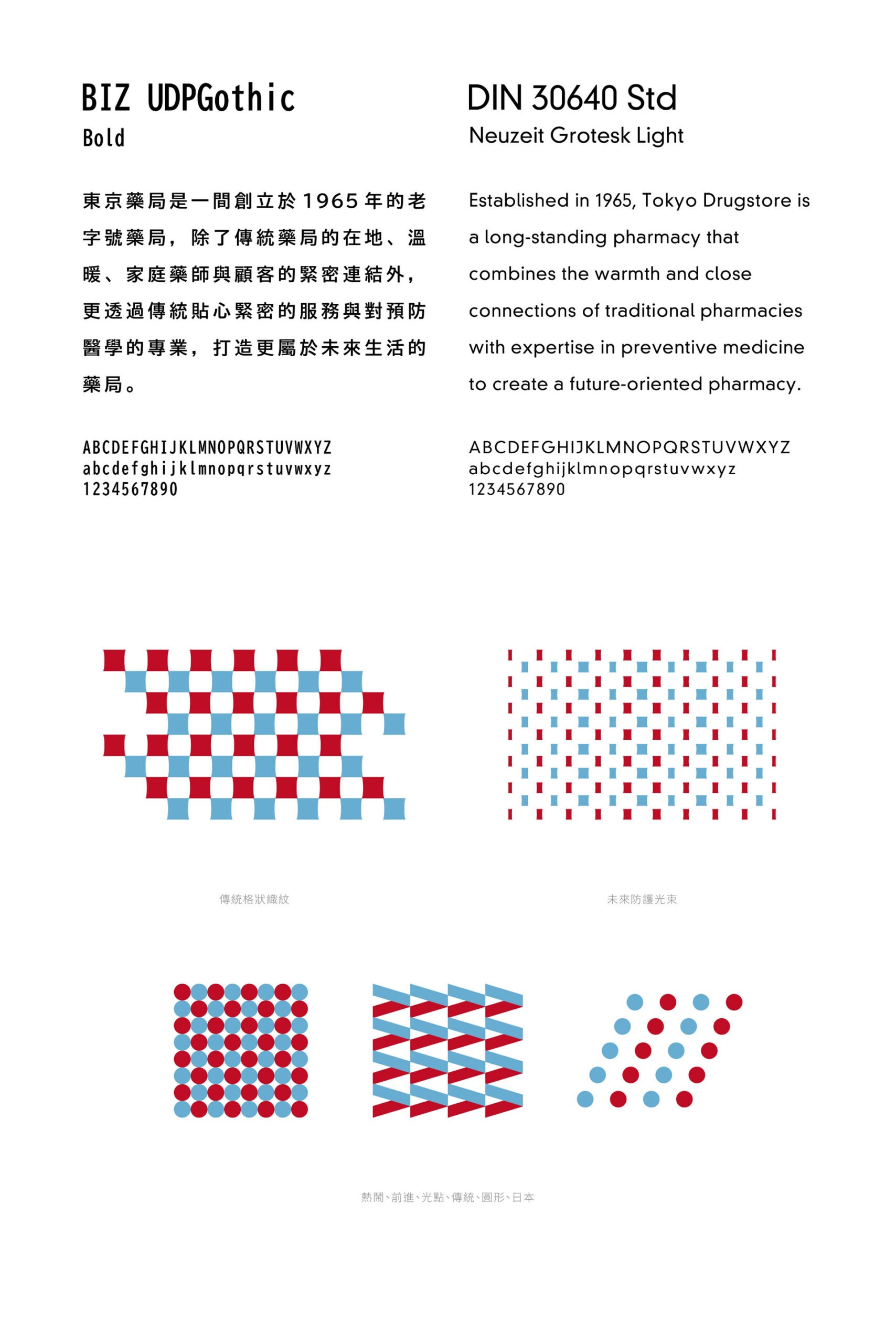
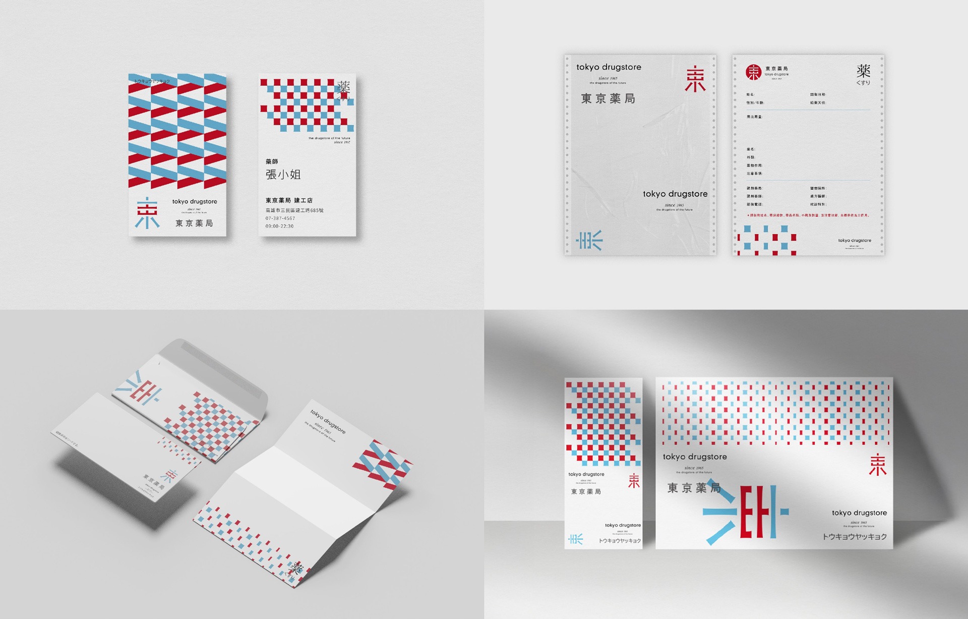
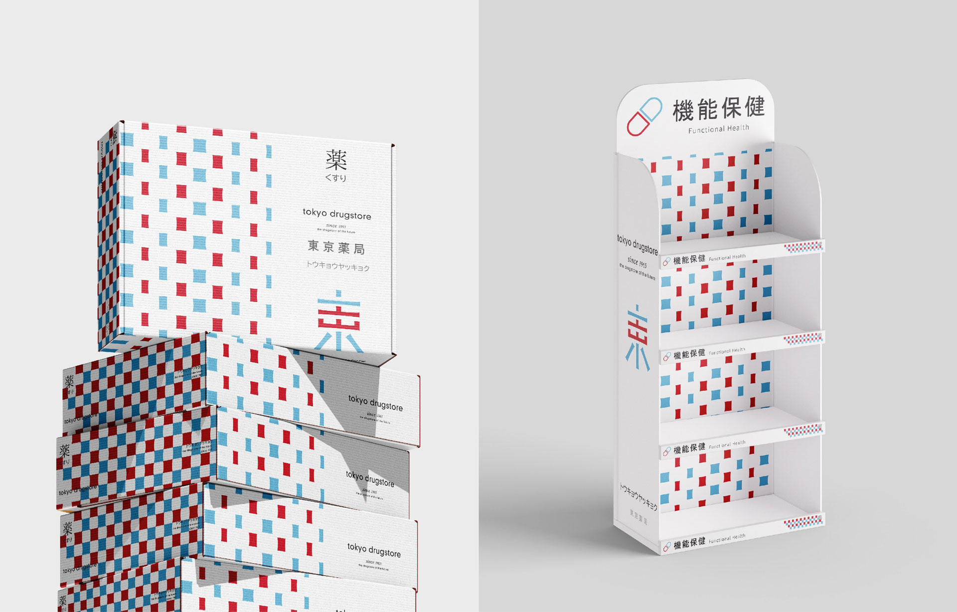
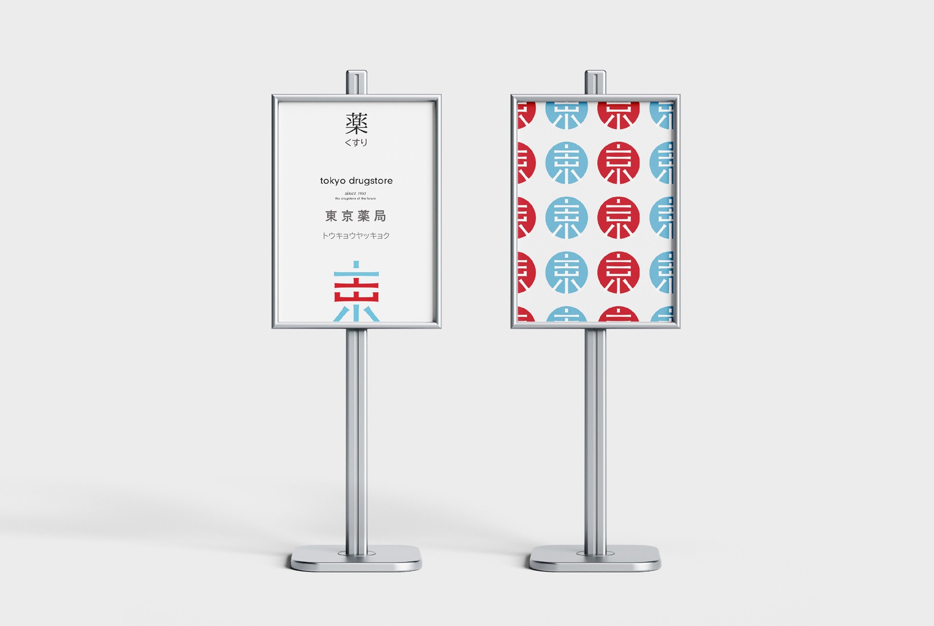
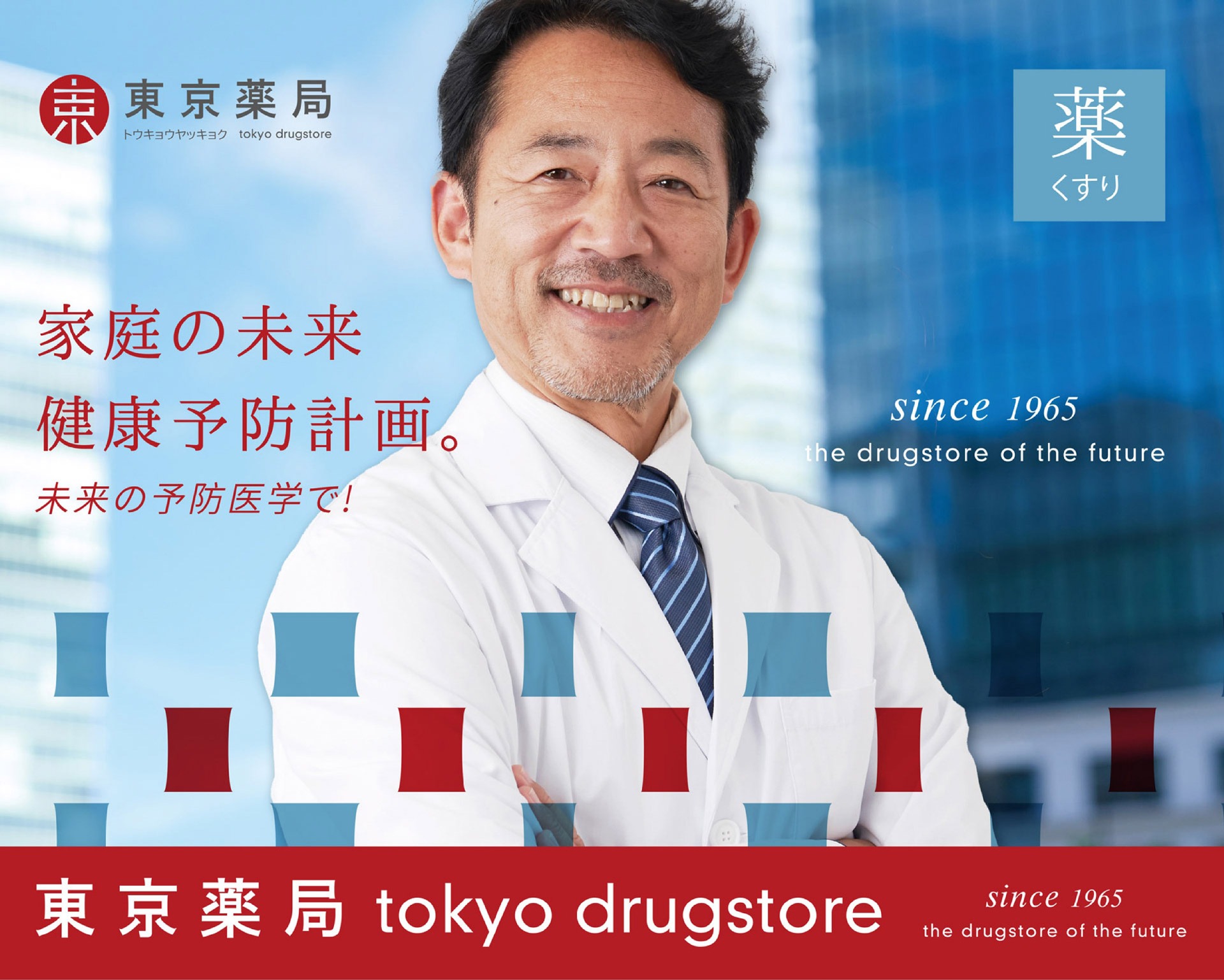
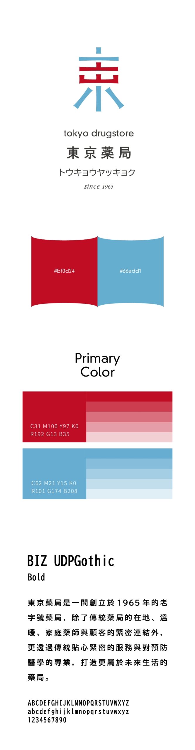
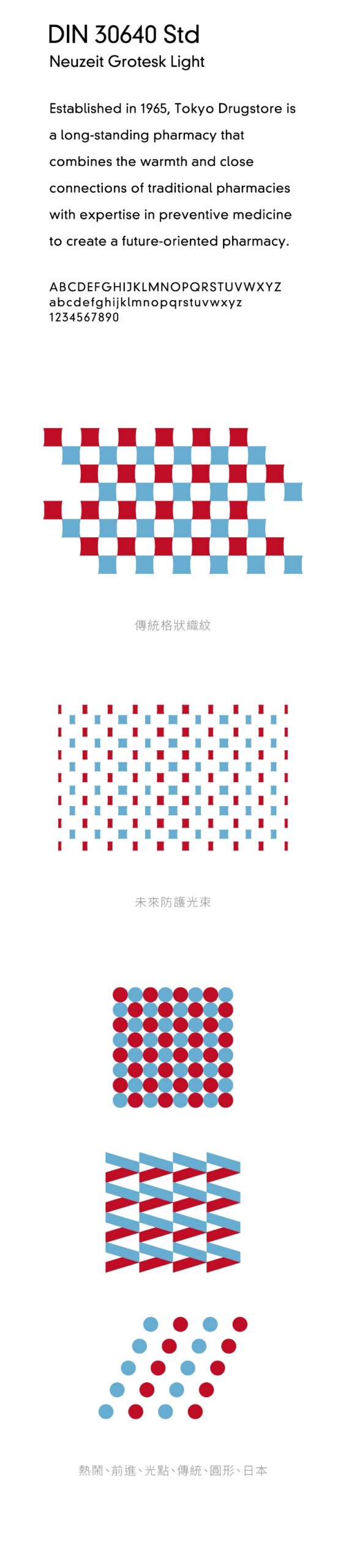
紅色象徵品牌深厚的歷史底蘊與熱情,藍色則代表現代感與前瞻視野,兩者相互映襯,展現東京藥局在傳承與創新間的平衡。輔助圖形的設計延續此概念,其中「格狀織紋」以穩定、有序的結構,強化整體識別系統的傳統感知與視覺秩序;而「未來防護光束」則呼應品牌在科技與醫學領域的創新能量,體現其在預防醫學與健康管理上的專業性與未來導向。
Red symbolizes the brand’s deep historical roots and passion, while blue represents modernity and a forward-looking vision. Together, they create a harmonious balance, showcasing Tokyo Drugstore’s equilibrium between tradition and innovation. The design of the supporting graphic elements continues this concept, with the “grid pattern” reinforcing the traditional feel and visual order of the identity system through its stable and structured form. Meanwhile, the “future protective light beams” reflect the brand’s innovative energy in the fields of technology and medicine, embodying its expertise and future-oriented approach in preventive healthcare and wellness management.
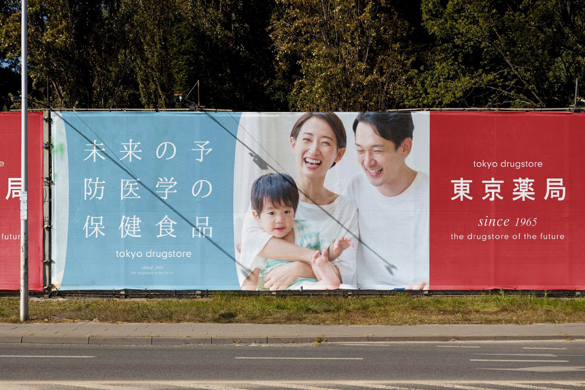
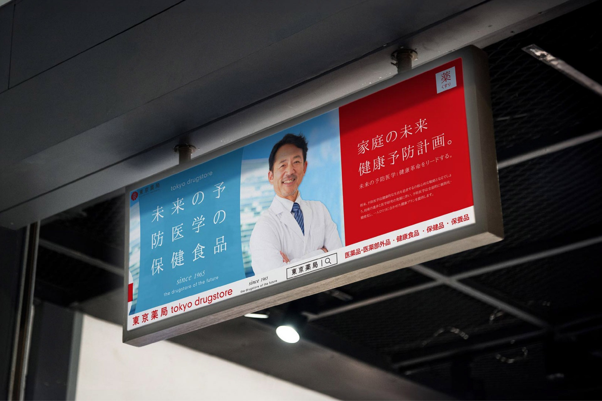
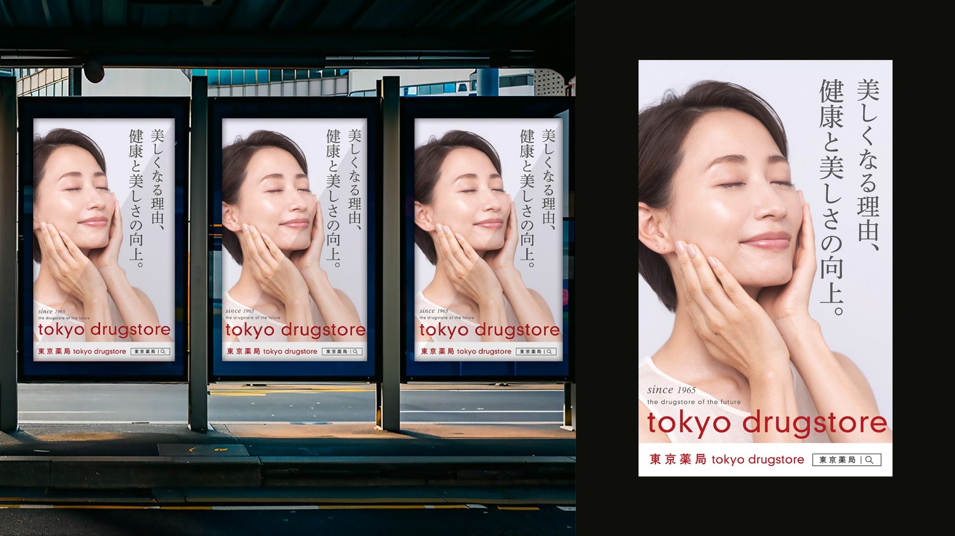
視覺之外,傳遞的是一份健康的承諾
東京藥局的品牌識別設計巧妙地結合了傳統與未來的視覺元素,塑造出一個既穩定又創新的品牌形象。這一識別系統不僅彰顯了品牌對歷史的尊重,還突顯了其在預防醫學與未來健康生活中的領先地位。每一個設計細節,從標誌到色彩,從圖形到形狀,都深刻傳遞了東京藥局專業、親切與未來導向的品牌精神。
The brand identity of Tokyo Drugstore cleverly combines traditional and futuristic visual elements, creating a brand image that is both stable and innovative. This identity system not only highlights the brand’s respect for history but also emphasizes its leading position in preventive medicine and future health living. Every design detail, from the logo to the color palette, from the graphics to the shapes, deeply conveys Tokyo Drugstore’s brand spirit of professionalism, approachability, and forward-thinking vision.
以光束為筆,描繪未來藥局藍圖
東京藥局的品牌識別設計,將傳統與未來的元素巧妙融合,體現其穩定性與創新精神。標誌的靈感來源於「東京」、「未來」、「光束」及「東京鐵塔」,這些元素不僅象徵著東京繁華都市的現代感與動感,也呼應了品牌面向未來發展的願景。光束的運用傳達了品牌對未來的探索與無限可能,而東京鐵塔則象徵著品牌在長久歷史中的穩定與承諾。
The brand identity of Tokyo Drugstore seamlessly blends elements of tradition and the future, reflecting both stability and a spirit of innovation. The logo draws inspiration from “Tokyo,” “the future,” “light beams,” and “Tokyo Tower.” These references symbolize not only the modern vibrancy of Tokyo as a metropolis, but also the brand’s forward-looking vision. The use of light beams conveys a sense of exploration and endless possibility, while Tokyo Tower represents the brand’s longstanding history, stability, and commitment.
從格紋到光束,藍紅交會的設計語言
紅色象徵品牌深厚的歷史底蘊與熱情,藍色則代表現代感與前瞻視野,兩者相互映襯,展現東京藥局在傳承與創新間的平衡。輔助圖形的設計延續此概念,其中「格狀織紋」以穩定、有序的結構,強化整體識別系統的傳統感知與視覺秩序;而「未來防護光束」則呼應品牌在科技與醫學領域的創新能量,體現其在預防醫學與健康管理上的專業性與未來導向。
Red symbolizes the brand’s deep historical roots and passion, while blue represents modernity and a forward-looking vision. Together, they create a harmonious balance, showcasing Tokyo Drugstore’s equilibrium between tradition and innovation. The design of the supporting graphic elements continues this concept, with the “grid pattern” reinforcing the traditional feel and visual order of the identity system through its stable and structured form. Meanwhile, the “future protective light beams” reflect the brand’s innovative energy in the fields of technology and medicine, embodying its expertise and future-oriented approach in preventive healthcare and wellness management.
視覺之外,傳遞的是一份健康的承諾
東京藥局的品牌識別設計巧妙地結合了傳統與未來的視覺元素,塑造出一個既穩定又創新的品牌形象。這一識別系統不僅彰顯了品牌對歷史的尊重,還突顯了其在預防醫學與未來健康生活中的領先地位。每一個設計細節,從標誌到色彩,從圖形到形狀,都深刻傳遞了東京藥局專業、親切與未來導向的品牌精神。
The brand identity of Tokyo Drugstore cleverly combines traditional and futuristic visual elements, creating a brand image that is both stable and innovative. This identity system not only highlights the brand’s respect for history but also emphasizes its leading position in preventive medicine and future health living. Every design detail, from the logo to the color palette, from the graphics to the shapes, deeply conveys Tokyo Drugstore’s brand spirit of professionalism, approachability, and forward-thinking vision.