MITSUMARU HOMEMADE
品牌創研 BRAND 視覺設計 VISUAL DESIGN

從母愛出發,為孩子打造安心美味的無負擔零食
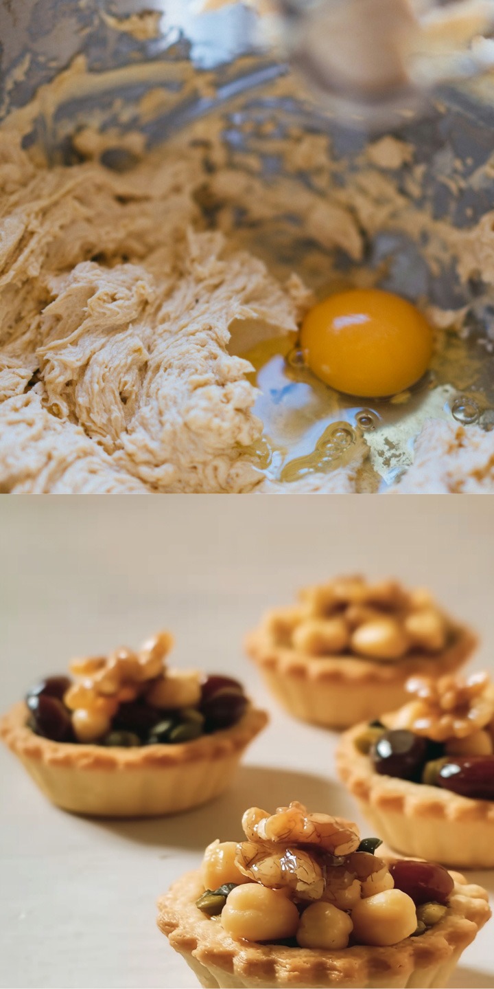
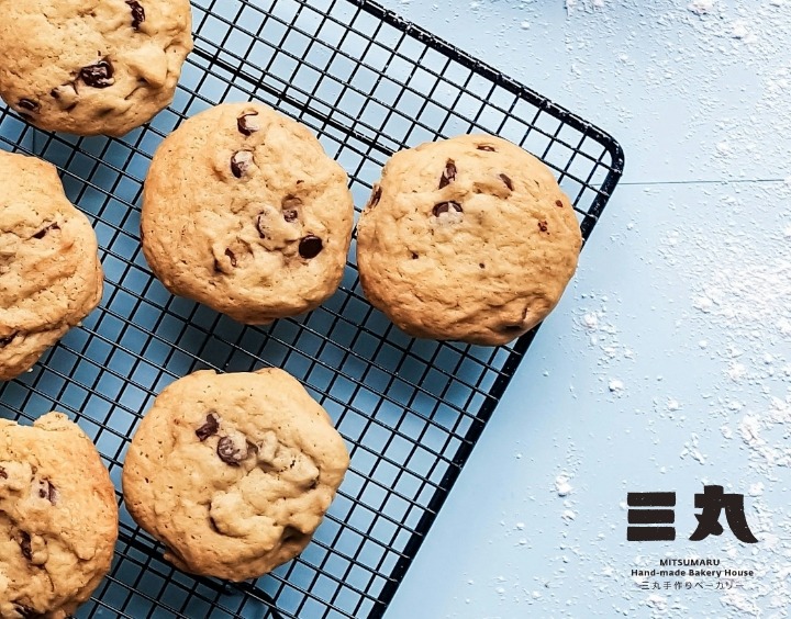
「三丸製菓」的誕生,源自一位媽媽對三個愛吃零食小孩的關愛。面對市售零食普遍含有高油、高糖、高鹽,讓她既心疼又擔憂,於是親手為孩子們研發出健康又美味的替代品。三丸相信,健康與美味並不矛盾,品牌主打的堅果塔選用無添加、優質的原材料,不僅能滿足孩子的味蕾,也讓家長無需擔心健康負擔,實現全家共享的美味小時光。
The story of MITSUMARU HOMEMADE began with a mother’s love for her three snack-loving children.Troubled by the unhealthy ingredients often found in store-bought snacks—high in oil, sugar, and salt—she decided to create a healthier alternative by hand. MITSUMARU HOMEMADE was born from this intention: a belief that health and deliciousness can go hand in hand. Their signature nut tarts are made with premium, additive-free ingredients, delivering both great taste and peace of mind. It’s a wholesome treat the whole family can enjoy together.
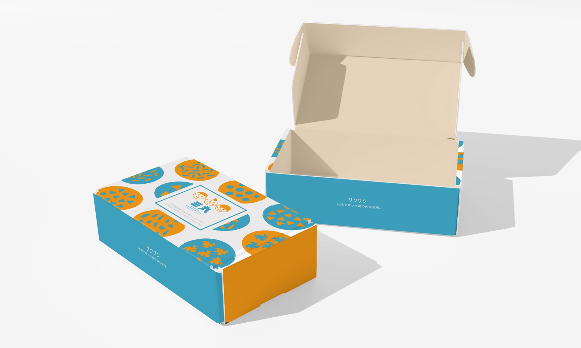
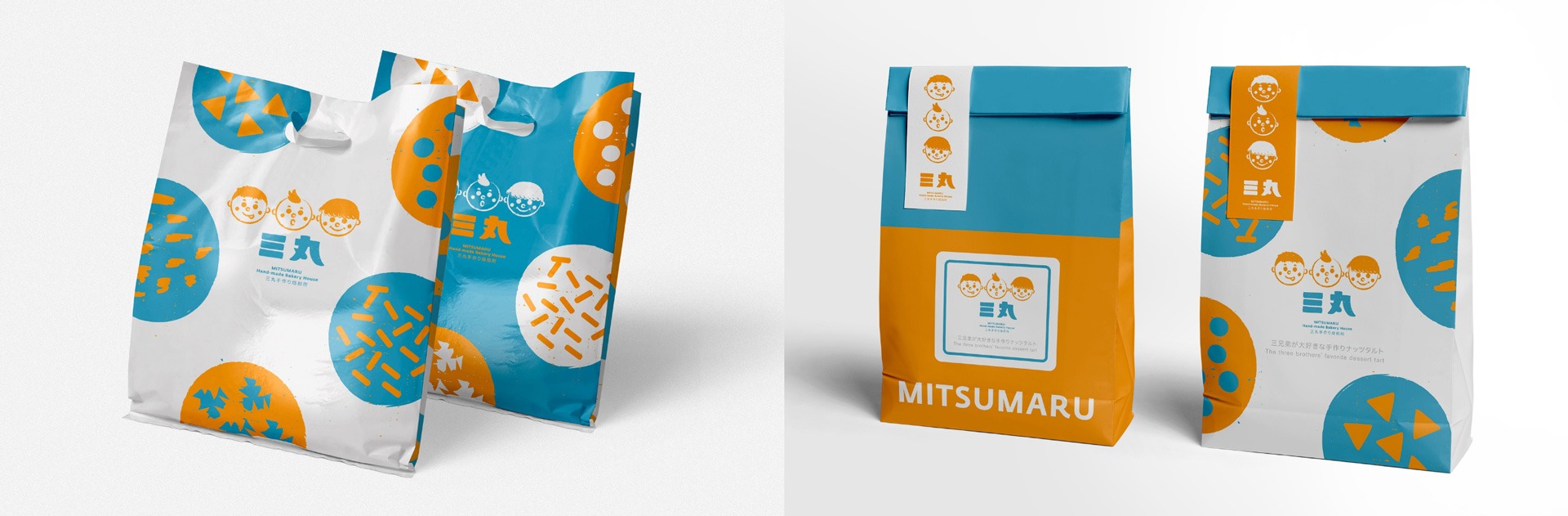
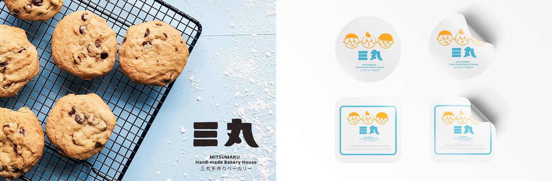
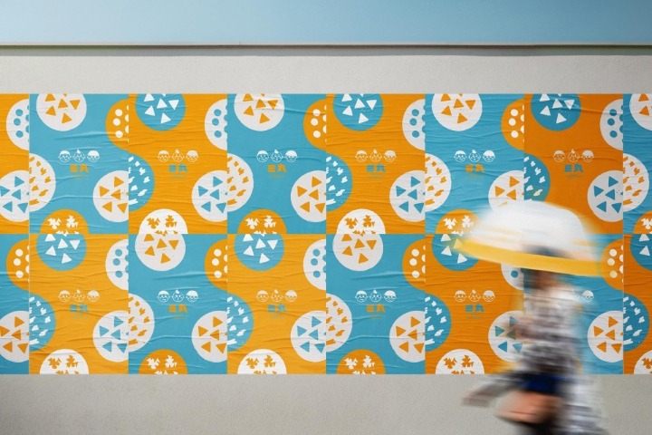
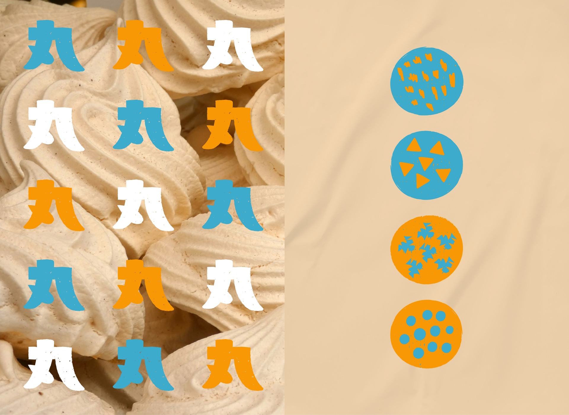
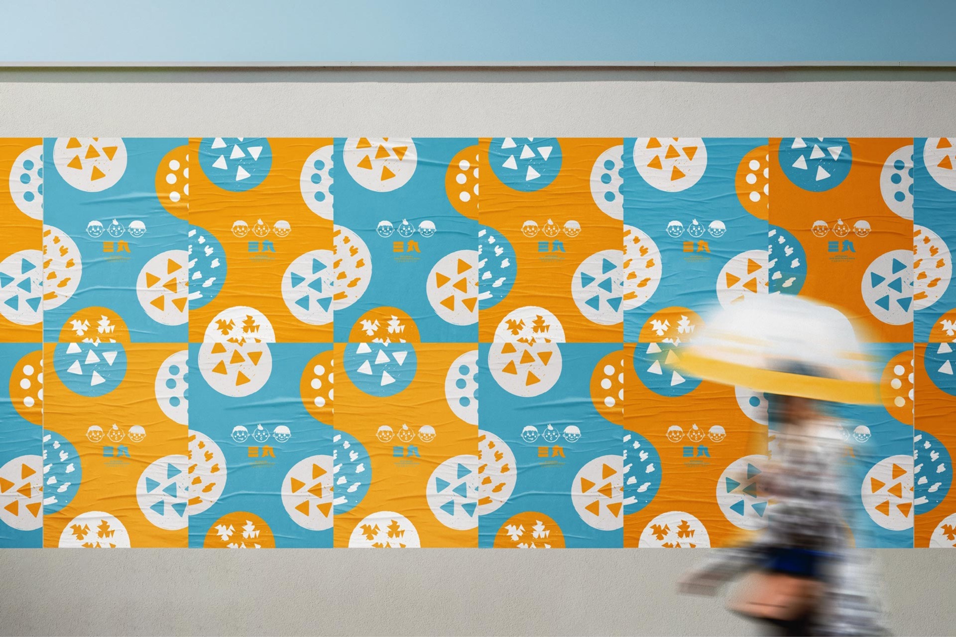
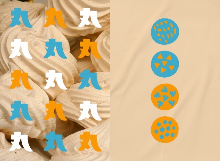
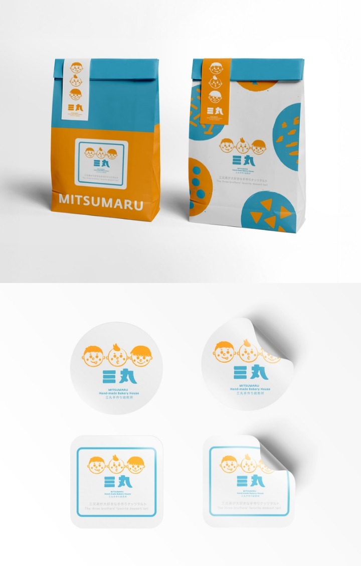
三個圓臉的童趣世界,溫暖詮釋零食的幸福圓滿
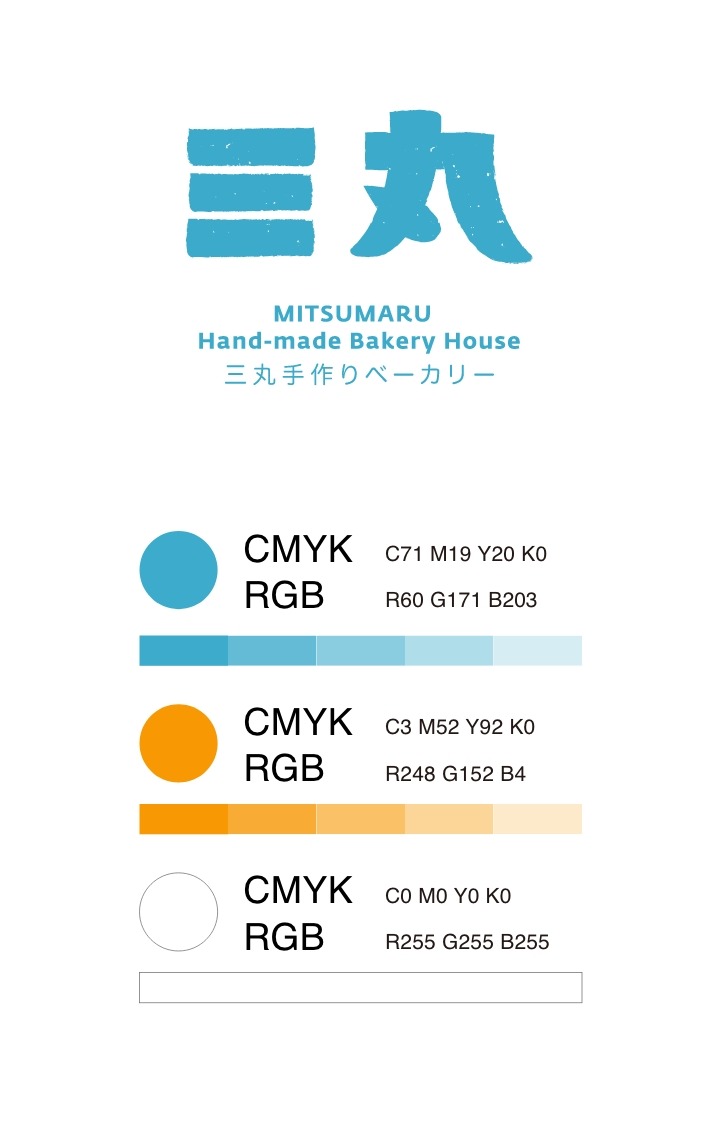
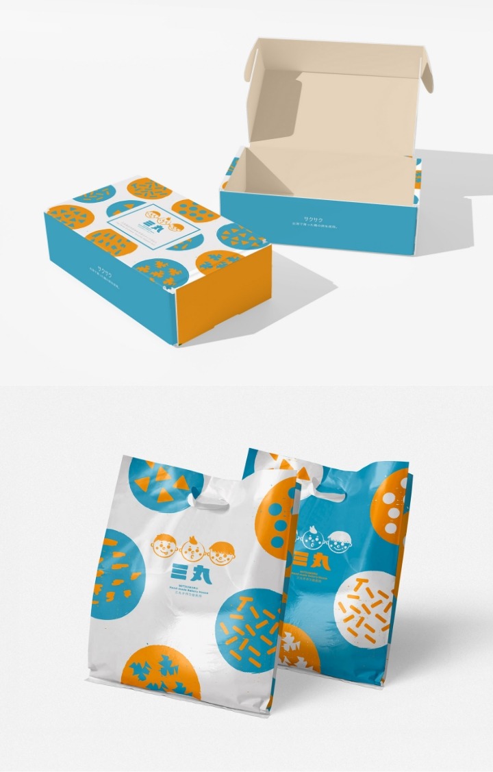
「三丸」這個名字,靈感取自日式文化中男孩名字的「丸」,象徵圓滿與童趣,呼應創辦者三個孩子的可愛模樣。品牌視覺以三個圓臉小童作為標誌,並選用藍、橘、白三色,打造出清新、親切又富有童心的品牌形象。包裝設計強調健康無負擔,搭配豐富堅果元素與清晰標示的產品資訊,讓消費者一眼感受到三丸製菓的用心與溫度。
The name “MITSUMARU” draws inspiration from the Japanese suffix “-maru,” traditionally used in boys’ names to symbolize completeness and playfulness.
It reflects the founder’s three adorable children and their round, cheerful faces—now the brand’s visual icons. The brand identity features three round-faced children in blue, orange, and white tones, creating a look that feels fresh, friendly, and full of childlike charm. The packaging highlights the snack’s healthy nature, featuring vibrant nut illustrations and clear product details that instantly communicate MITSUMARU HOMEMADE’s care and sincerity.
從母愛出發,為孩子打造安心美味的無負擔零食
「三丸製菓」的誕生,源自一位媽媽對三個愛吃零食小孩的關愛。面對市售零食普遍含有高油、高糖、高鹽,讓她既心疼又擔憂,於是親手為孩子們研發出健康又美味的替代品。三丸相信,健康與美味並不矛盾,品牌主打的堅果塔選用無添加、優質的原材料,不僅能滿足孩子的味蕾,也讓家長無需擔心健康負擔,實現全家共享的美味小時光。
The story of MITSUMARU HOMEMADE began with a mother’s love for her three snack-loving children.Troubled by the unhealthy ingredients often found in store-bought snacks—high in oil, sugar, and salt—she decided to create a healthier alternative by hand. MITSUMARU HOMEMADE was born from this intention: a belief that health and deliciousness can go hand in hand. Their signature nut tarts are made with premium, additive-free ingredients, delivering both great taste and peace of mind. It’s a wholesome treat the whole family can enjoy together.
三個圓臉的童趣世界,溫暖詮釋零食的幸福圓滿
「三丸」這個名字,靈感取自日式文化中男孩名字的「丸」,象徵圓滿與童趣,呼應創辦者三個孩子的可愛模樣。品牌視覺以三個圓臉小童作為標誌,並選用藍、橘、白三色,打造出清新、親切又富有童心的品牌形象。包裝設計強調健康無負擔,搭配豐富堅果元素與清晰標示的產品資訊,讓消費者一眼感受到三丸製菓的用心與溫度。
The name “MITSUMARU” draws inspiration from the Japanese suffix “-maru,” traditionally used in boys’ names to symbolize completeness and playfulness.
It reflects the founder’s three adorable children and their round, cheerful faces—now the brand’s visual icons. The brand identity features three round-faced children in blue, orange, and white tones, creating a look that feels fresh, friendly, and full of childlike charm. The packaging highlights the snack’s healthy nature, featuring vibrant nut illustrations and clear product details that instantly communicate MITSUMARU HOMEMADE’s care and sincerity.