品牌創研 BRAND 視覺設計 VISUAL DESIGN 動態廣告 FILM 社群行銷 SOCIAL MEDIA
爸要喝茶的家庭號召:從諧音創意延伸八倍歡聚
“Dad Wants Tea”: Turning a Brand Pun into an Eightfold Family Celebration
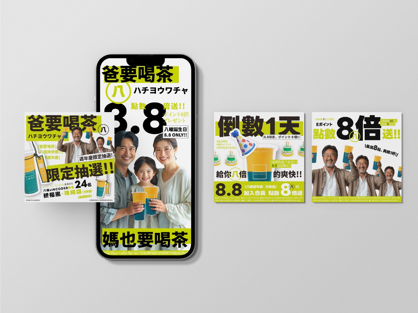
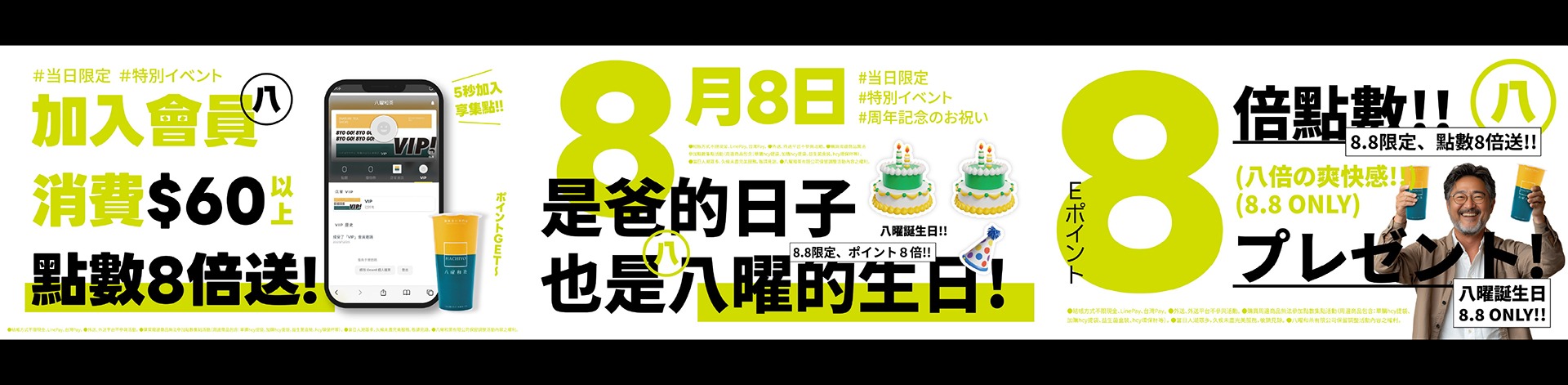
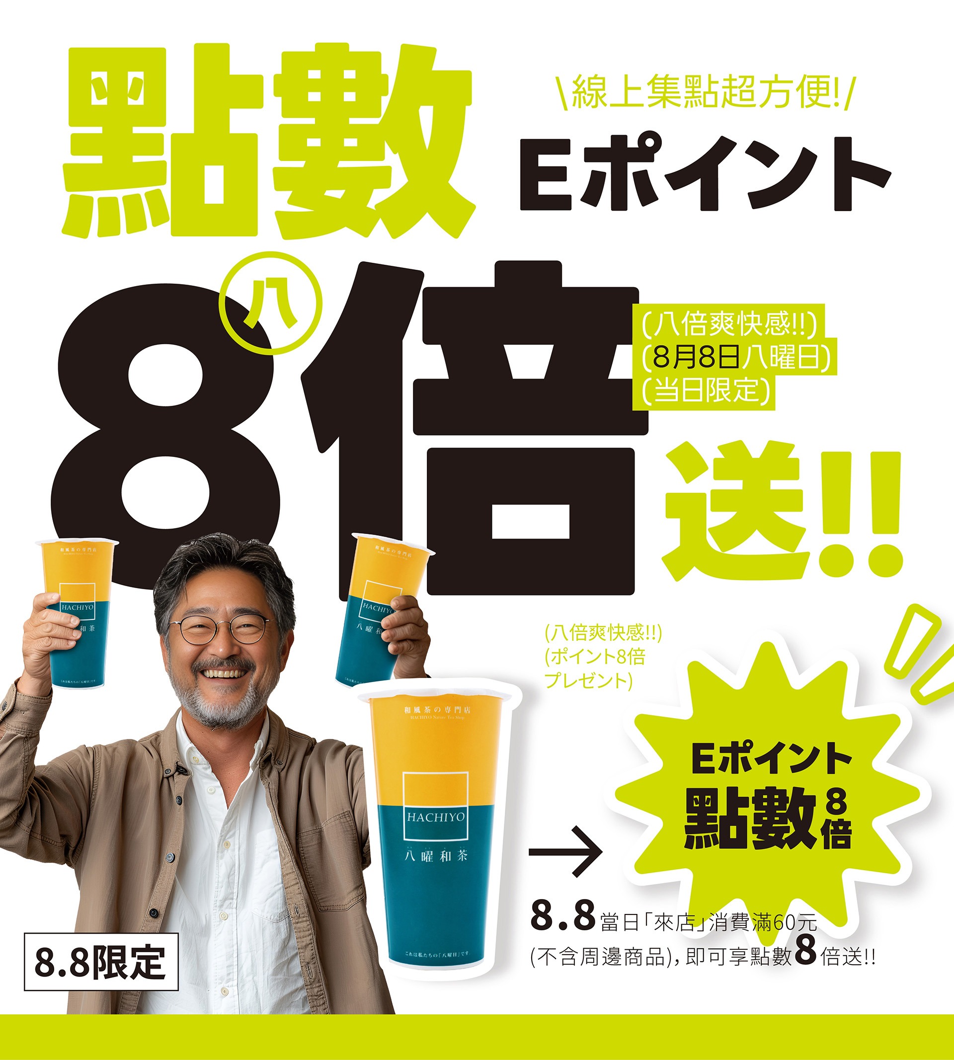
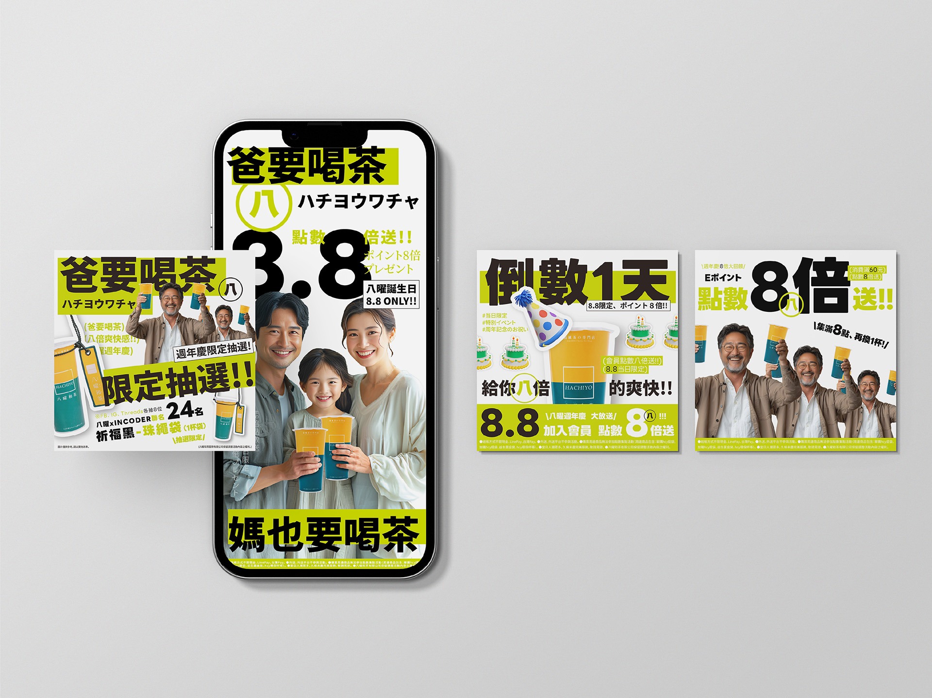
「2024八曜點數八倍送」檔期主視覺,以八曜和茶的品牌名稱諧音「爸要喝茶」作為創意起點,將父親節的節慶情境延伸為「全家一起來八曜喝茶」的活動主張。畫面以一家三口共同舉杯的歡聚場景建立情感核心,讓點數八倍贈送不只是促銷優惠,更成為邀請家人相聚、一起分享茶飲的節日理由。
視覺將「爸要喝茶、媽也要喝茶」轉化為直接而有趣的溝通語言,搭配放大的「8.8」與「點數八倍送」活動資訊,快速建立父親節、八曜與八倍回饋之間的連結。透過家庭情境與諧音創意的結合,使活動訊息更具親切感與記憶點,也將品牌名稱自然融入消費者的日常對話。
The key visual for Hachiyo’s 2024 Eightfold Points Campaign began with a playful phonetic connection between the brand name and the Mandarin phrase “Dad Wants Tea.” Built around the Father’s Day occasion, the concept was extended into an invitation for the whole family to enjoy tea together at Hachiyo. A family of three raising their drinks forms the emotional center of the visual, transforming the eightfold points reward from a simple promotion into a reason for families to gather and share tea.
The phrases “Dad Wants Tea” and “Mom Wants Tea Too” were developed into direct and playful campaign messages. Combined with the enlarged “8.8” and “Eightfold Points” information, the design immediately connects Father’s Day, Hachiyo, and the eightfold reward. By bringing together a familiar family scene and a memorable linguistic pun, the campaign creates a warm and approachable message while naturally integrating the brand name into everyday conversation.
螢光綠的節慶變奏:高對比字體與八倍數字的視覺衝擊
A Neon-Green Festive Statement: Bold Typography and the Visual Impact of Eight
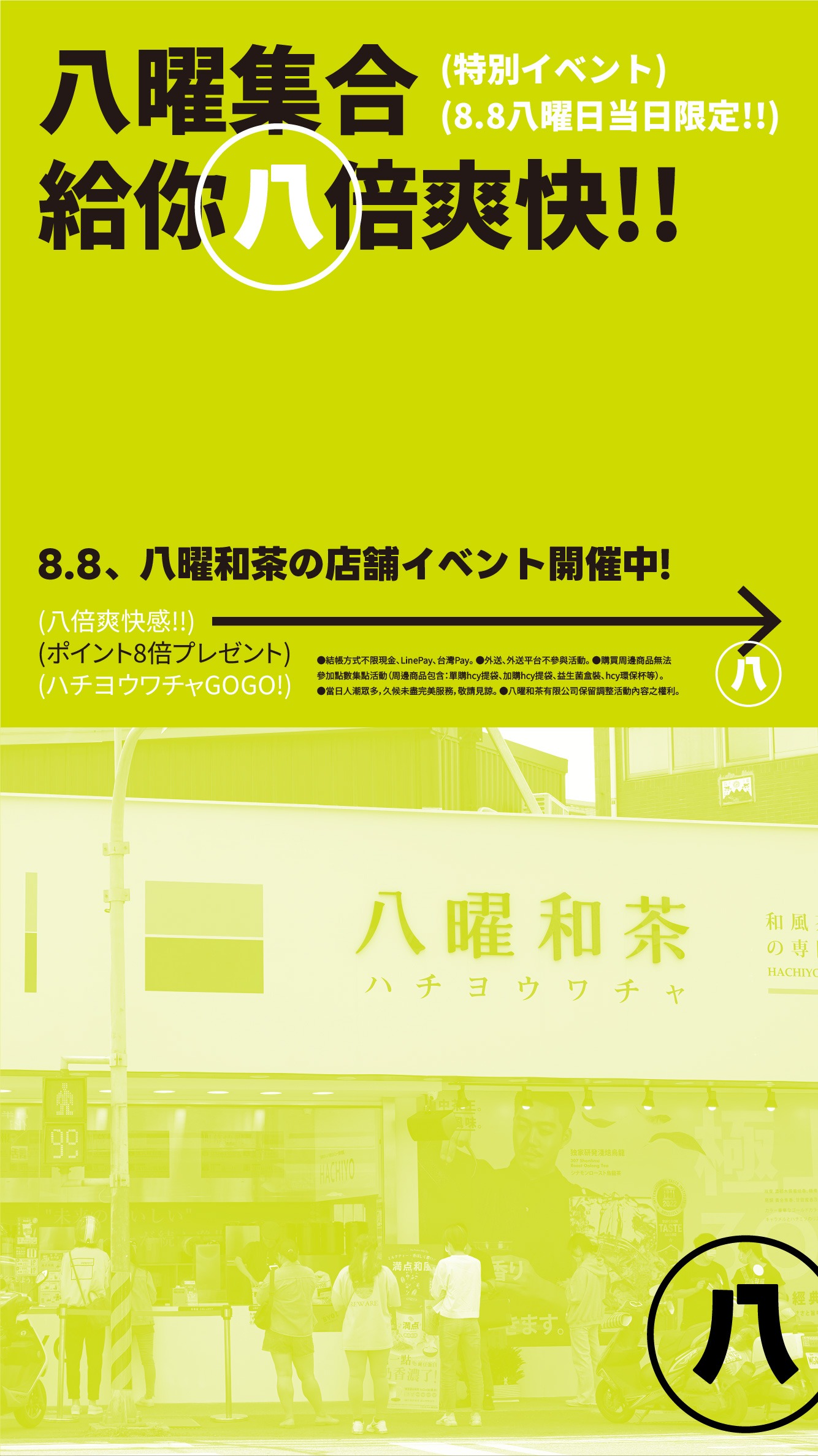
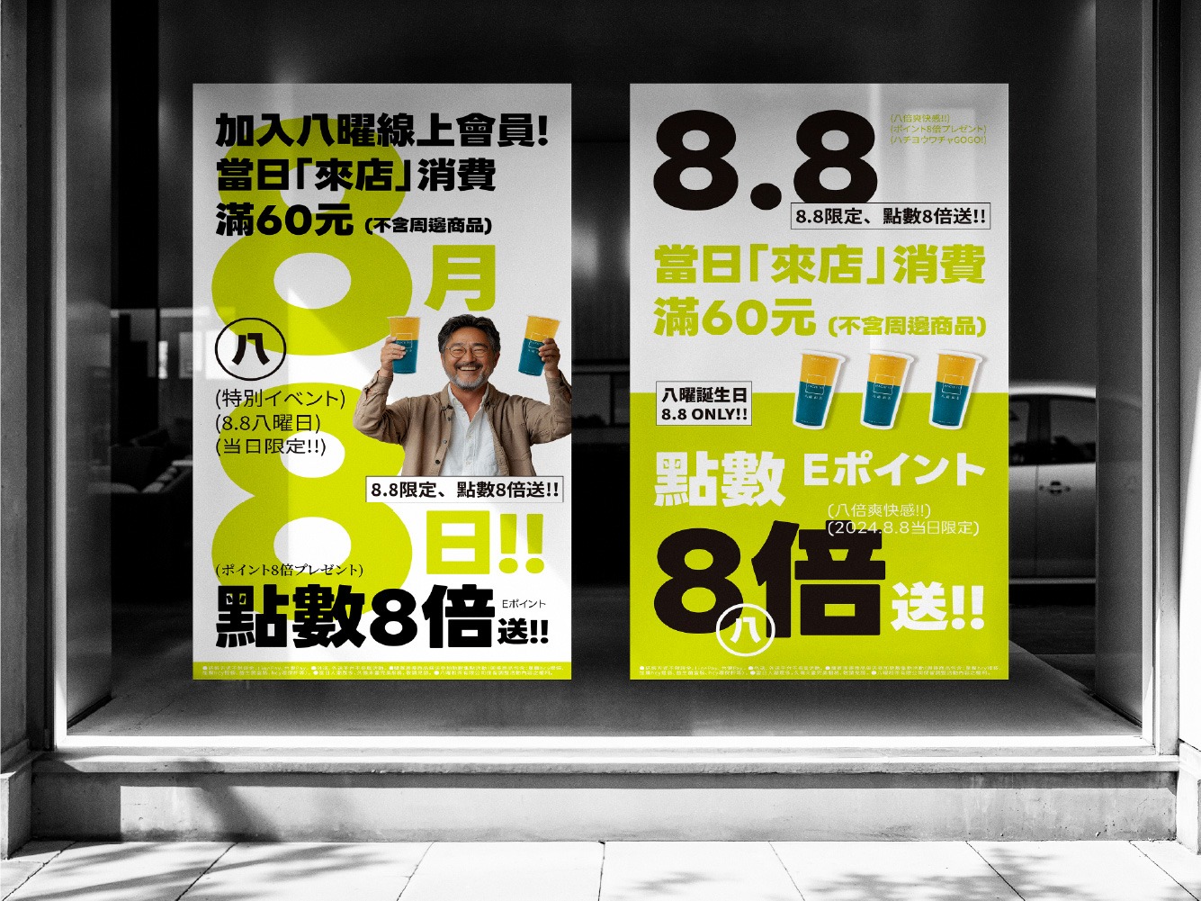
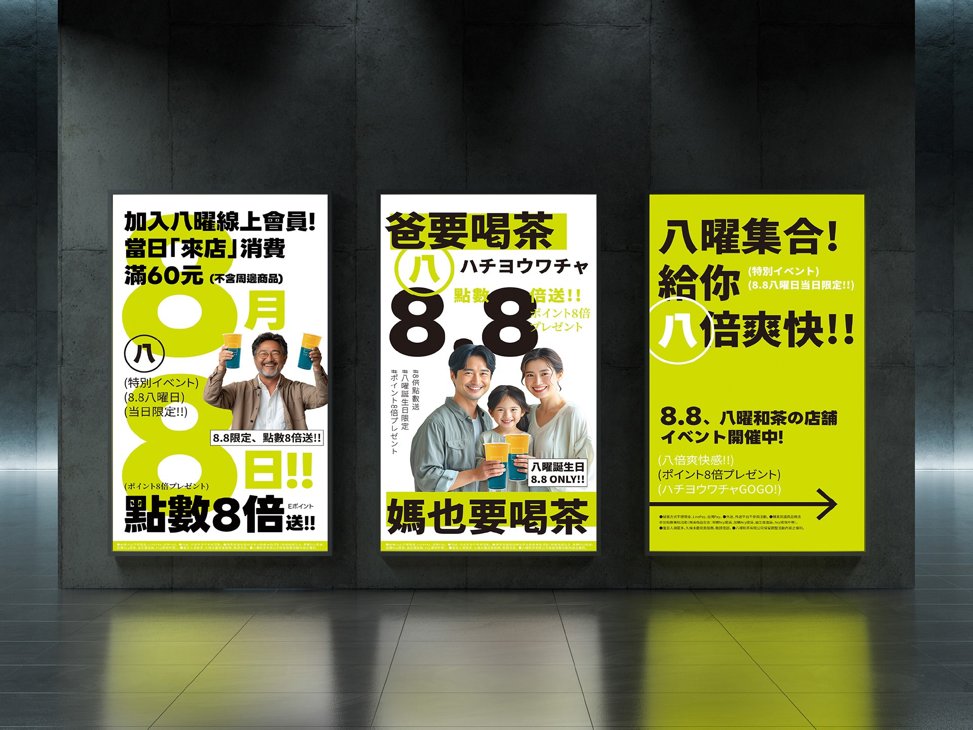
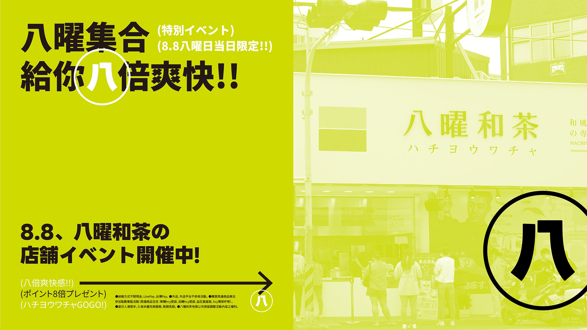
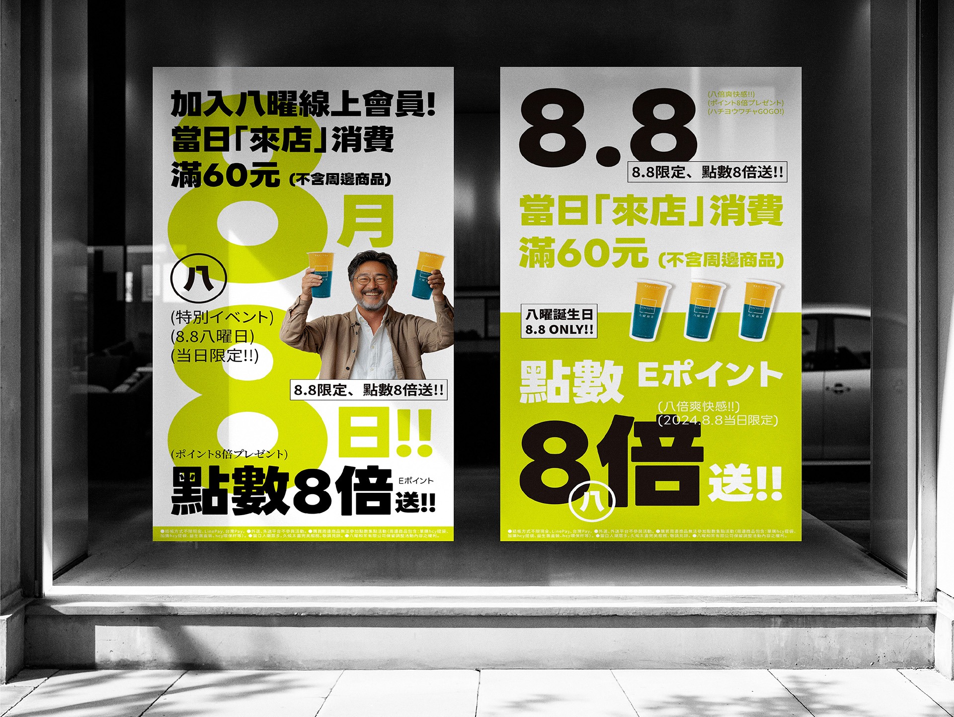
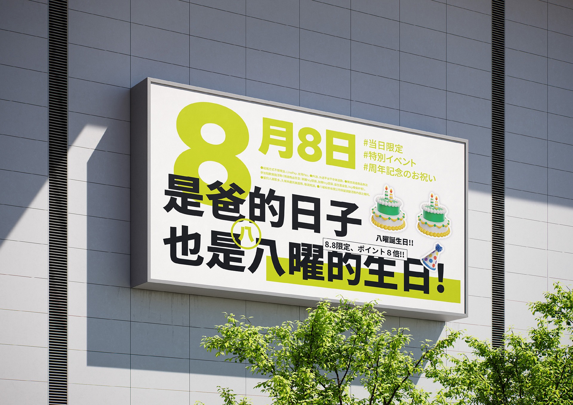
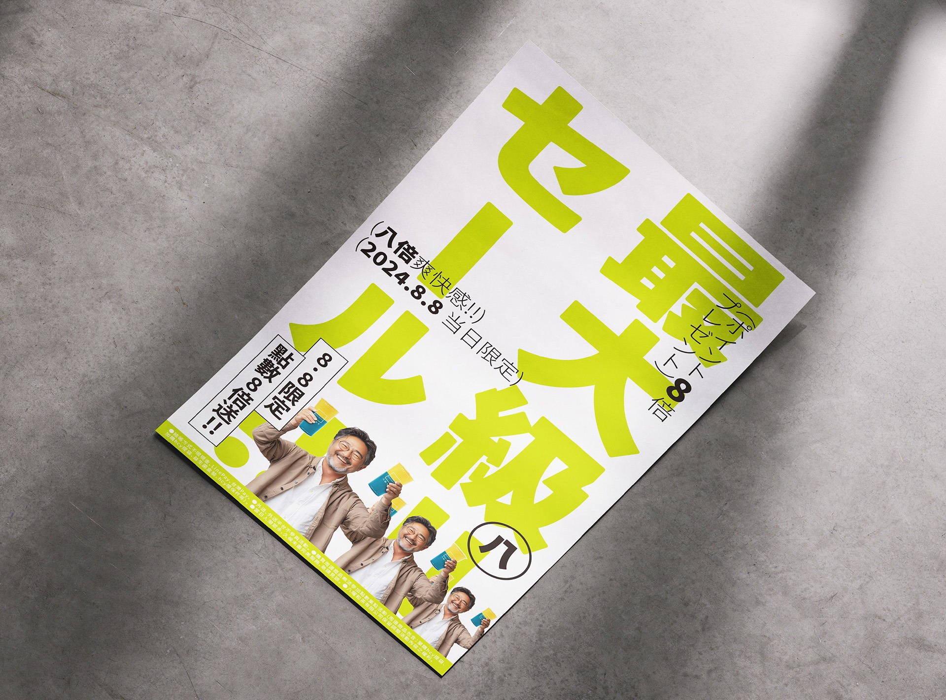
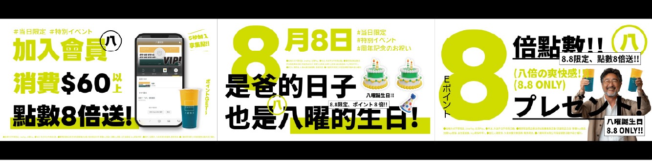
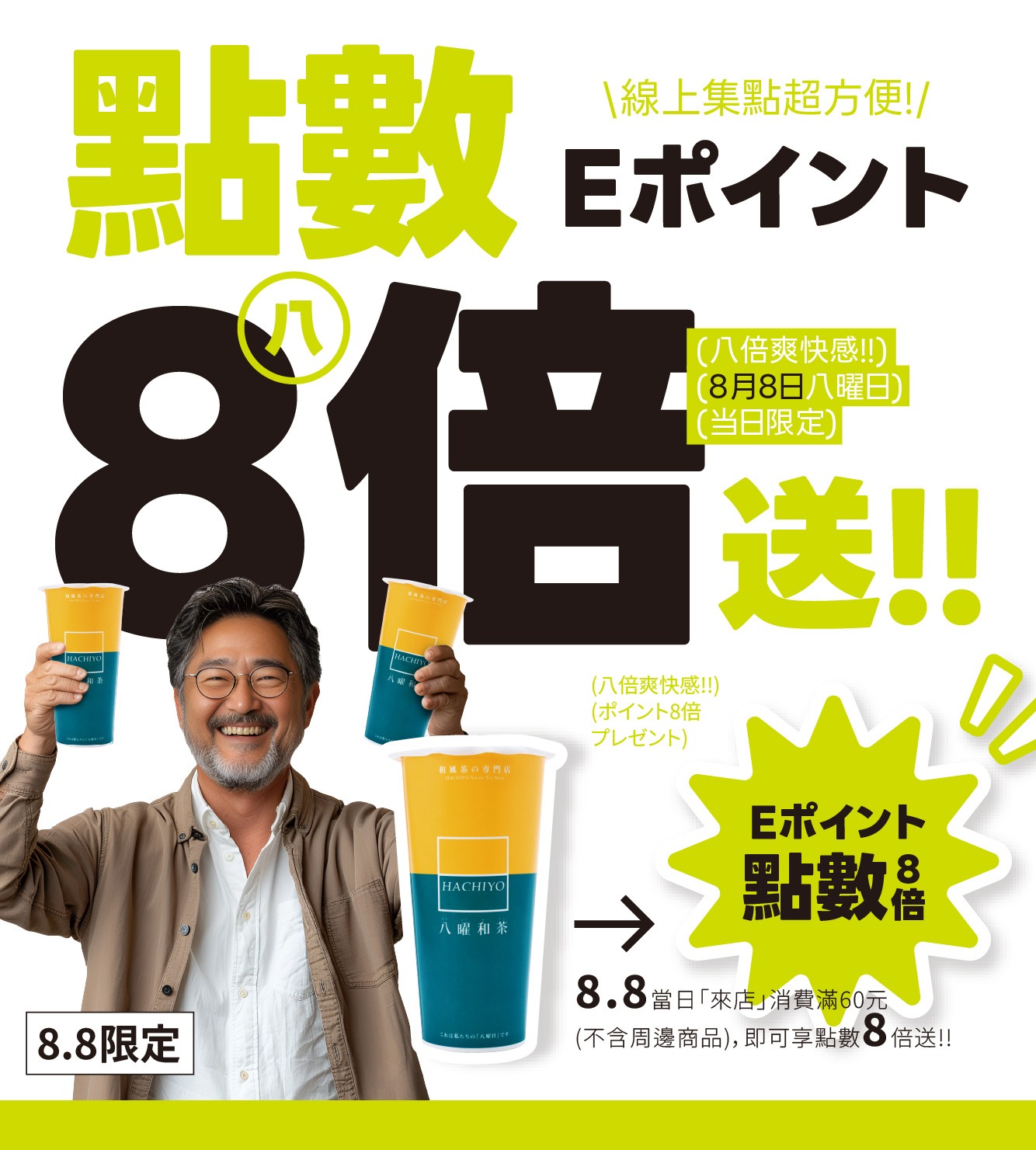
主視覺從八曜和茶代表性的綠色出發,進一步轉化為明亮醒目的螢光綠,搭配黑色粗體字與大面積白色留白,建立高對比、活潑且充滿節慶熱度的視覺風格。超大型標題與數字「8.8」形成畫面重心,讓活動日期、八倍點數與八曜品牌在第一時間被辨識。
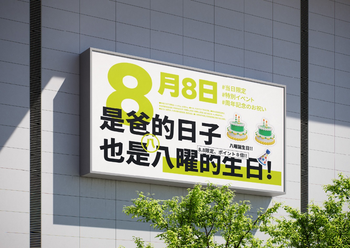
版面運用大字級、中日文混排與不同比例的資訊層次,營造近似潮流雜誌與日系促銷廣告的鮮明節奏。螢光綠不僅延續八曜的品牌識別,也放大活動的熱鬧感與限時感;家庭人物、飲品與促銷資訊彼此交織,完整傳達「全家一起喝茶,點數八倍帶回家」的節慶體驗。
The key visual evolves Hachiyo’s signature green into a bright, high-impact neon green. Paired with bold black typography and generous white space, the palette creates a lively, high-contrast visual style filled with festive energy. Oversized headlines and the prominent “8.8” become the central focus, allowing the campaign date, eightfold points reward, and Hachiyo brand identity to be recognized immediately.
Large-scale typography, a mix of Chinese and Japanese text, and varied information proportions create a striking rhythm reminiscent of contemporary fashion editorials and Japanese promotional graphics. The neon green retains Hachiyo’s core brand identity while amplifying the event’s excitement and limited-time appeal. By combining family imagery, beverages, and promotional information, the design communicates a complete festive experience: “Enjoy tea with the whole family and take home eight times the points.”
爸要喝茶的家庭號召:從諧音創意延伸八倍歡聚
“Dad Wants Tea”: Turning a Brand Pun into an Eightfold Family Celebration
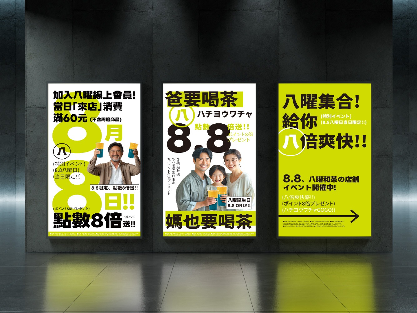
「2024八曜點數八倍送」檔期主視覺,以八曜和茶的品牌名稱諧音「爸要喝茶」作為創意起點,將父親節的節慶情境延伸為「全家一起來八曜喝茶」的活動主張。畫面以一家三口共同舉杯的歡聚場景建立情感核心,讓點數八倍贈送不只是促銷優惠,更成為邀請家人相聚、一起分享茶飲的節日理由。
視覺將「爸要喝茶、媽也要喝茶」轉化為直接而有趣的溝通語言,搭配放大的「8.8」與「點數八倍送」活動資訊,快速建立父親節、八曜與八倍回饋之間的連結。透過家庭情境與諧音創意的結合,使活動訊息更具親切感與記憶點,也將品牌名稱自然融入消費者的日常對話。
The key visual for Hachiyo’s 2024 Eightfold Points Campaign began with a playful phonetic connection between the brand name and the Mandarin phrase “Dad Wants Tea.” Built around the Father’s Day occasion, the concept was extended into an invitation for the whole family to enjoy tea together at Hachiyo. A family of three raising their drinks forms the emotional center of the visual, transforming the eightfold points reward from a simple promotion into a reason for families to gather and share tea.
The phrases “Dad Wants Tea” and “Mom Wants Tea Too” were developed into direct and playful campaign messages. Combined with the enlarged “8.8” and “Eightfold Points” information, the design immediately connects Father’s Day, Hachiyo, and the eightfold reward. By bringing together a familiar family scene and a memorable linguistic pun, the campaign creates a warm and approachable message while naturally integrating the brand name into everyday conversation.
螢光綠的節慶變奏:高對比字體與八倍數字的視覺衝擊
A Neon-Green Festive Statement: Bold Typography and the Visual Impact of Eight
主視覺從八曜和茶代表性的綠色出發,進一步轉化為明亮醒目的螢光綠,搭配黑色粗體字與大面積白色留白,建立高對比、活潑且充滿節慶熱度的視覺風格。超大型標題與數字「8.8」形成畫面重心,讓活動日期、八倍點數與八曜品牌在第一時間被辨識。
版面運用大字級、中日文混排與不同比例的資訊層次,營造近似潮流雜誌與日系促銷廣告的鮮明節奏。螢光綠不僅延續八曜的品牌識別,也放大活動的熱鬧感與限時感;家庭人物、飲品與促銷資訊彼此交織,完整傳達「全家一起喝茶,點數八倍帶回家」的節慶體驗。
The key visual evolves Hachiyo’s signature green into a bright, high-impact neon green. Paired with bold black typography and generous white space, the palette creates a lively, high-contrast visual style filled with festive energy. Oversized headlines and the prominent “8.8” become the central focus, allowing the campaign date, eightfold points reward, and Hachiyo brand identity to be recognized immediately.
Large-scale typography, a mix of Chinese and Japanese text, and varied information proportions create a striking rhythm reminiscent of contemporary fashion editorials and Japanese promotional graphics. The neon green retains Hachiyo’s core brand identity while amplifying the event’s excitement and limited-time appeal. By combining family imagery, beverages, and promotional information, the design communicates a complete festive experience: “Enjoy tea with the whole family and take home eight times the points.”