品牌創研 BRAND 視覺設計 VISUAL DESIGN 動態廣告 FILM 社群行銷 SOCIAL MEDIA
城市裡的清爽和風茶補給站
A Refreshing Tea Station in the City
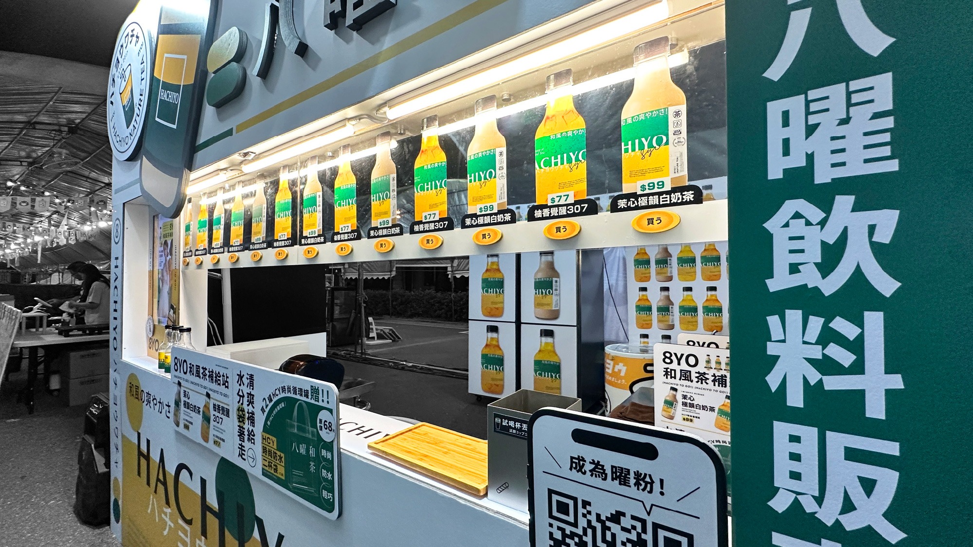
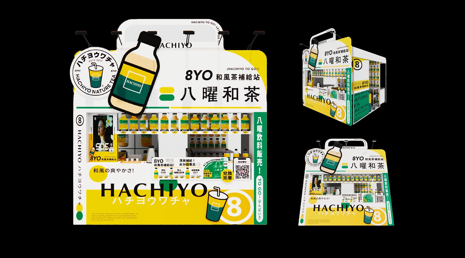
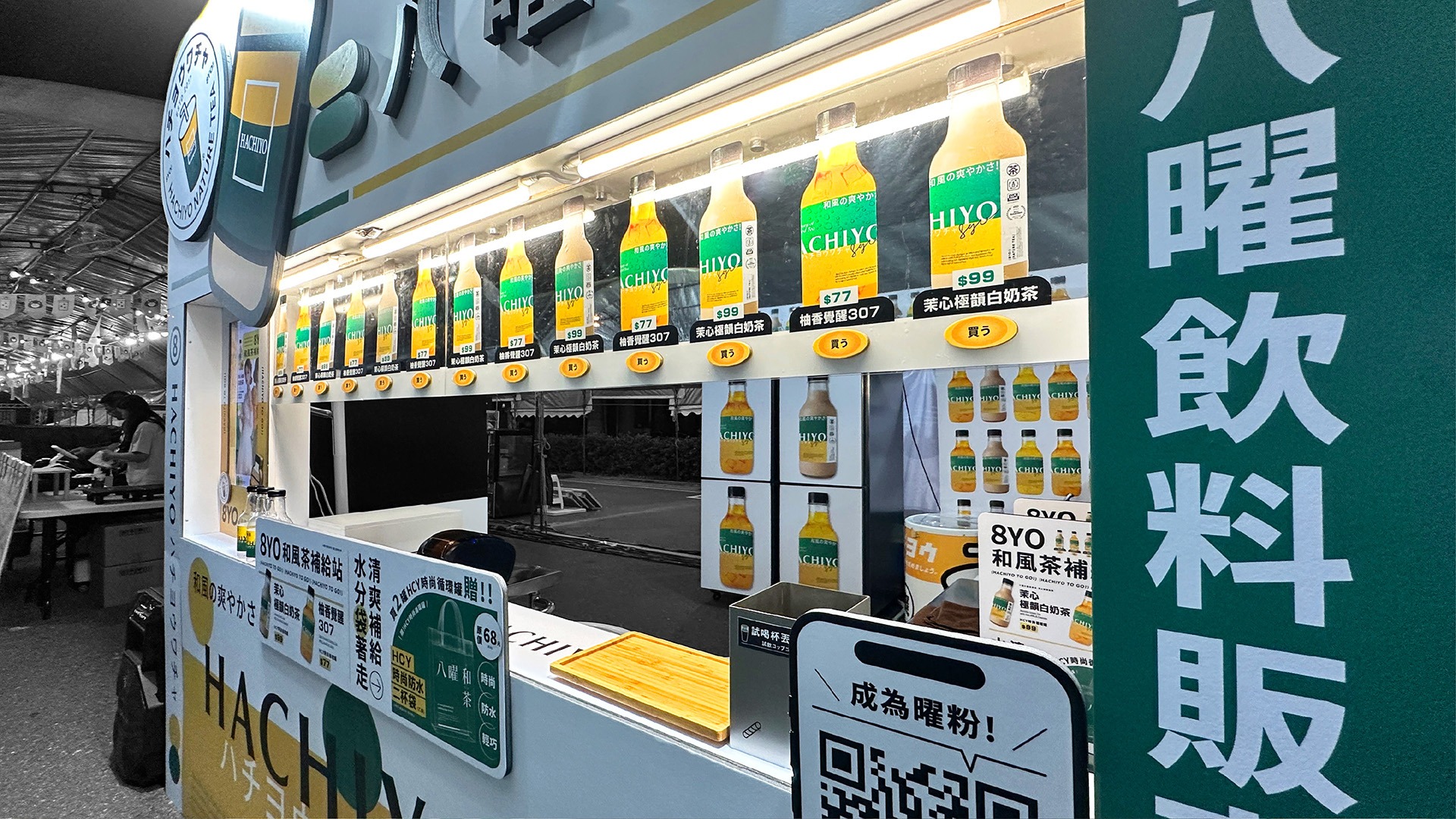
八曜和茶於「2025高雄奶茶節」活動設計的攤位以「和風茶補給站」為主題,延續八曜「清爽、自然、無負擔」的品牌核心,將茶飲視為城市生活中的日常補給,並以大型販賣機作為攤位整體造型靈感,強化城市茶飲補給的趣味想像。
視覺運用八曜和茶鮮明的黃綠品牌色與一致的圖像語彙,建立明亮清爽、活潑且高辨識度的整體形象。透過鮮明而統一的視覺設計,在資訊密集的奶茶節活動中快速吸引目光,讓「和風茶補給站」成為奶茶節中醒目且具記憶點的品牌場景。
Hachiyo’s booth at the 2025 Kaohsiung Milk Tea Festival was developed around the theme of the “Hachiyo Tea Refreshment Station.” Extending the brand’s core values of being refreshing, natural, and light, the concept presents tea as an everyday source of refreshment within urban life. A large-scale vending machine served as the inspiration for the booth’s overall form, adding a playful interpretation of a city tea refreshment station.
Hachiyo’s signature yellow-and-green palette and consistent graphic language establish a bright, refreshing, energetic, and highly recognizable visual identity. In the visually dense festival environment, the unified design quickly captures attention and transforms the Hachiyo Tea Refreshment Station into a distinctive and memorable brand presence.
整合瓶身與社群延伸完整品牌體驗
Extending the Brand Experience through Packaging and Social Media
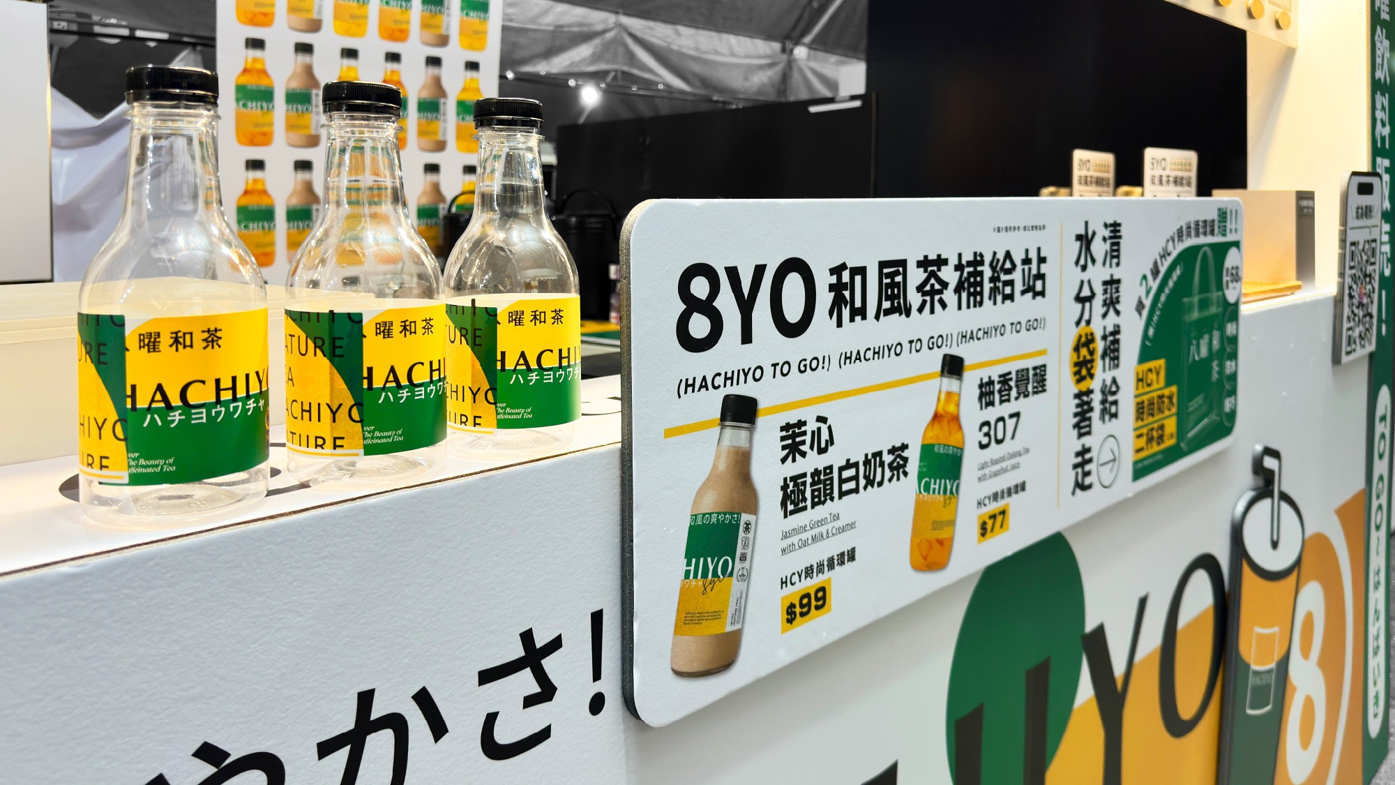
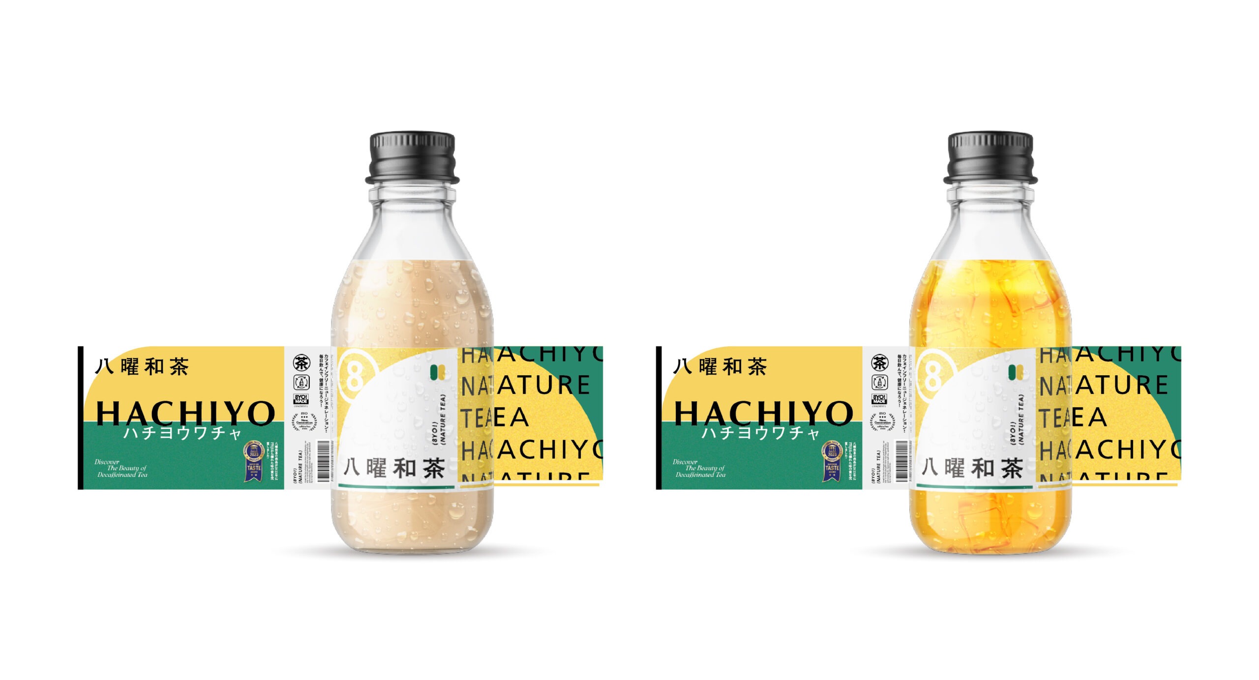
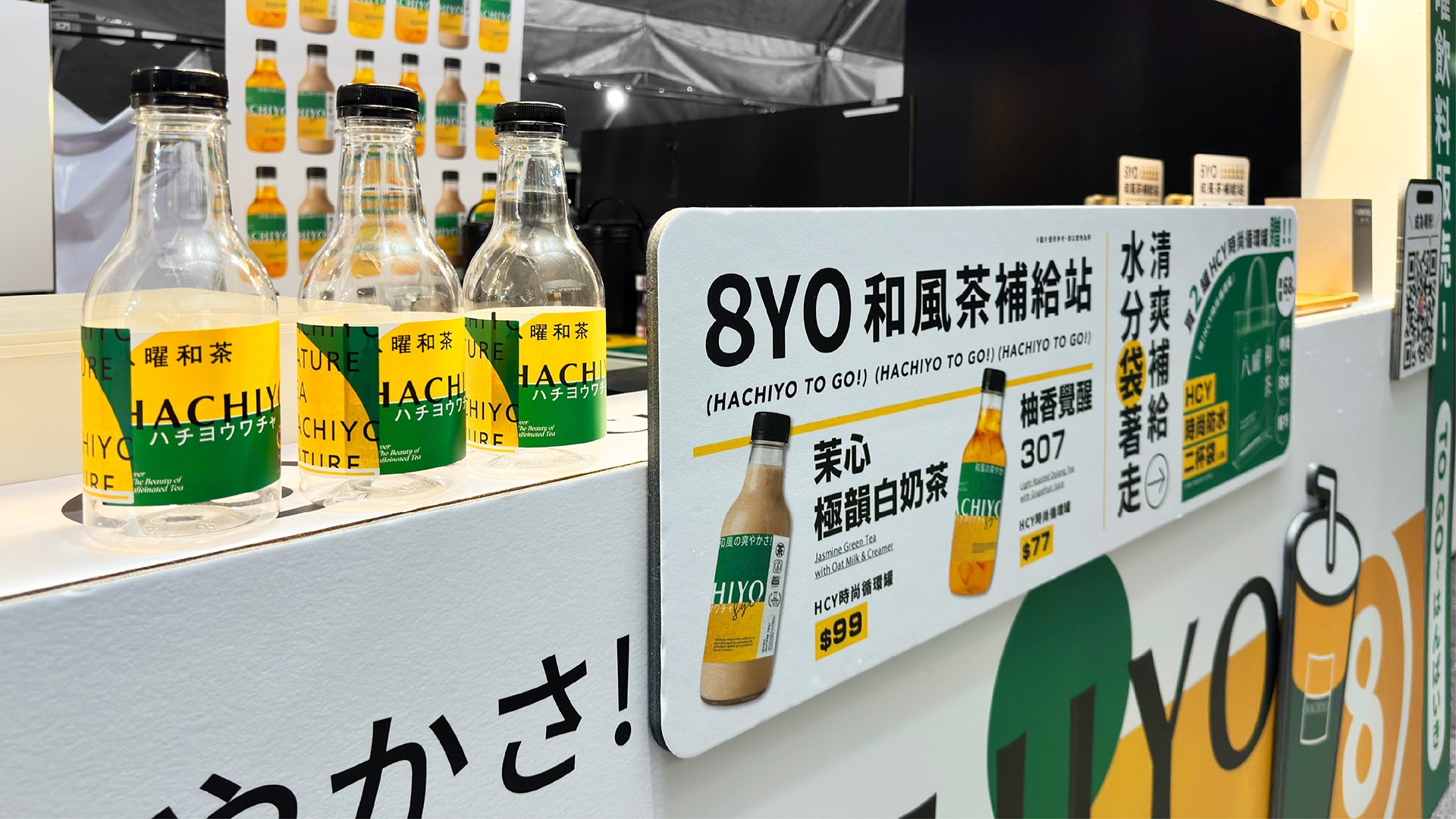
瓶身貼紙延續活動主視覺的色彩與設計語彙,將每瓶飲品轉化為具限定感的「和風補給品」。貼紙不僅承載品牌與產品資訊,也讓飲品成為可被攜帶、拍攝與分享的視覺媒介,使活動體驗從現場延伸至日常與社群傳播。
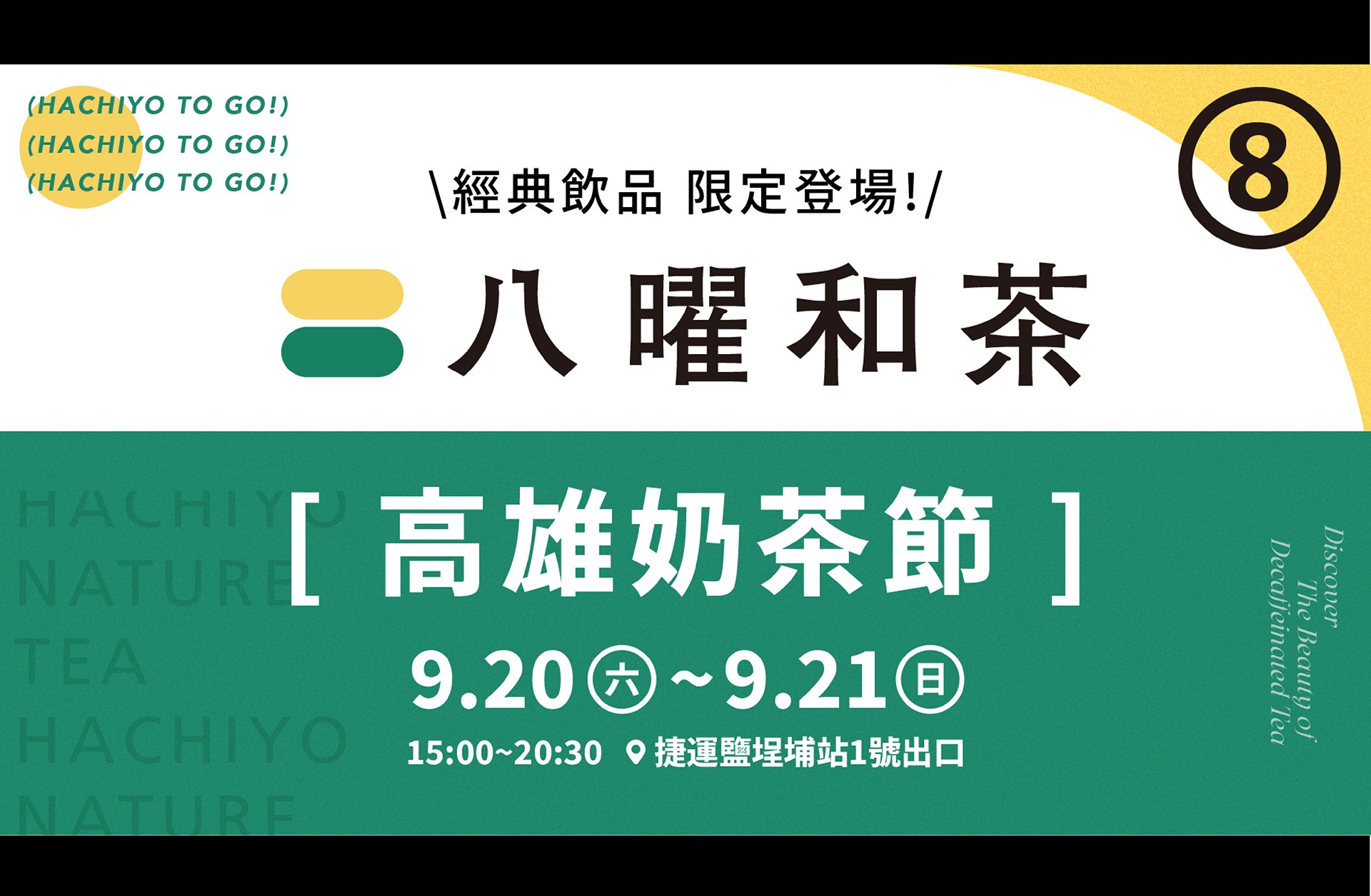
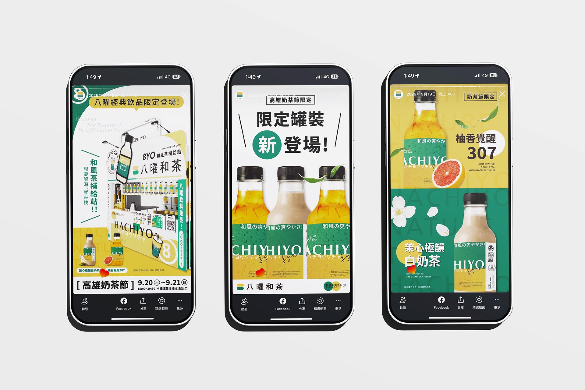
社群宣傳則以販賣機攤位、限定瓶身與「補給」概念為主軸,發展貼文、限時動態及活動資訊素材。透過一致的色彩與編排,串聯線上宣傳、現場體驗與飲品包裝,將單次展售活動轉化為可辨識、可互動且具分享性的八曜和茶品牌體驗。
The bottle labels extend the colors and design language of the campaign’s key visual, transforming each beverage into a limited-edition “Hachiyo Refreshment.” Beyond communicating brand and product information, the labels turn each bottle into a portable, photogenic, and shareable visual medium, extending the event experience beyond the venue and into everyday life and social media.
Social media communications were developed around the vending-machine-inspired booth, limited-edition bottles, and the concept of refreshment, encompassing social posts, Stories, and event information materials. Consistent colors and layouts connect online promotion, the on-site experience, and beverage packaging, transforming a temporary sales event into a recognizable, interactive, and highly shareable Hachiyo brand experience.
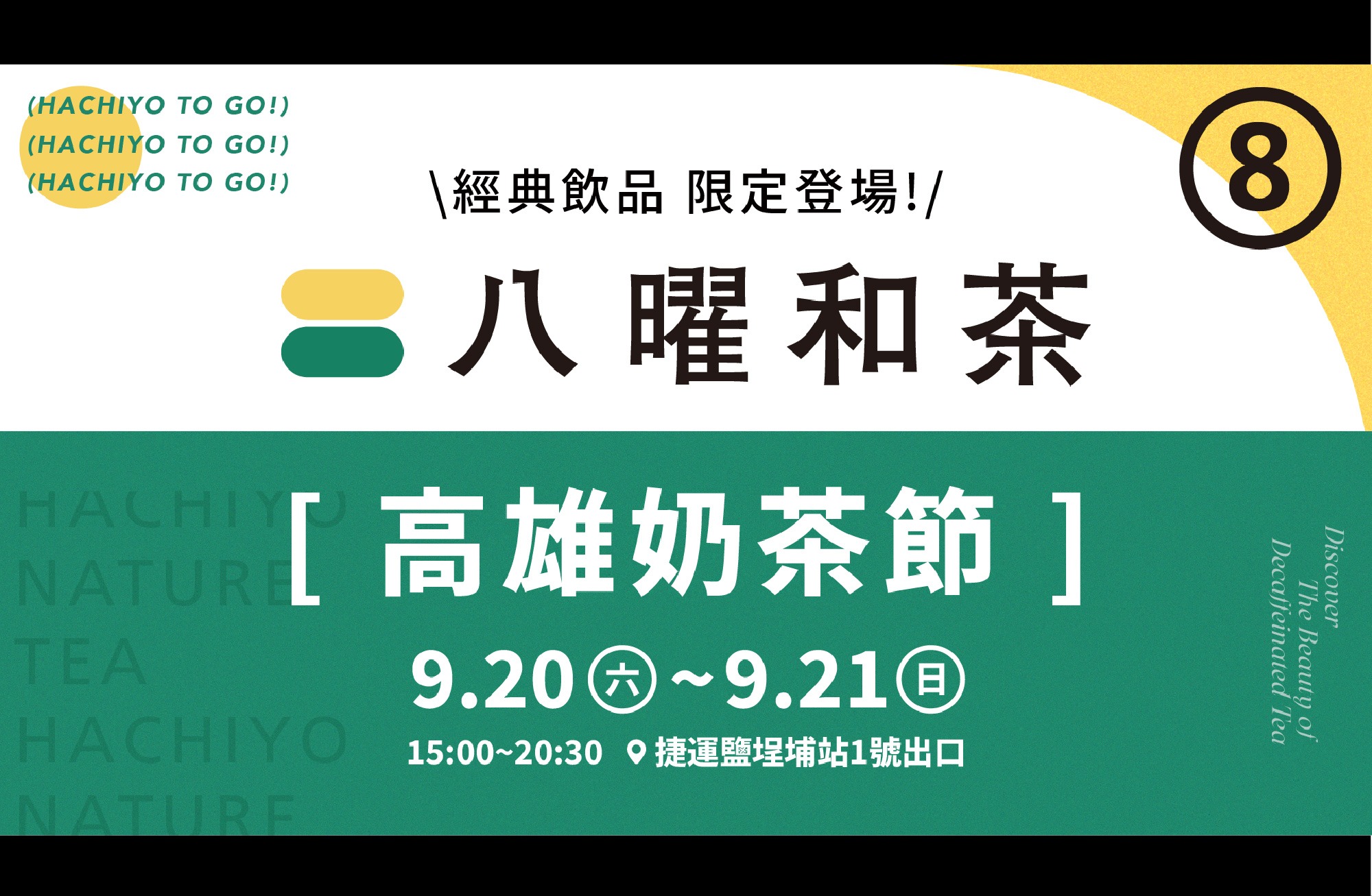
城市裡的清爽和風茶補給站
A Refreshing Tea Station in the City
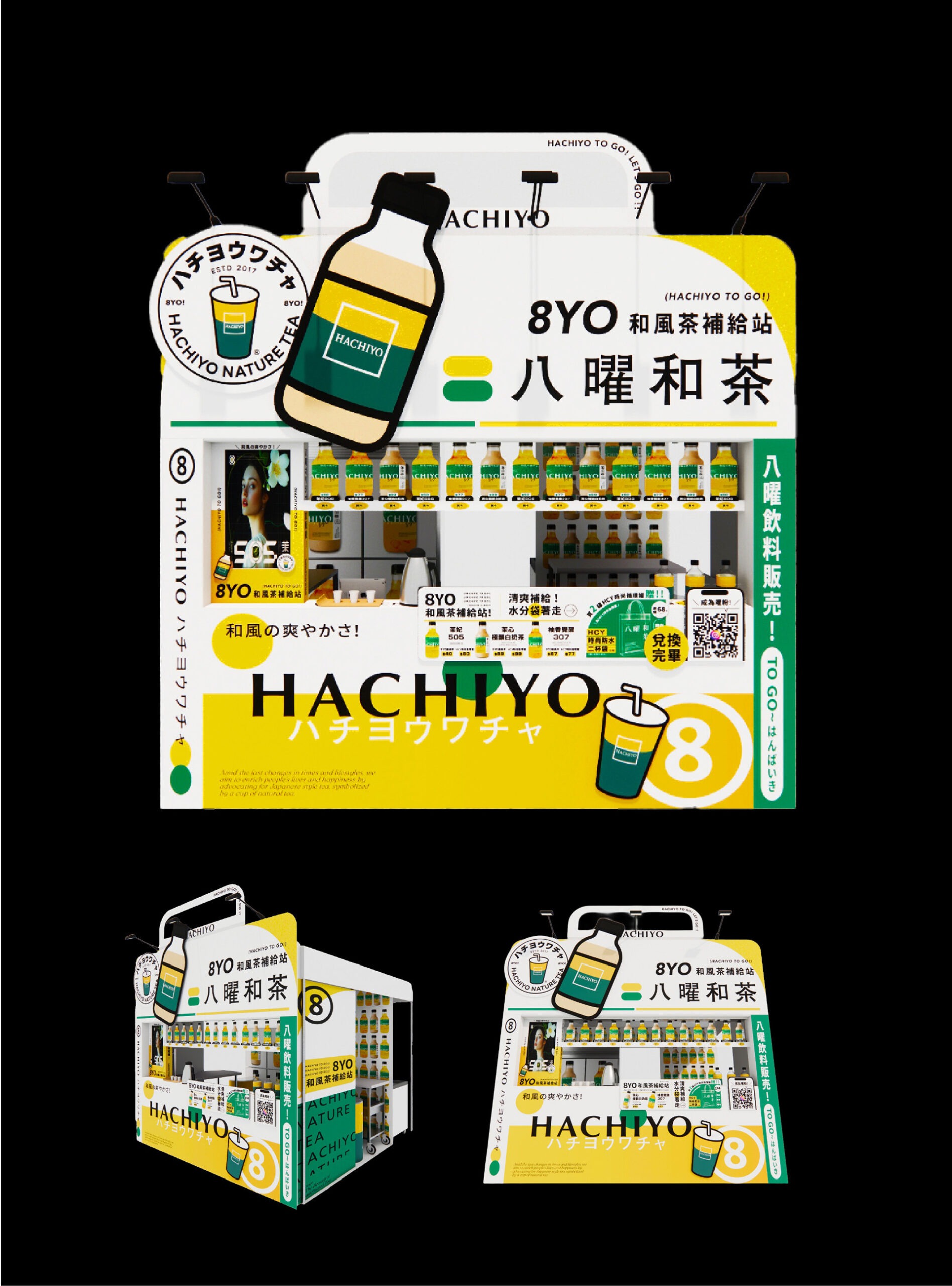
八曜和茶於「2025高雄奶茶節」活動設計的攤位以「和風茶補給站」為主題,延續八曜「清爽、自然、無負擔」的品牌核心,將茶飲視為城市生活中的日常補給,並以大型販賣機作為攤位整體造型靈感,強化城市茶飲補給的趣味想像。
視覺運用八曜和茶鮮明的黃綠品牌色與一致的圖像語彙,建立明亮清爽、活潑且高辨識度的整體形象。透過鮮明而統一的視覺設計,在資訊密集的奶茶節活動中快速吸引目光,讓「和風茶補給站」成為奶茶節中醒目且具記憶點的品牌場景。
Hachiyo’s booth at the 2025 Kaohsiung Milk Tea Festival was developed around the theme of the “Hachiyo Tea Refreshment Station.” Extending the brand’s core values of being refreshing, natural, and light, the concept presents tea as an everyday source of refreshment within urban life. A large-scale vending machine served as the inspiration for the booth’s overall form, adding a playful interpretation of a city tea refreshment station.
Hachiyo’s signature yellow-and-green palette and consistent graphic language establish a bright, refreshing, energetic, and highly recognizable visual identity. In the visually dense festival environment, the unified design quickly captures attention and transforms the Hachiyo Tea Refreshment Station into a distinctive and memorable brand presence.
整合瓶身與社群延伸完整品牌體驗
Extending the Brand Experience through Packaging and Social Media
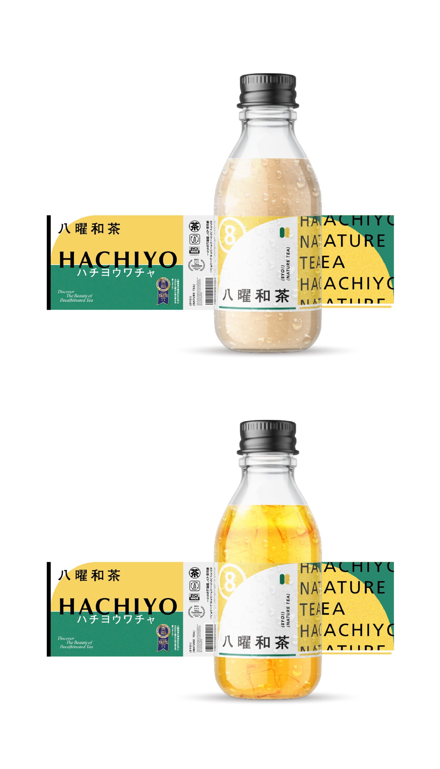
瓶身貼紙延續活動主視覺的色彩與設計語彙,將每瓶飲品轉化為具限定感的「和風補給品」。貼紙不僅承載品牌與產品資訊,也讓飲品成為可被攜帶、拍攝與分享的視覺媒介,使活動體驗從現場延伸至日常與社群傳播。
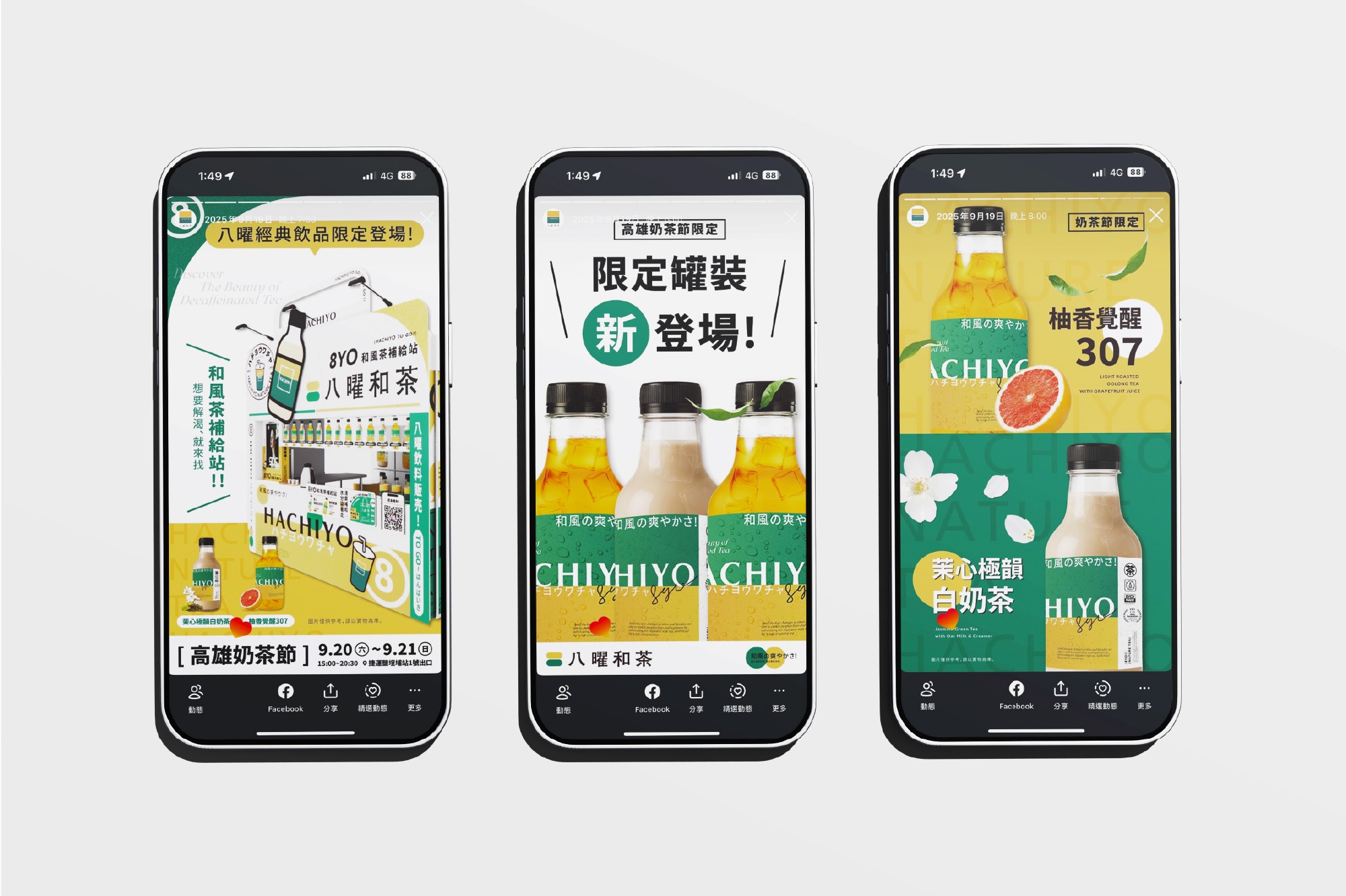
社群宣傳則以販賣機攤位、限定瓶身與「補給」概念為主軸,發展貼文、限時動態及活動資訊素材。透過一致的色彩與編排,串聯線上宣傳、現場體驗與飲品包裝,將單次展售活動轉化為可辨識、可互動且具分享性的八曜和茶品牌體驗。
The bottle labels extend the colors and design language of the campaign’s key visual, transforming each beverage into a limited-edition “Hachiyo Refreshment.” Beyond communicating brand and product information, the labels turn each bottle into a portable, photogenic, and shareable visual medium, extending the event experience beyond the venue and into everyday life and social media.
Social media communications were developed around the vending-machine-inspired booth, limited-edition bottles, and the concept of refreshment, encompassing social posts, Stories, and event information materials. Consistent colors and layouts connect online promotion, the on-site experience, and beverage packaging, transforming a temporary sales event into a recognizable, interactive, and highly shareable Hachiyo brand experience.