Dadao International:SUNLAY
品牌創研 BRAND 視覺設計 VISUAL DESIGN 空間設計 SPACE
時間淬鍊下的大晃傳英深厚製茶底蘊
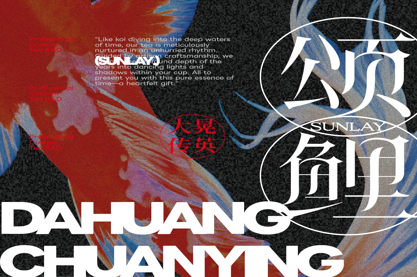
大晃傳英累積了長期而穩定的製茶專業,但在展覽環境中,觀眾往往只有短暫時間接收品牌訊息。因此,「頌鯉」最重要的設計任務,是將大晃所累積構成的深厚內容,轉化為清楚、當代且具有辨識度的視覺與空間語言,讓觀眾被吸引並願意靠近深入理解品牌。
我們重新梳理大晃傳英的核心價值,看見品牌不只是提供茶品,更在長年投入中累積出穩定、細緻且持續精進的專業厚度。因此此次展覽以「久養淬鍊」為核心,將錦鯉象徵的養成、前行與蛻變,連結至茶葉歷經時間與工序淬鍊的品牌精神,將大晃傳英對製茶品質的堅持轉化為符合當代觀看方式的設計表達。
DAHUANG CHUANYING has built a long-standing and consistent foundation of tea-making expertise. In an exhibition environment, however, visitors often have only a brief window in which to absorb a brand’s message. The primary design objective of SUNLAY was therefore to translate the brand’s extensive knowledge and heritage into a clear, contemporary, and distinctive visual and spatial language—one capable of capturing attention, encouraging visitors to approach, and inviting them to explore the brand in greater depth. By reassessing DAHUANG CHUANYING’s core values, we recognized that the brand offers more than tea products; it embodies a stable, meticulous, and continuously evolving body of expertise developed through years of dedication. The exhibition was therefore centered on the concept of “Cultivated Through Time, Refined through Craft,” connecting the koi’s symbolism of nurturing, progression, and transformation with tea leaves refined through time and meticulous processes. In doing so, the brand’s commitment to tea-making quality was translated into a design expression suited to contemporary modes of viewing.
從錦鯉意象提煉的流動視覺語彙
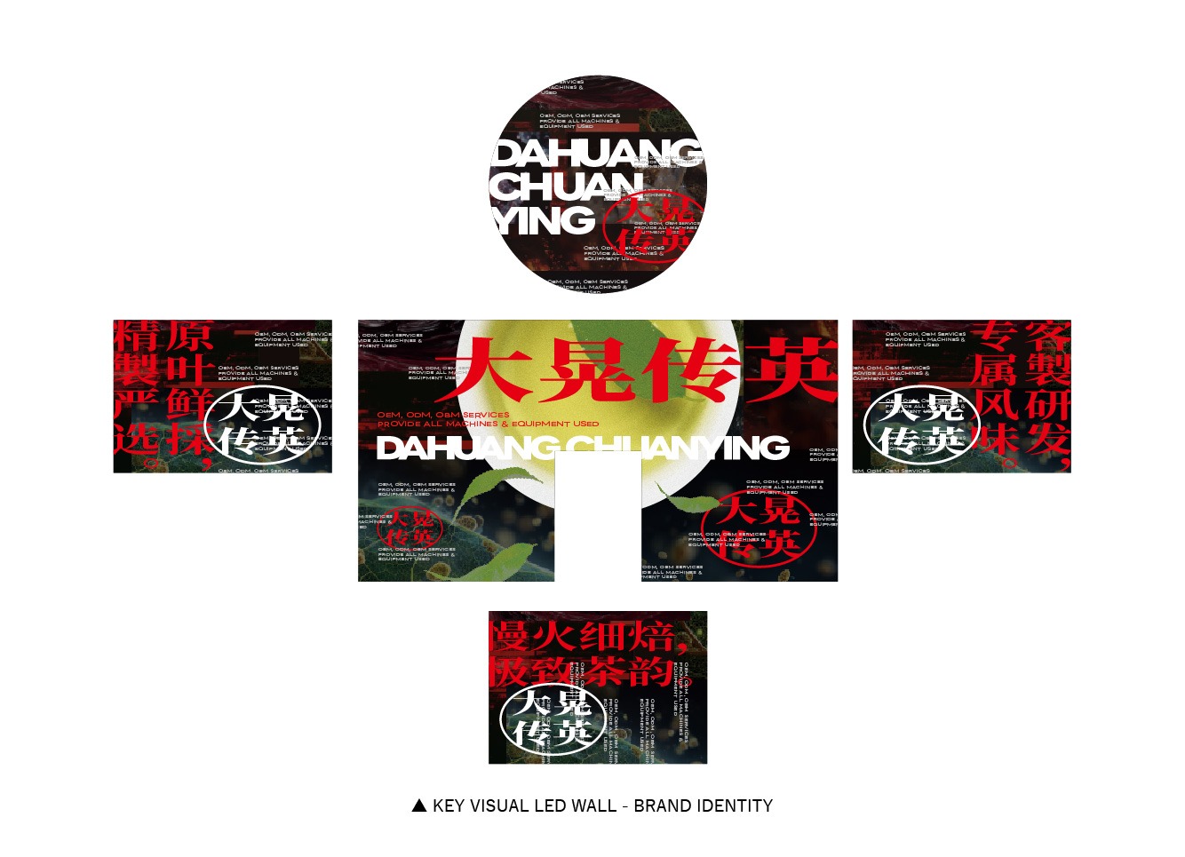
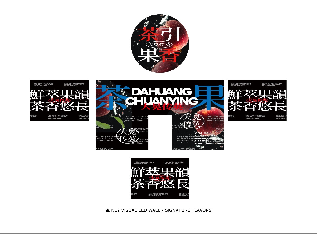
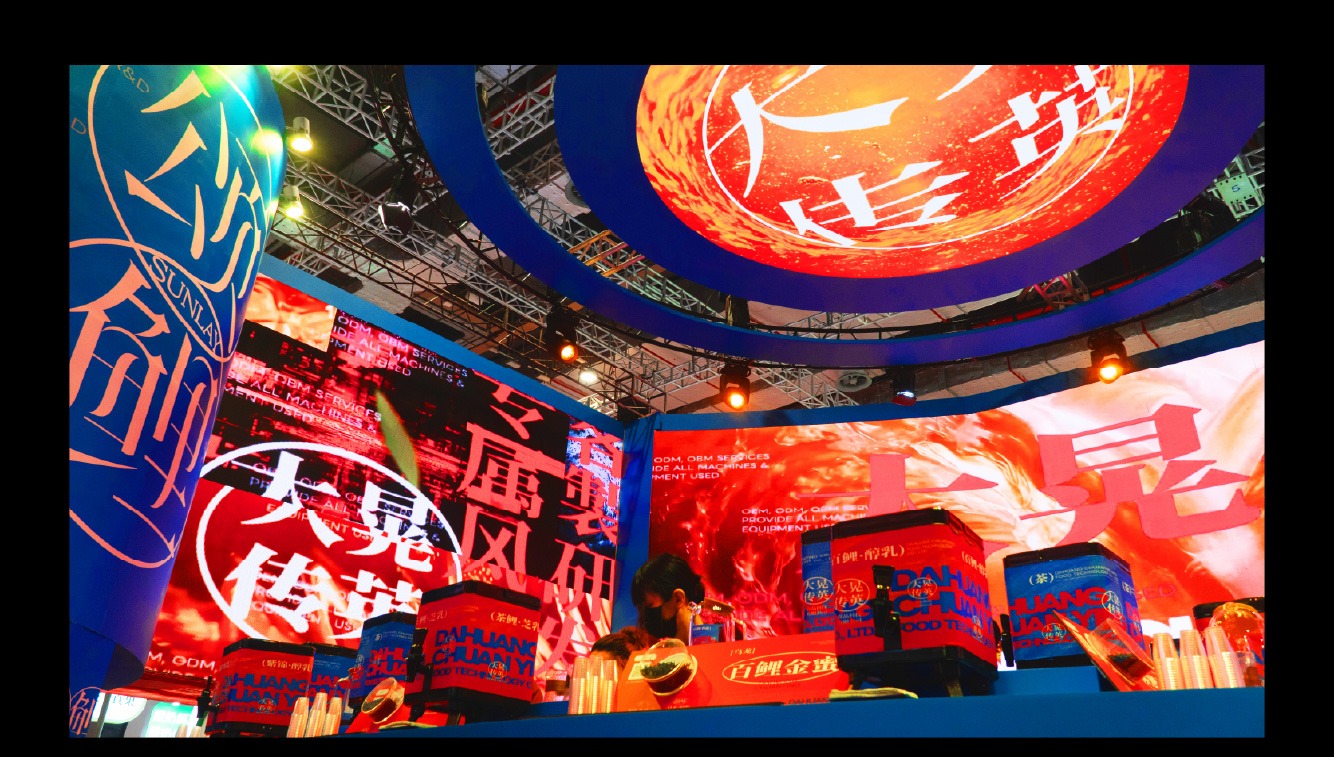
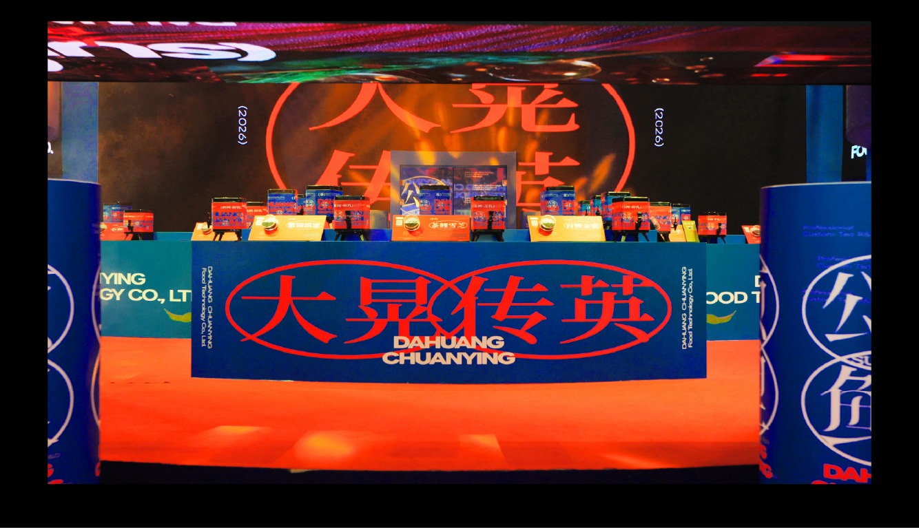
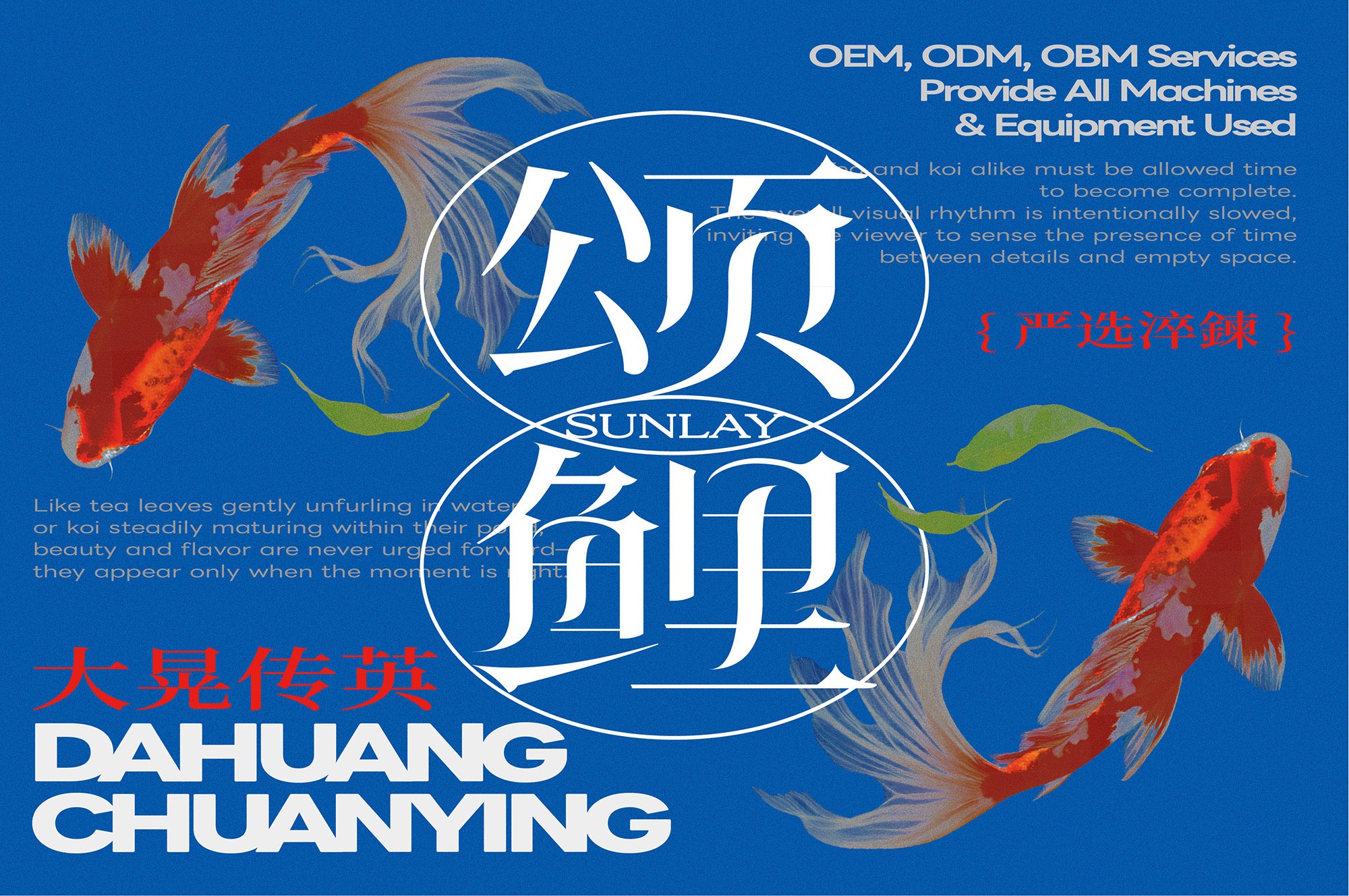
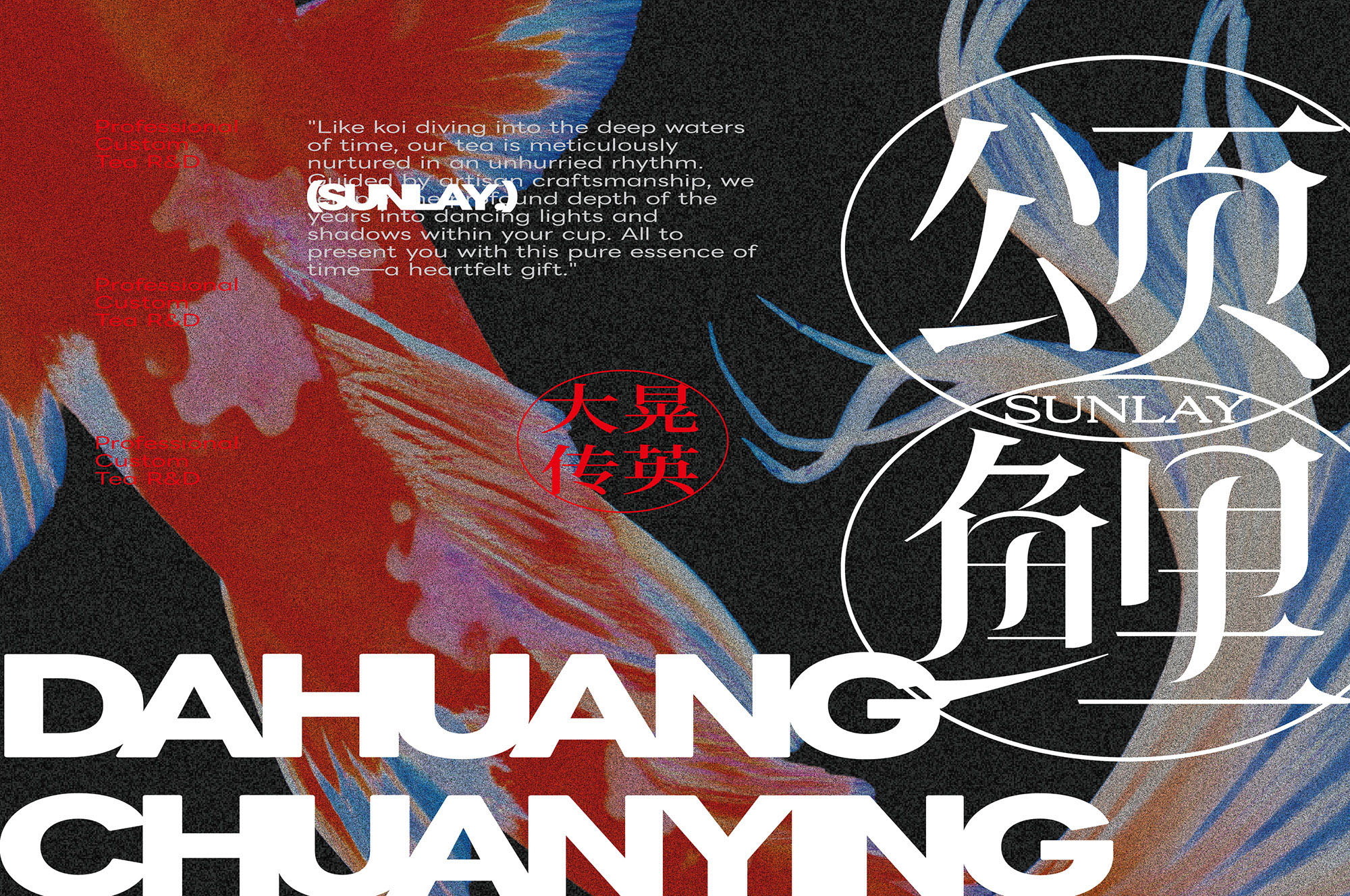
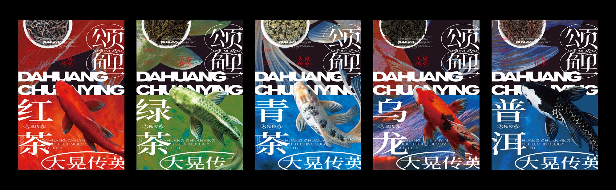
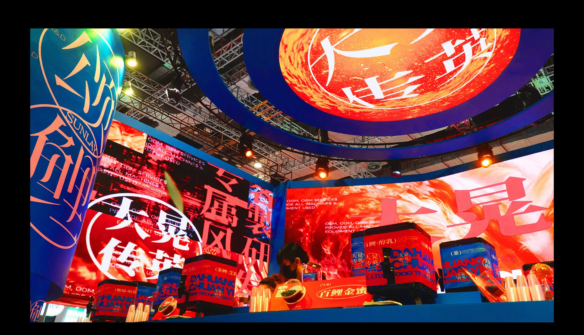
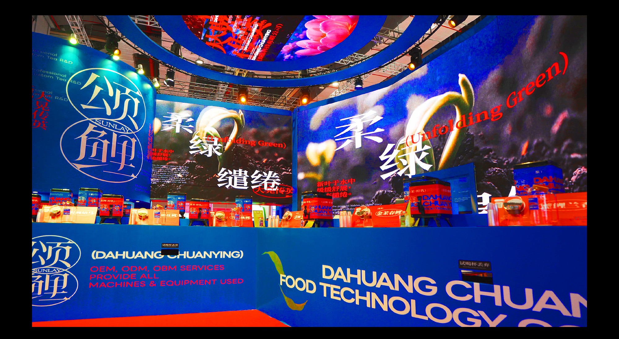
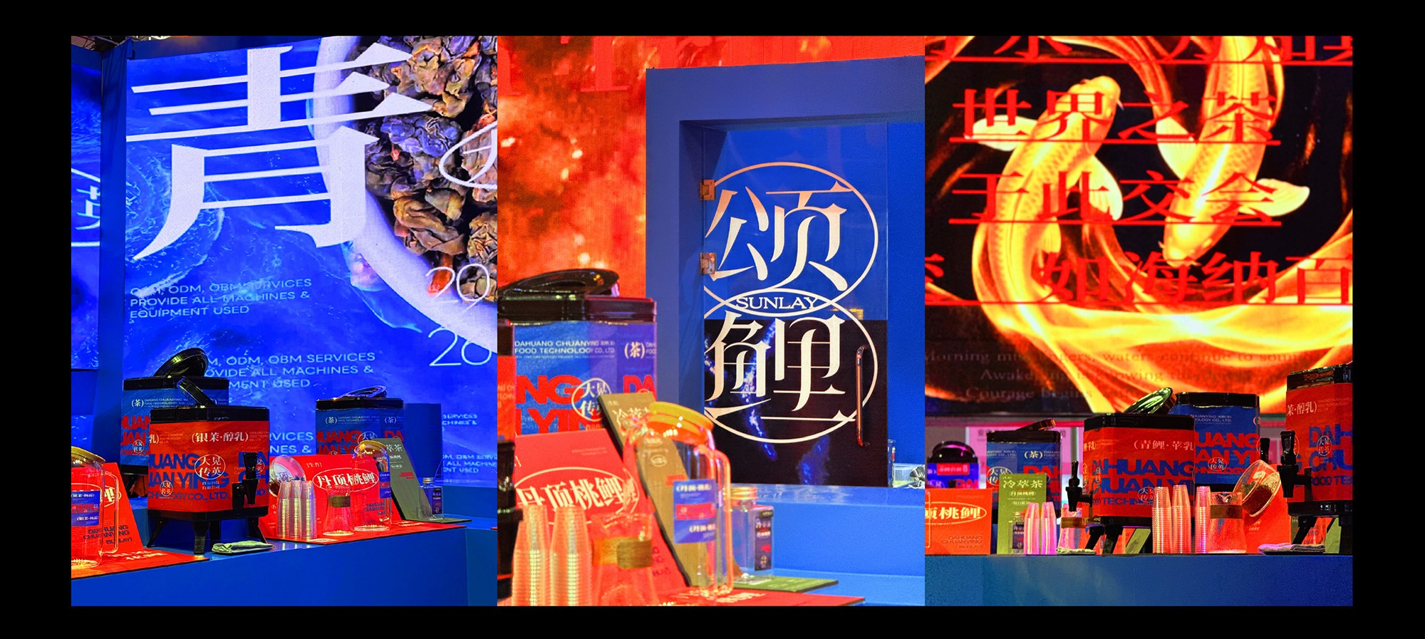
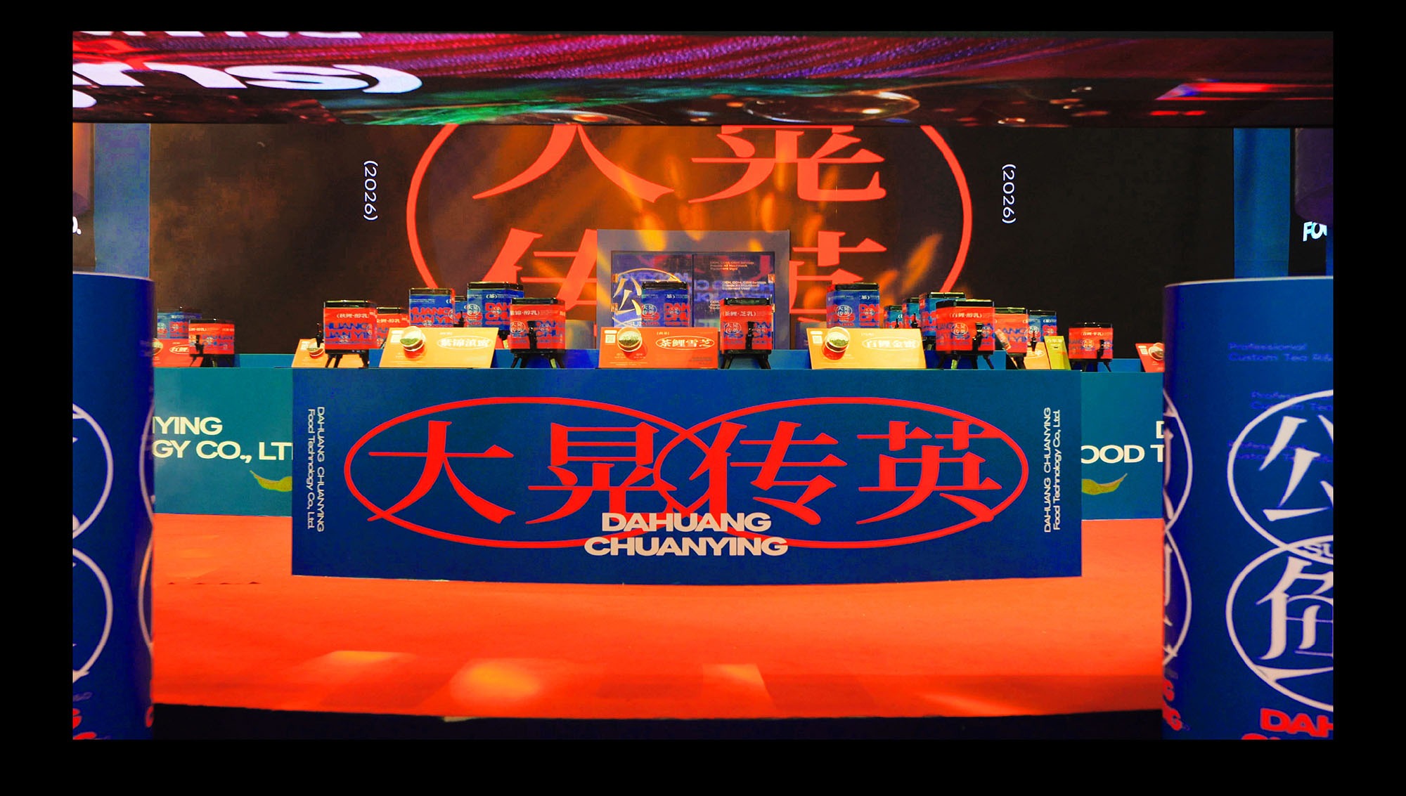
視覺設計除了轉化錦鯉的具體外形,更拆解其帶來的意象感受,將錦鯉於各種狀態下呈現的特質發展為整體設計語言。空間結構大量運用圓弧線條與曲面,如同錦鯉悠游時舒展的姿態,也呼應水流順勢推進的軌跡,使不同展示區域自然銜接,形成柔和而具有方向性的空間節奏。透過由遠至近的資訊編排,以清楚的視覺層級與空間節點,引導觀眾自然駐足,逐步建立對品牌與茶品的理解。
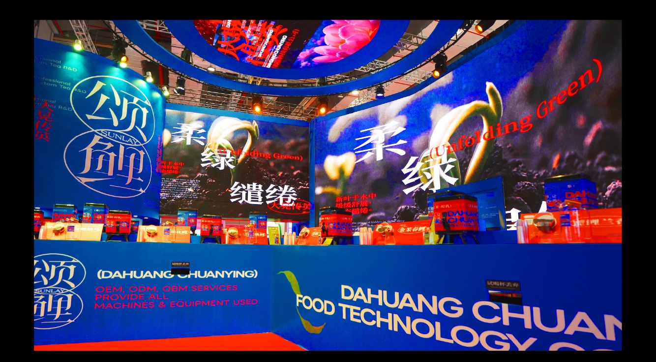
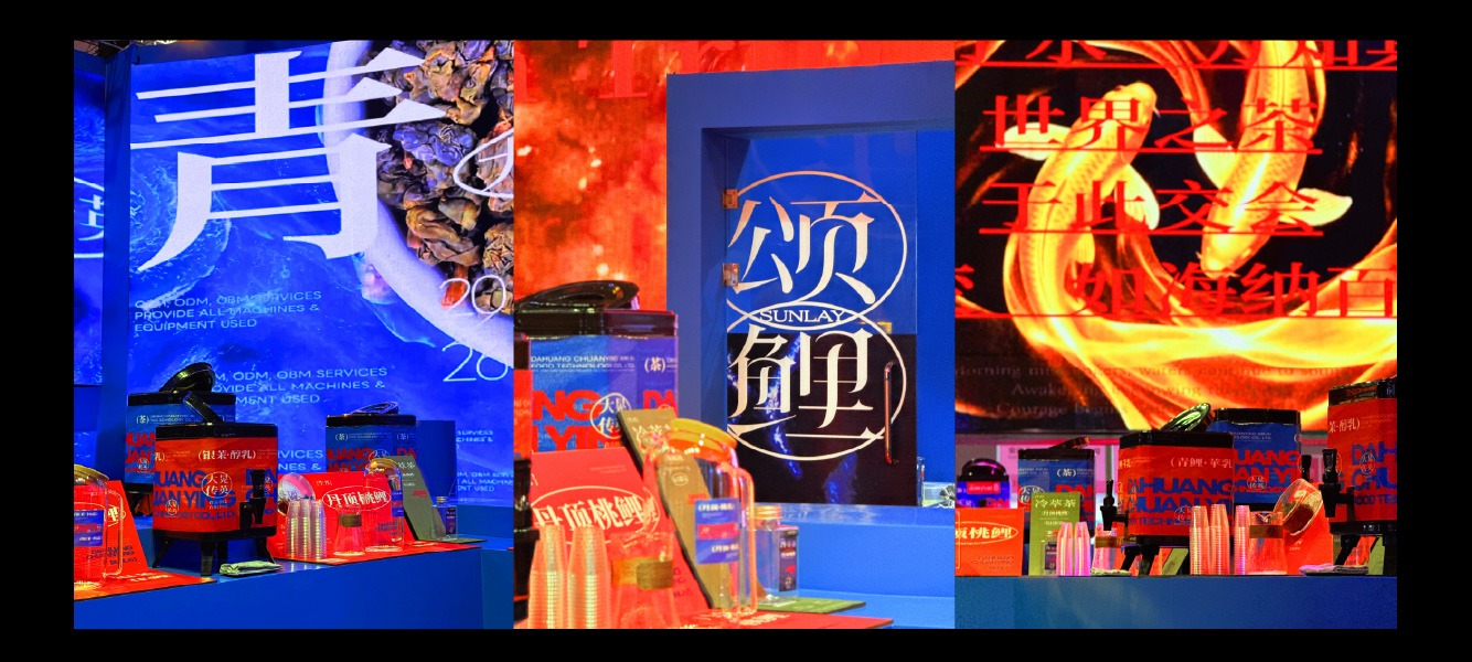
Rather than simply reproducing the physical form of the koi, the visual design deconstructs the impressions and qualities associated with it, developing its varied states into a cohesive design language. Curved lines and surfaces are used extensively throughout the spatial structure, evoking the graceful movement of koi in water while echoing the natural flow and forward momentum of a current. These elements allow the different exhibition zones to connect seamlessly, creating a soft yet directional spatial rhythm. Through an information sequence that progresses from distant viewing to close engagement, clear visual hierarchies and spatial focal points guide visitors to pause naturally and gradually deepen their understanding of the brand and its teas.
讓茶韻以聲光影像逐層交織於場域中
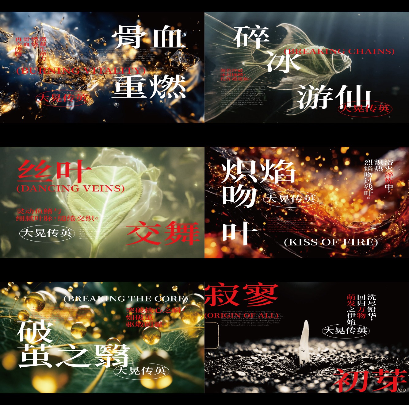
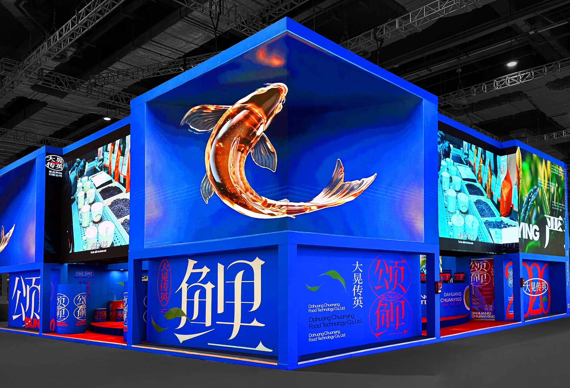
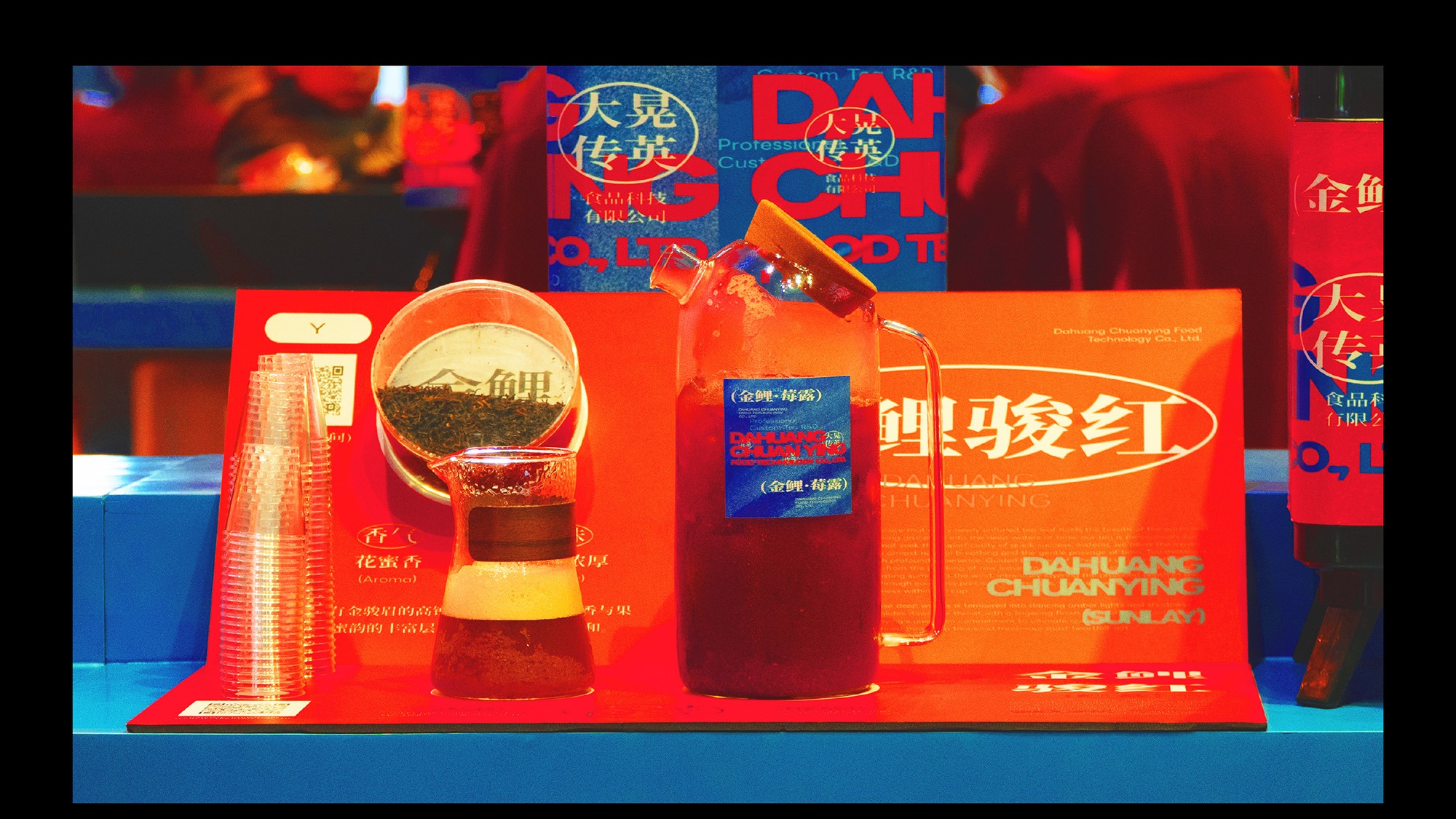
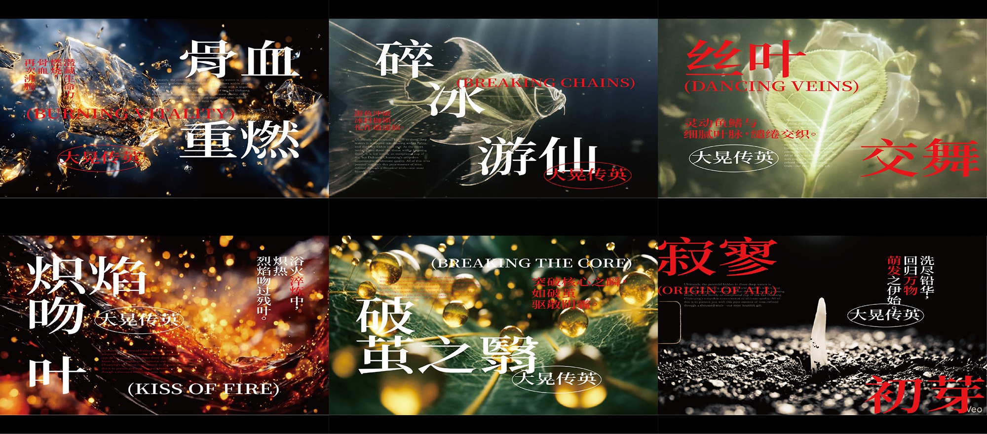
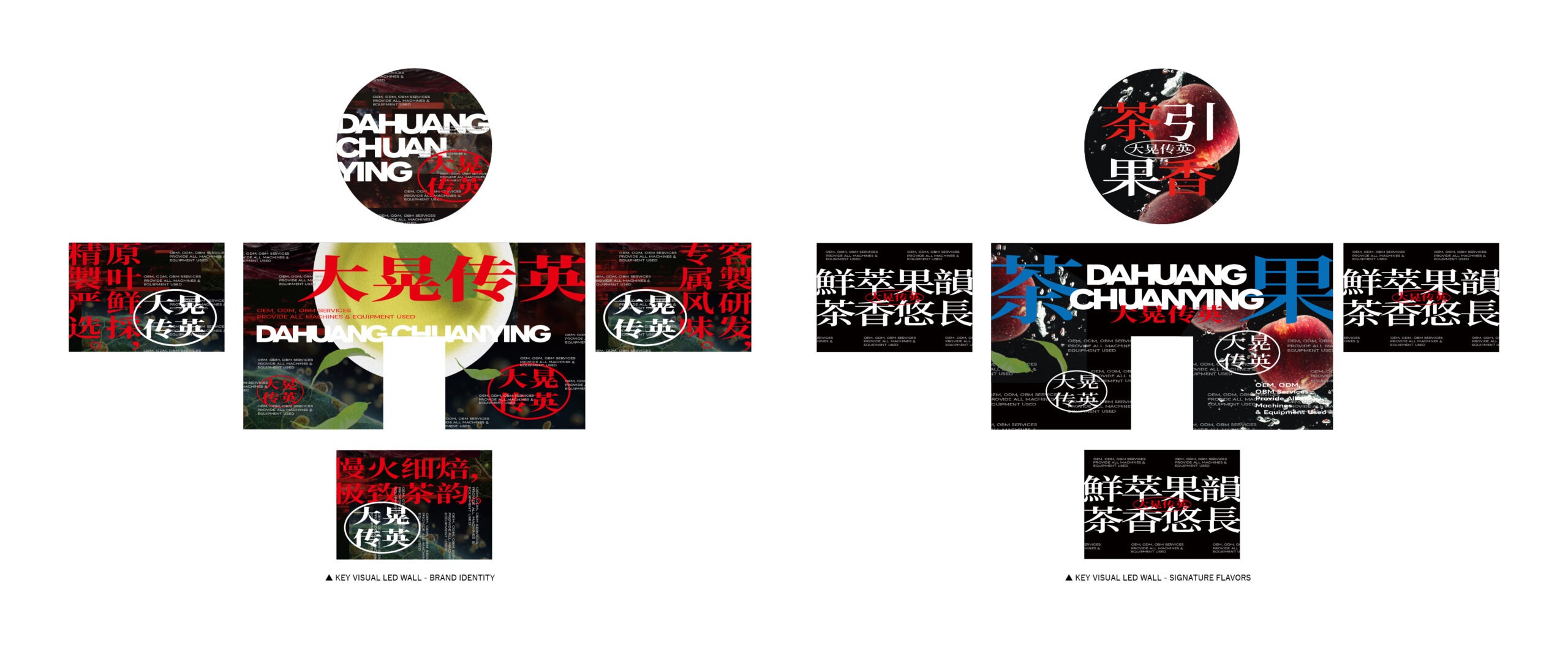
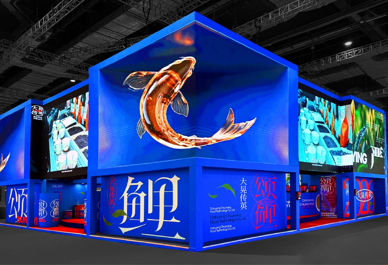
動態視覺延續「風味層層展開、錦色時至而顯」的概念,讓光影、色澤與紋理隨時間逐步累積,呼應茶湯從入口至尾韻緩慢展現層次的品飲感受。展場外觀的一角特別設置裸視3D動畫,作為吸引觀眾靠近的第一層動態識別。影像取自「頌鯉」的故事概念,呈現鯉魚在流動與游移之間逐漸轉化為茶葉的過程,透過突破平面的立體視覺效果,形成直觀而鮮明的觀看記憶。透過多感官設計的整合,將大晃傳英難以在短時間內完整說明的茶業底蘊,濃縮為一場容易辨識、值得靠近,並能在停留後逐步理解的品牌展覽。
The motion design extends the concept of “flavors unfolding layer by layer, with radiant colors emerging in time.” Light, color, and texture gradually accumulate and evolve, reflecting the tasting experience of tea as its character develops slowly from the initial sip to the lingering finish. A glasses-free 3D animation was installed at one corner of the exhibition exterior, serving as the first layer of dynamic visual identity designed to draw visitors closer. Inspired by the narrative of SUNLAY, the animation depicts a koi gradually transforming into tea leaves through fluid movement and shifting forms. Its dimensional effect appears to break beyond the flat screen, creating an immediate and memorable visual impression. By integrating multiple sensory elements, the exhibition condenses DAHUANG CHUANYING’s extensive tea heritage—otherwise difficult to communicate within a short encounter—into a brand experience that is instantly recognizable, compelling to approach, and progressively understood through sustained engagement.
時間淬鍊下的大晃傳英深厚製茶底蘊
大晃傳英累積了長期而穩定的製茶專業,但在展覽環境中,觀眾往往只有短暫時間接收品牌訊息。因此,「頌鯉」最重要的設計任務,是將大晃所累積構成的深厚內容,轉化為清楚、當代且具有辨識度的視覺與空間語言,讓觀眾被吸引並願意靠近深入理解品牌。
我們重新梳理大晃傳英的核心價值,看見品牌不只是提供茶品,更在長年投入中累積出穩定、細緻且持續精進的專業厚度。因此此次展覽以「久養淬鍊」為核心,將錦鯉象徵的養成、前行與蛻變,連結至茶葉歷經時間與工序淬鍊的品牌精神,將大晃傳英對製茶品質的堅持轉化為符合當代觀看方式的設計表達。
DAHUANG CHUANYING has built a long-standing and consistent foundation of tea-making expertise. In an exhibition environment, however, visitors often have only a brief window in which to absorb a brand’s message. The primary design objective of SUNLAY was therefore to translate the brand’s extensive knowledge and heritage into a clear, contemporary, and distinctive visual and spatial language—one capable of capturing attention, encouraging visitors to approach, and inviting them to explore the brand in greater depth. By reassessing DAHUANG CHUANYING’s core values, we recognized that the brand offers more than tea products; it embodies a stable, meticulous, and continuously evolving body of expertise developed through years of dedication. The exhibition was therefore centered on the concept of “Cultivated Through Time, Refined through Craft,” connecting the koi’s symbolism of nurturing, progression, and transformation with tea leaves refined through time and meticulous processes. In doing so, the brand’s commitment to tea-making quality was translated into a design expression suited to contemporary modes of viewing.
從錦鯉意象提煉的流動視覺語彙
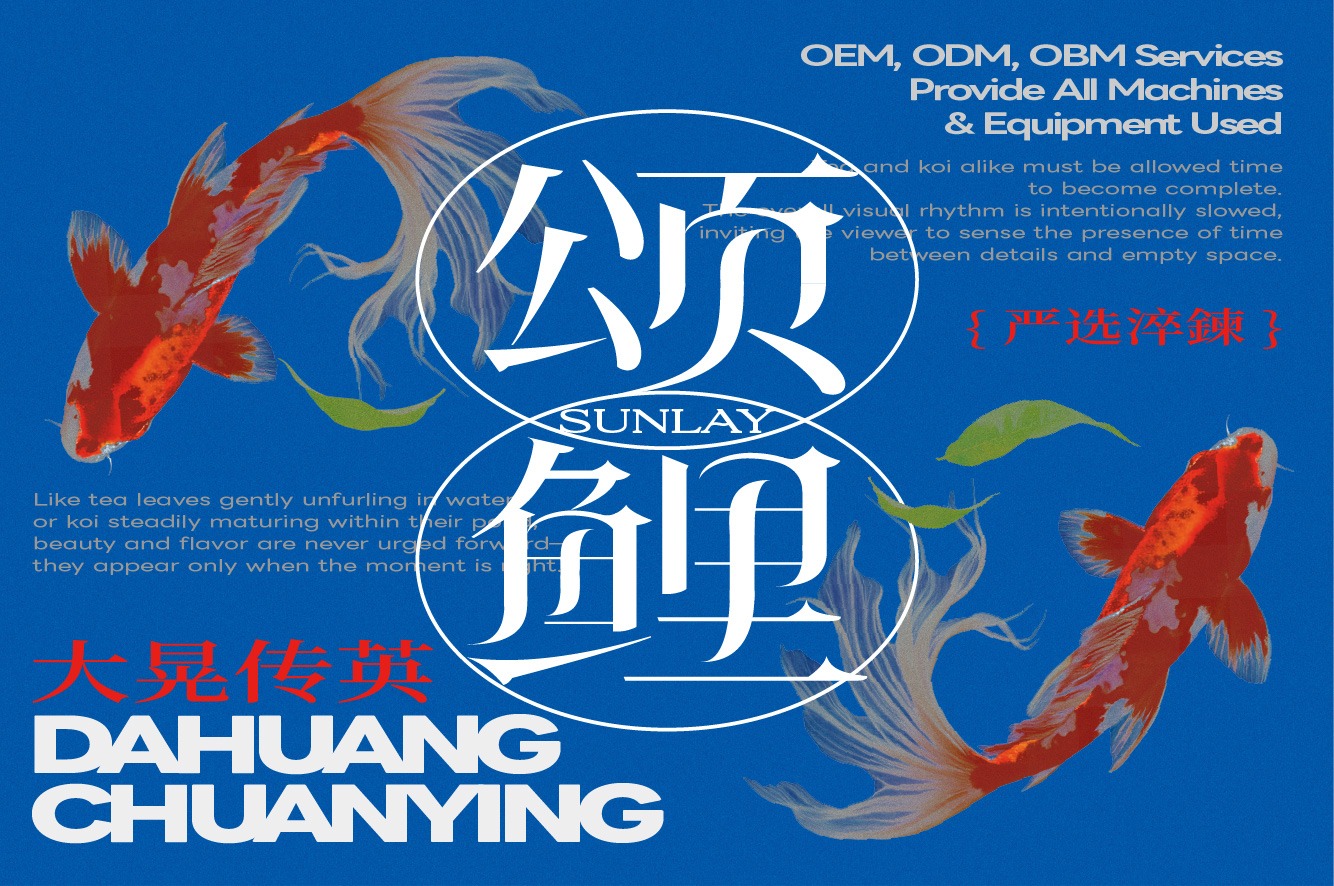
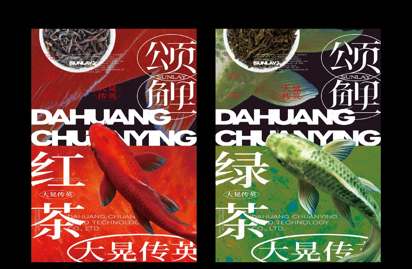
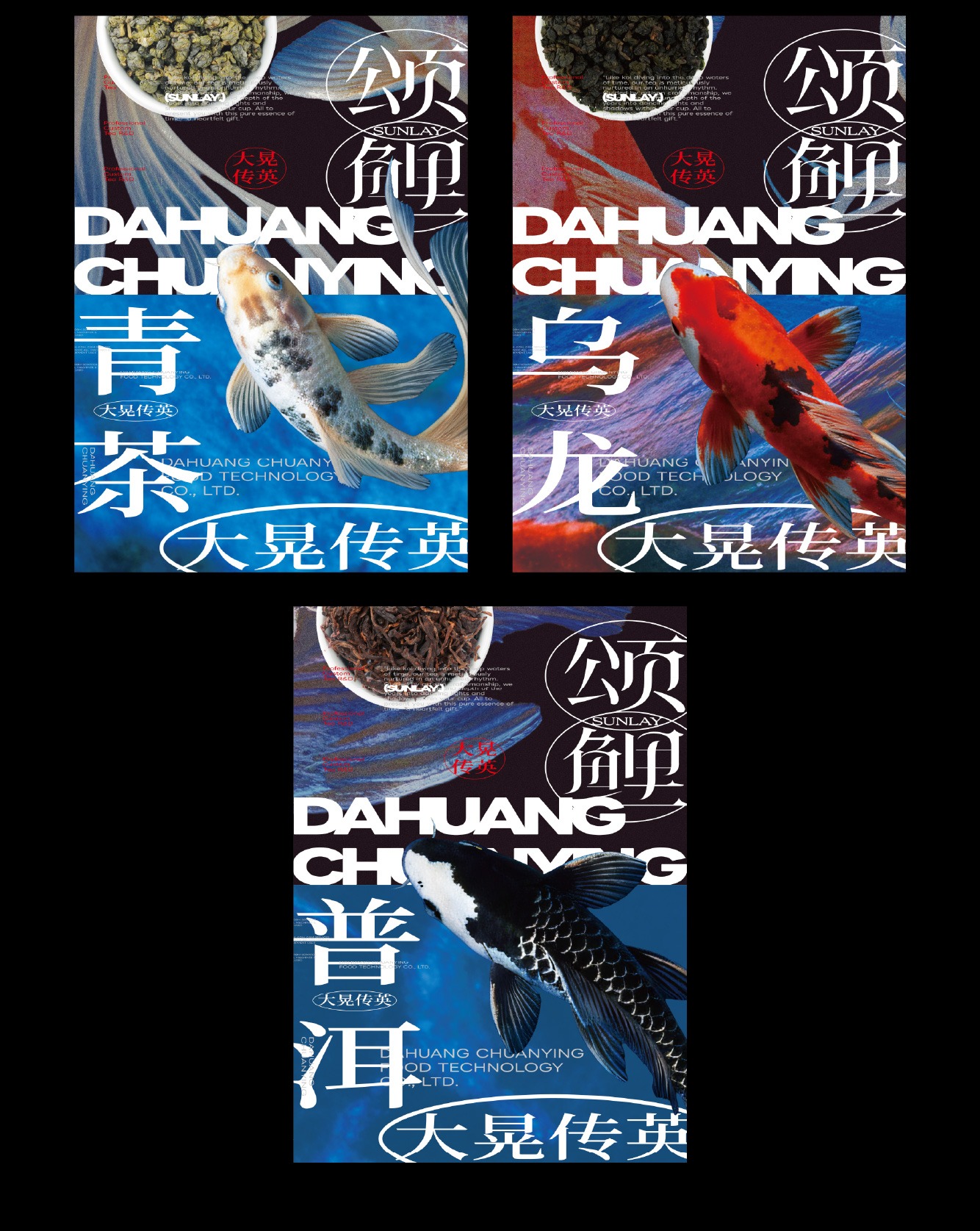
視覺設計除了轉化錦鯉的具體外形,更拆解其帶來的意象感受,將錦鯉於各種狀態下呈現的特質發展為整體設計語言。空間結構大量運用圓弧線條與曲面,如同錦鯉悠游時舒展的姿態,也呼應水流順勢推進的軌跡,使不同展示區域自然銜接,形成柔和而具有方向性的空間節奏。透過由遠至近的資訊編排,以清楚的視覺層級與空間節點,引導觀眾自然駐足,逐步建立對品牌與茶品的理解。
Rather than simply reproducing the physical form of the koi, the visual design deconstructs the impressions and qualities associated with it, developing its varied states into a cohesive design language. Curved lines and surfaces are used extensively throughout the spatial structure, evoking the graceful movement of koi in water while echoing the natural flow and forward momentum of a current. These elements allow the different exhibition zones to connect seamlessly, creating a soft yet directional spatial rhythm. Through an information sequence that progresses from distant viewing to close engagement, clear visual hierarchies and spatial focal points guide visitors to pause naturally and gradually deepen their understanding of the brand and its teas.
讓茶韻以聲光影像逐層交織於場域中
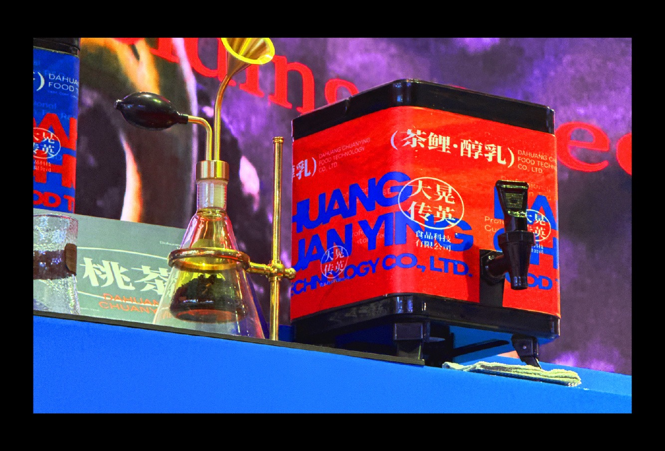
動態視覺延續「風味層層展開、錦色時至而顯」的概念,讓光影、色澤與紋理隨時間逐步累積,呼應茶湯從入口至尾韻緩慢展現層次的品飲感受。展場外觀的一角特別設置裸視3D動畫,作為吸引觀眾靠近的第一層動態識別。影像取自「頌鯉」的故事概念,呈現鯉魚在流動與游移之間逐漸轉化為茶葉的過程,透過突破平面的立體視覺效果,形成直觀而鮮明的觀看記憶。透過多感官設計的整合,將大晃傳英難以在短時間內完整說明的茶業底蘊,濃縮為一場容易辨識、值得靠近,並能在停留後逐步理解的品牌展覽。
The motion design extends the concept of “flavors unfolding layer by layer, with radiant colors emerging in time.” Light, color, and texture gradually accumulate and evolve, reflecting the tasting experience of tea as its character develops slowly from the initial sip to the lingering finish. A glasses-free 3D animation was installed at one corner of the exhibition exterior, serving as the first layer of dynamic visual identity designed to draw visitors closer. Inspired by the narrative of SUNLAY, the animation depicts a koi gradually transforming into tea leaves through fluid movement and shifting forms. Its dimensional effect appears to break beyond the flat screen, creating an immediate and memorable visual impression. By integrating multiple sensory elements, the exhibition condenses DAHUANG CHUANYING’s extensive tea heritage—otherwise difficult to communicate within a short encounter—into a brand experience that is instantly recognizable, compelling to approach, and progressively understood through sustained engagement.