品牌創研 BRAND 視覺設計 VISUAL DESIGN 平面攝影 PHOTOGRAPHY 動態廣告 FILM 社群行銷 SOCIAL MEDIA
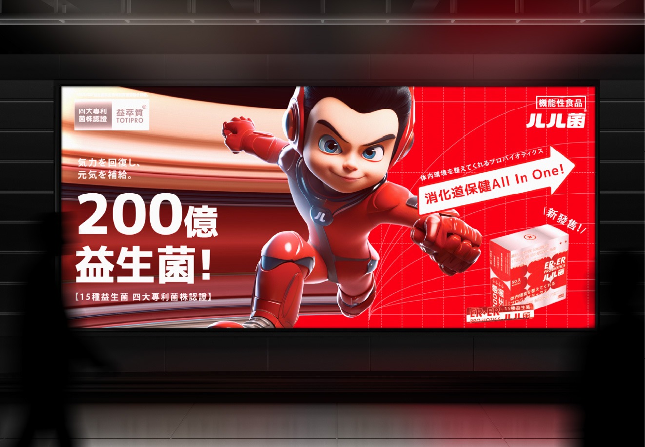
把補菌變成一種本能:從「ㄦㄦ」開始的品牌革命
Turning Probiotics into Instinct: A Brand Revolution Starting from “ERER”
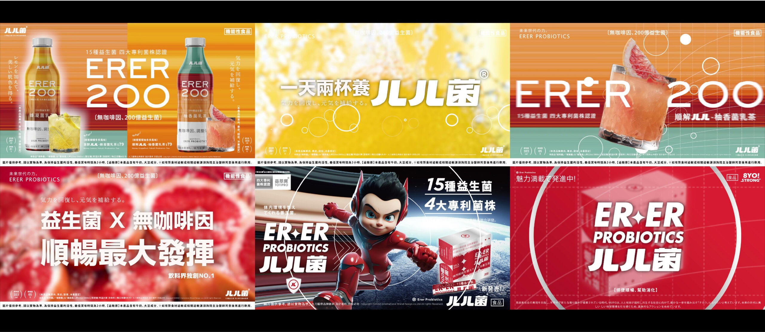
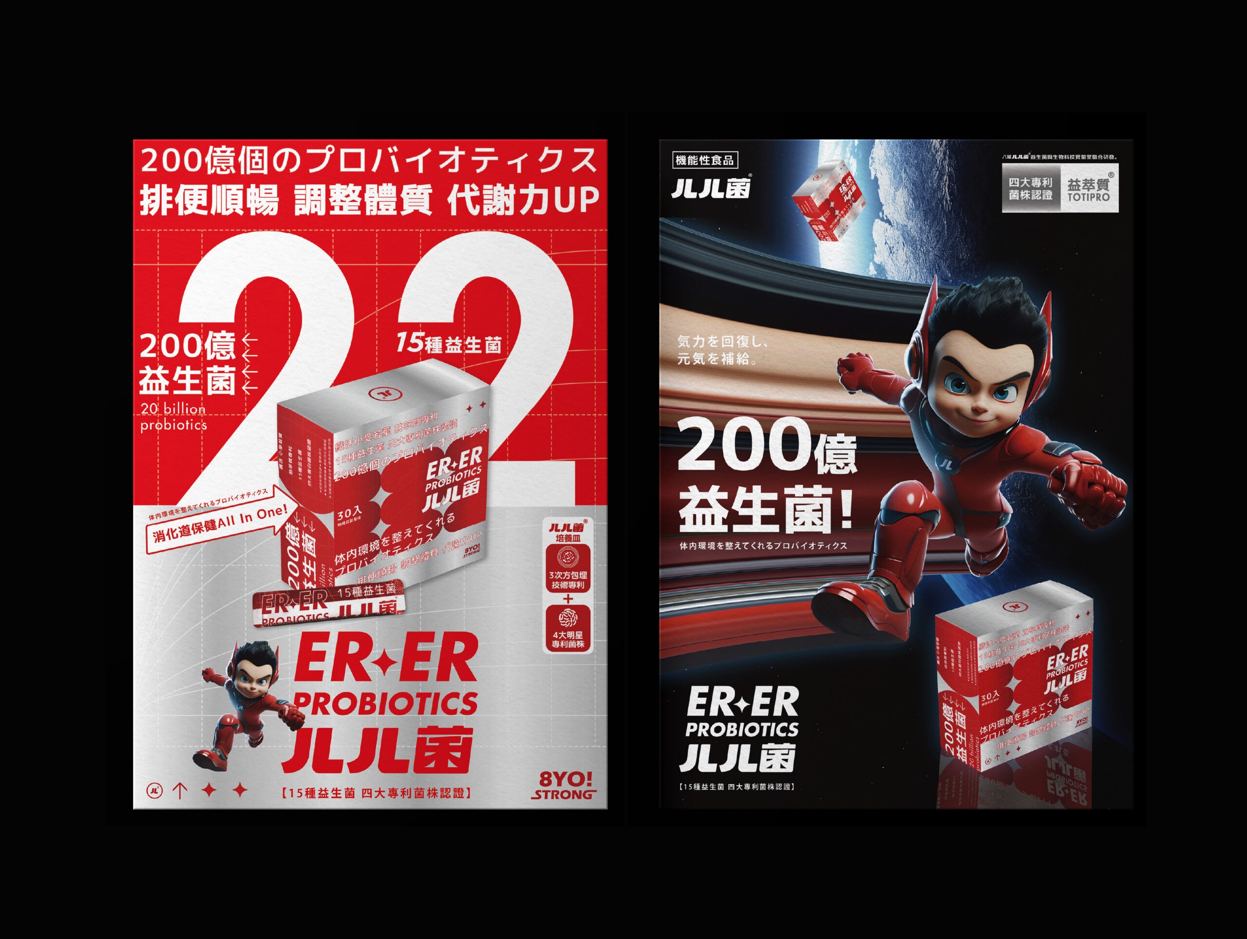
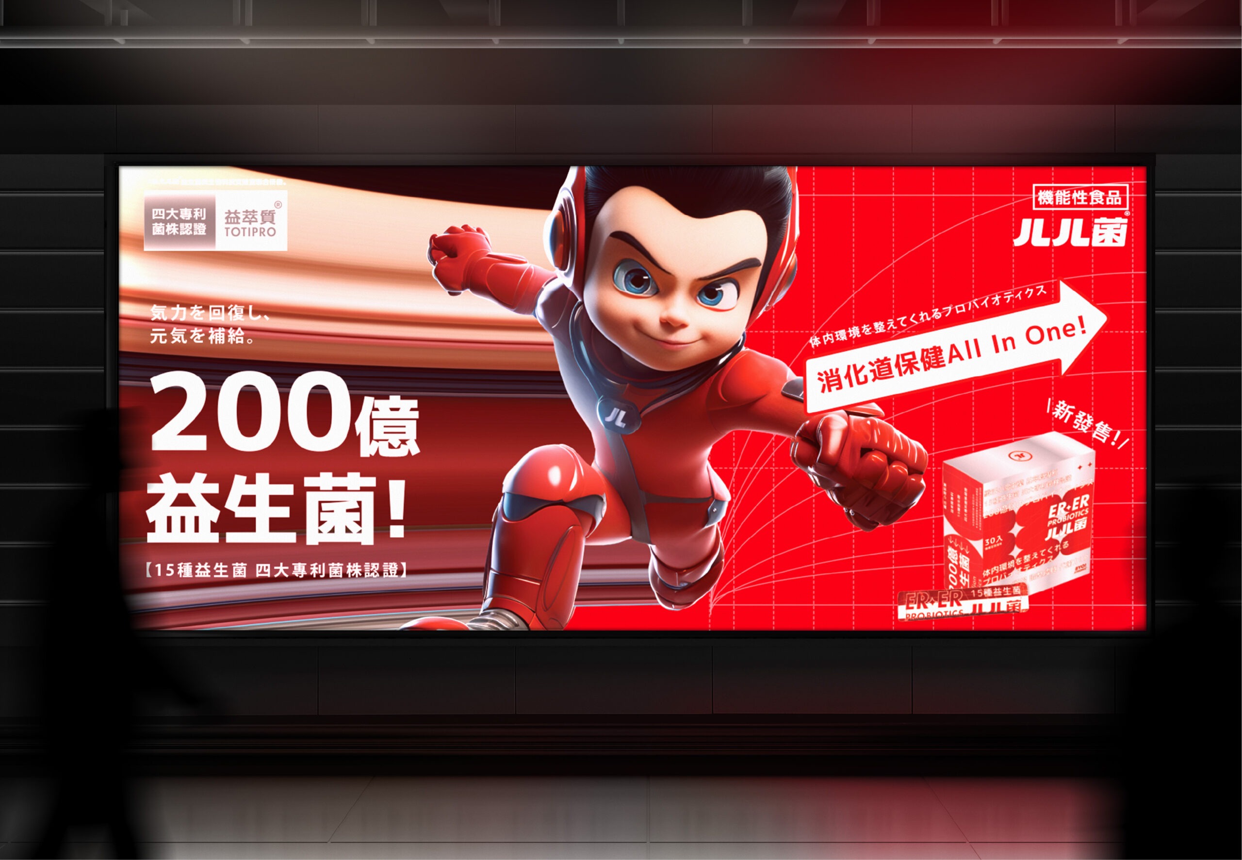
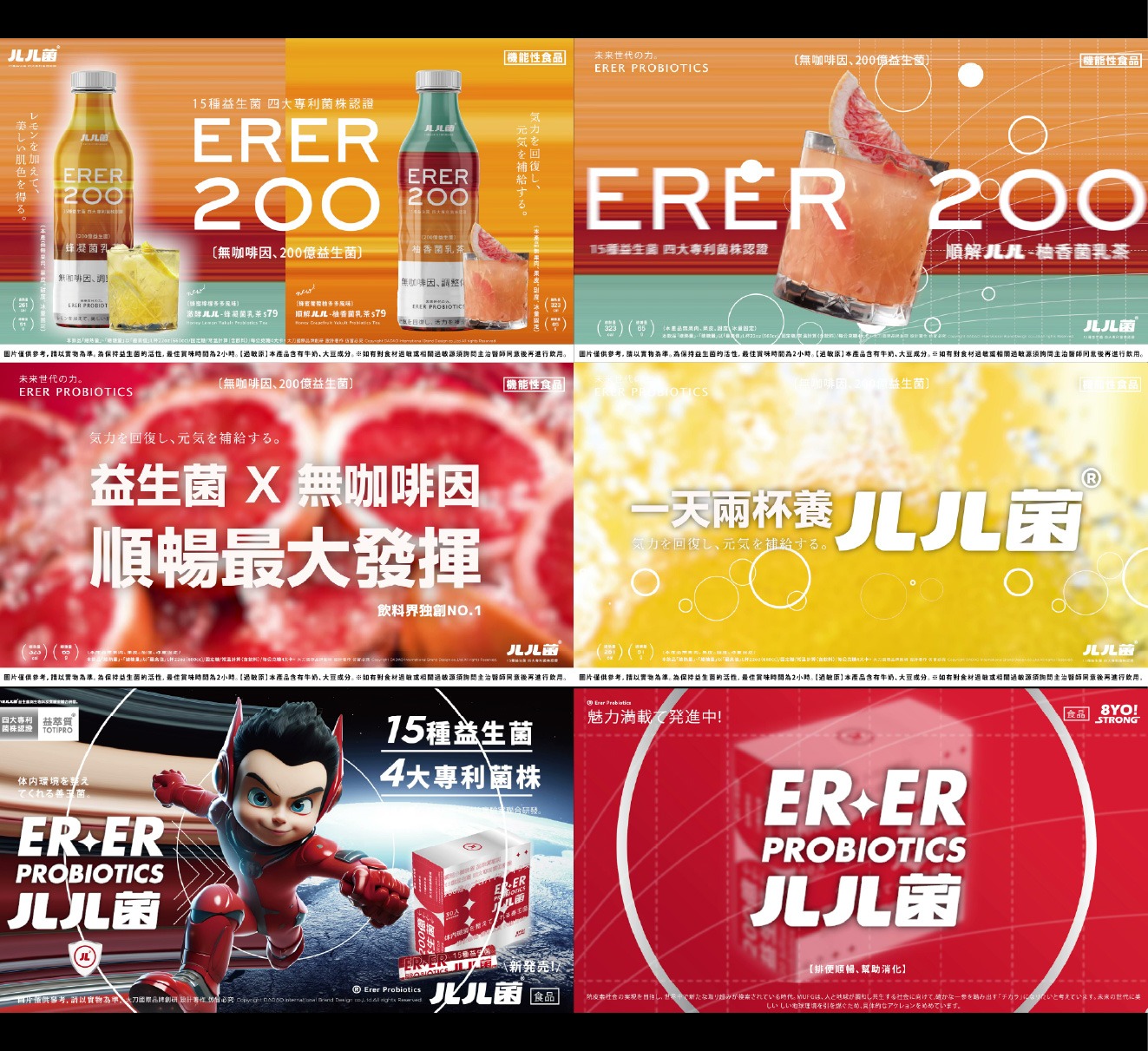
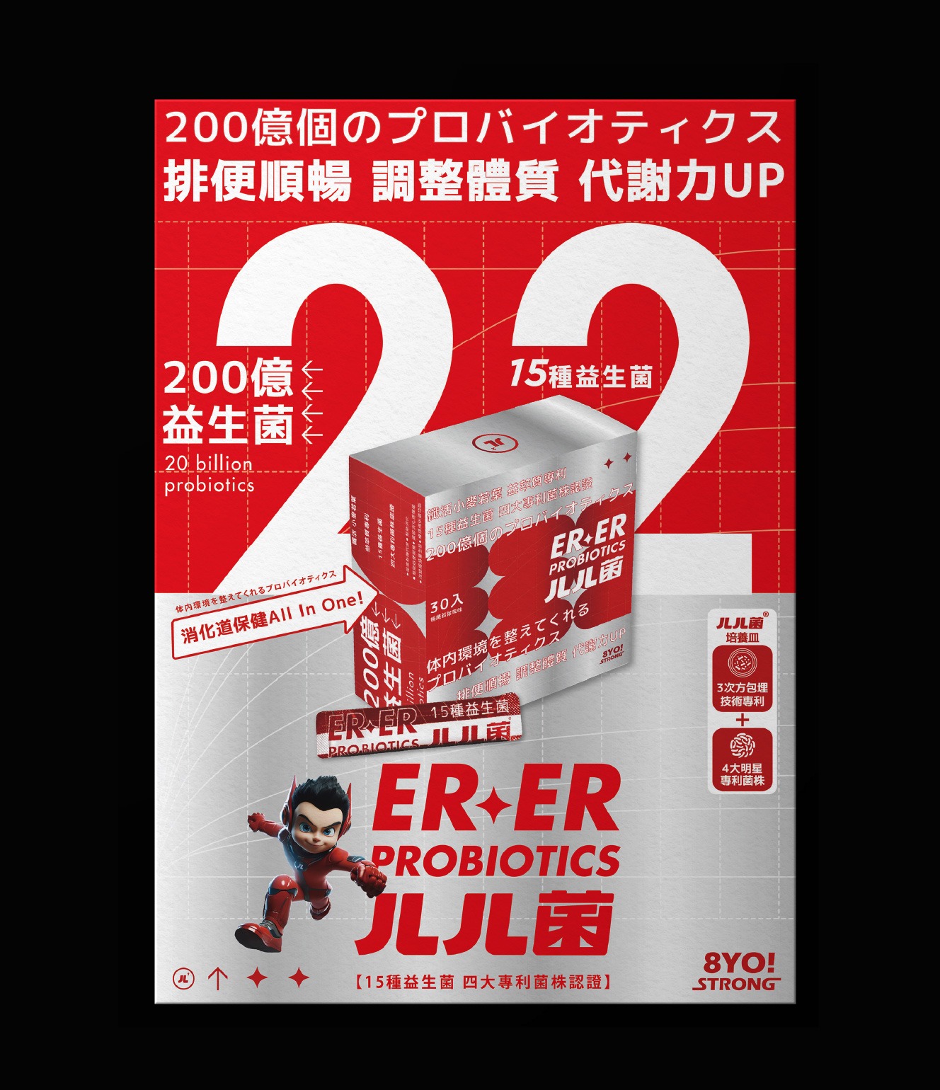
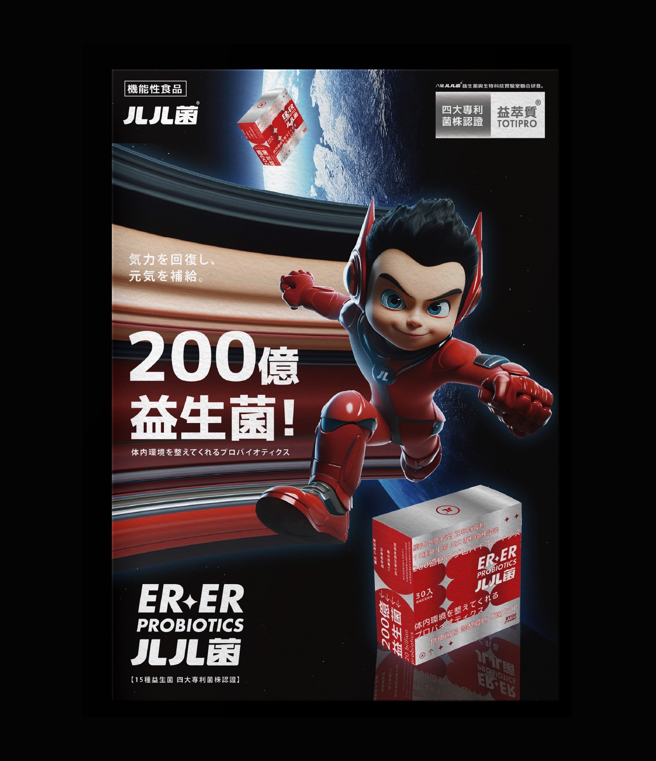
「ㄦㄦ菌」的誕生,來自一個極度直覺的聲音——不是艱深學名,也不依賴專有名詞建立權威,而是一種讓身體先理解的語言。「ㄦㄦ」像是一口順暢後的輕吐,也像帶點幽默卻真實的身體反應,讓補菌從專業領域走入日常感知,成為一種自然行為。在此基礎上,「ㄦㄦ小超人」作為盒裝產品的核心視覺誕生。他不只是角色,而是品牌信任的具象化象徵,代表從菌種研發、配方設計到保存與攝取的全流程把關。透過科技盔甲與高速動態語彙,傳達「補給即行動」的精神,讓機能補充不再被動,而是一種主動守護身體的選擇。他所守護的,是產品本質與品牌對健康的堅持——一個守住根本的起點。
The creation of ERER200 originates from an instinctive sound—neither a complex scientific term nor a construct of authority, but a language the body understands first. “ERER” echoes the relief of natural flow, a subtle yet relatable bodily response that transforms probiotic intake from a specialized concept into an everyday instinct. Building upon this concept, the “ERER Little Hero” emerges as the core visual for packaged products. More than a character, he embodies trust—representing full control from strain development and formulation to preservation and consumption. Through dynamic motion and futuristic armor aesthetics, he conveys the idea that “supplementation is action,” turning functional intake into a proactive choice. What he protects is not just the product, but the brand’s commitment to health at its core.

從守護到實踐:打造「未來健康宇宙」的雙主角設計
From Protection to Practice: Building a Dual-Protagonist Future Health Universe
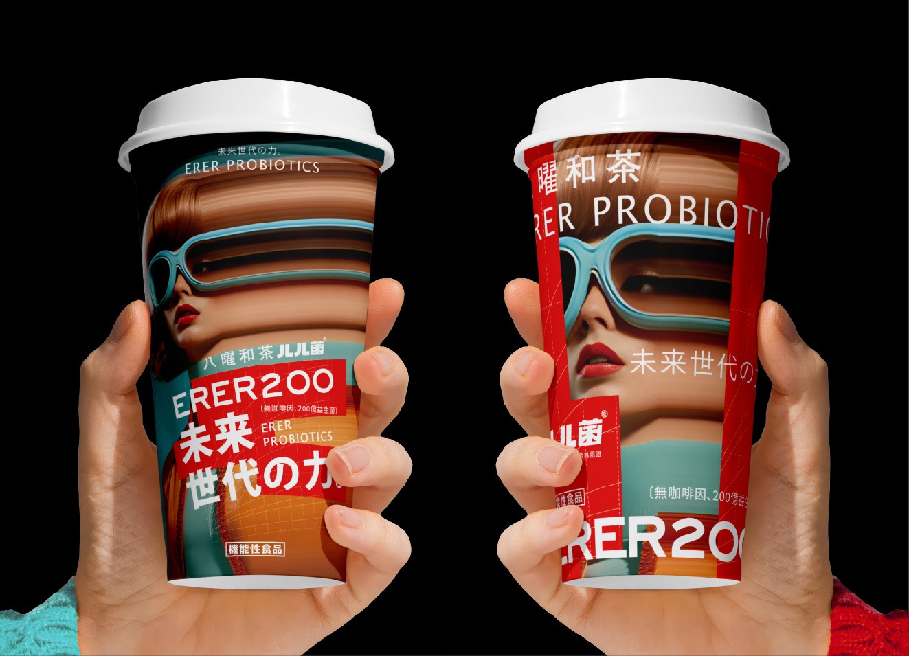
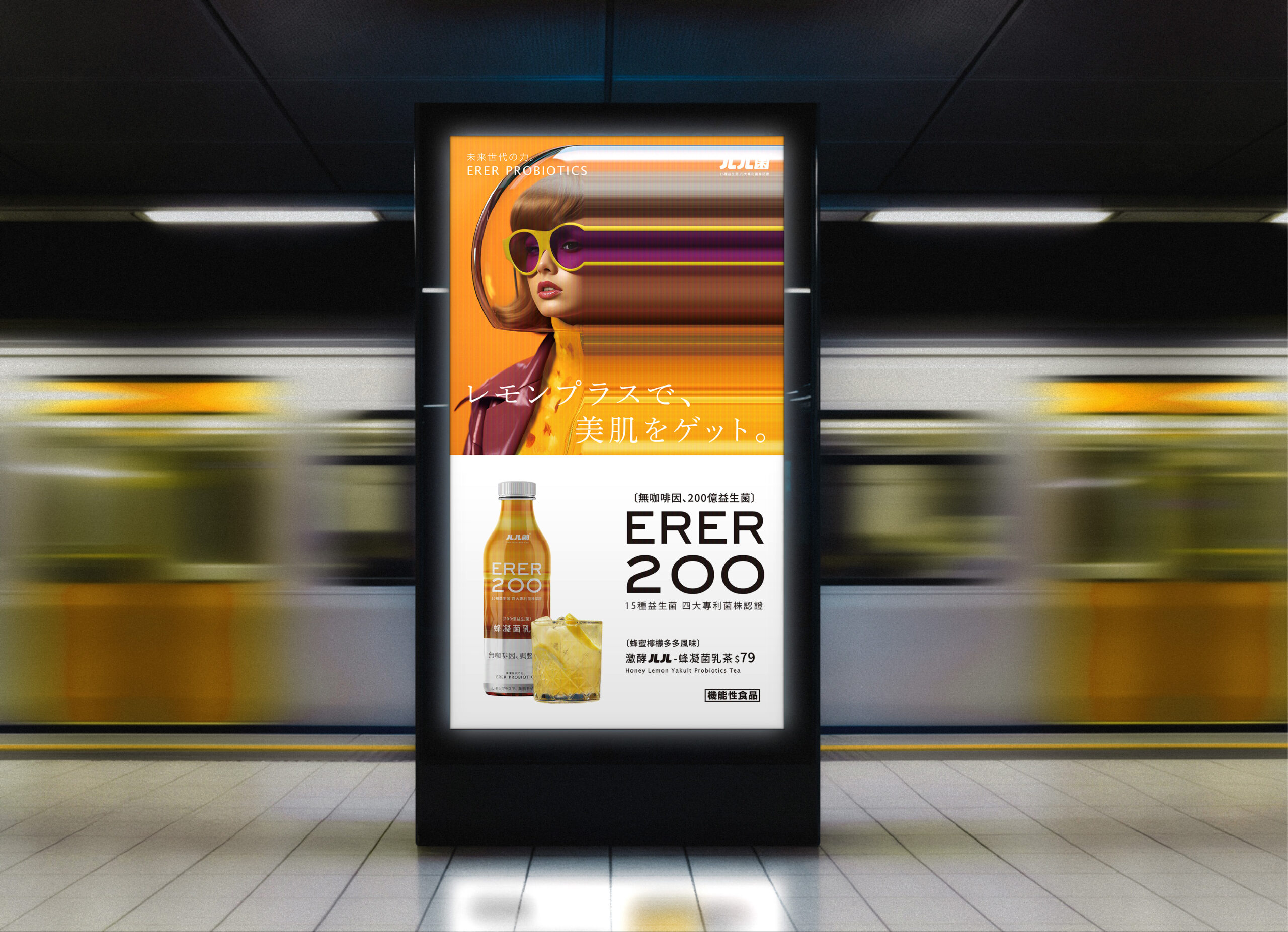
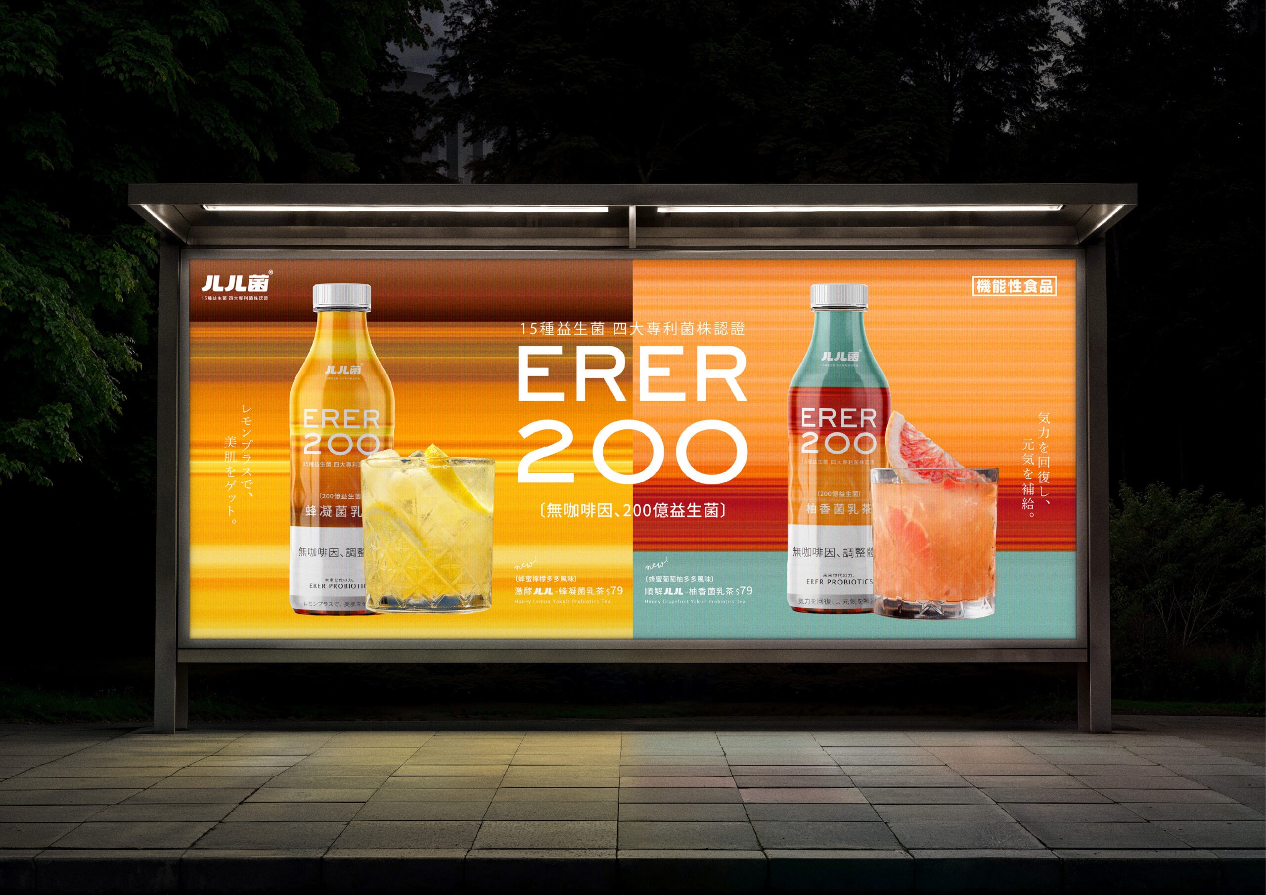
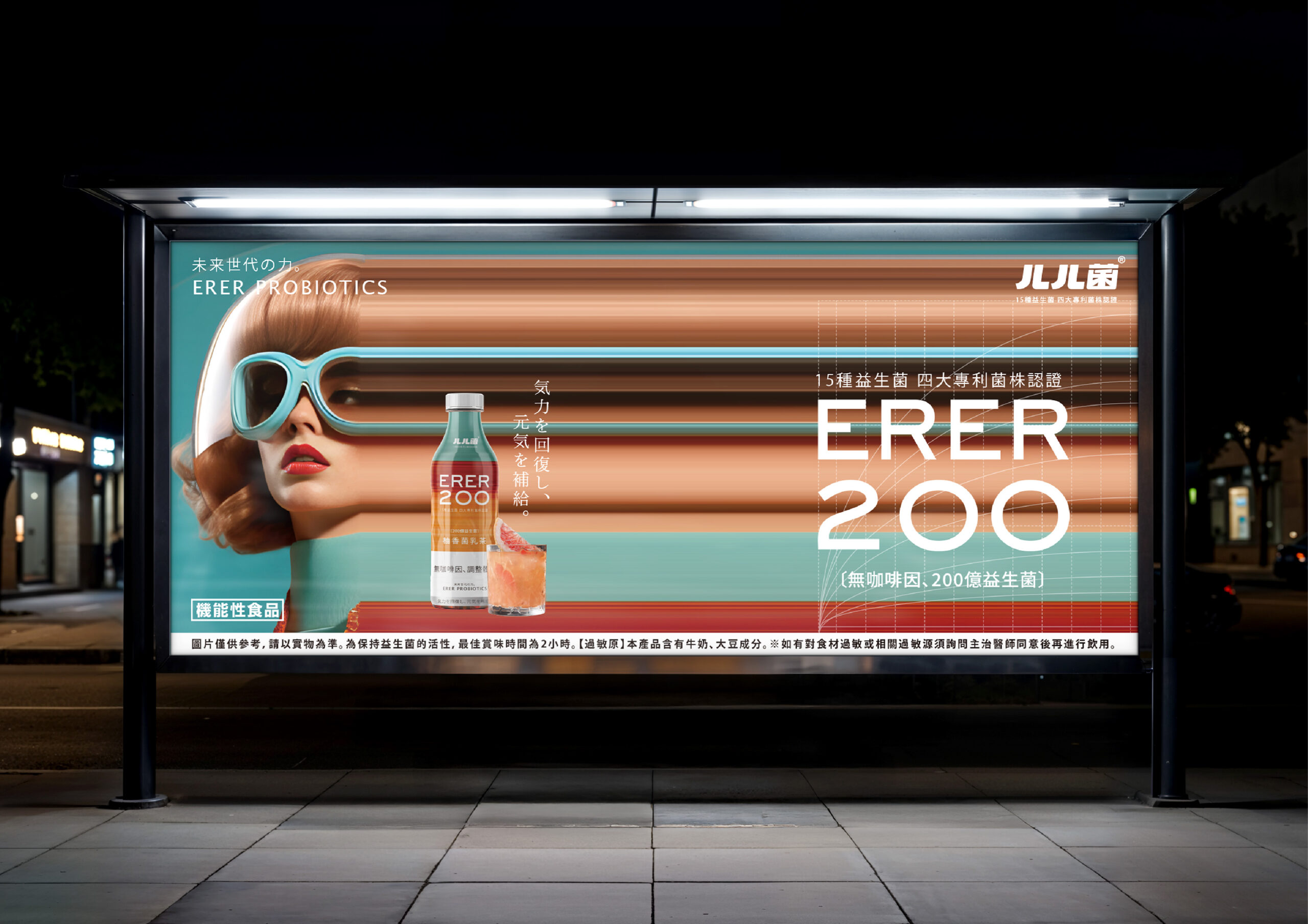
在建立信任之上,品牌延伸出「ㄦㄦ女超人」,將專業轉化為日常行動。她不只是門市飲品的視覺角色,更象徵當代消費者——願意照顧自己、以簡單行為建立長期健康習慣的實踐者。相較於「ㄦㄦ小超人」的理性守護,她代表的是行動與生活,讓補菌從產品轉化為日常文化。設計上以未來感線條與科技語彙為核心,突破傳統機能產品的保守美學。銀色象徵科技與信任,視覺配色則代表能量與循環,並以流動線條視覺化益生菌在體內的運作。透過雙角色的建立,品牌構築出一個完整的「未來健康宇宙」——一個守護根本,一個改變習慣,從產品延伸到生活,重新定義機能飲食文化。
Expanding from a foundation of trust, the brand introduces the “ERER Female Hero,” translating expertise into everyday action. She is not merely a retail visual figure, but a symbol of modern consumers—those who actively care for themselves and build lasting habits through simple actions. In contrast to the rational protection of the ERER Little Hero, she represents movement and lifestyle, transforming probiotics from a product into a daily culture. The design language centers on futuristic lines and technological symbolism, breaking away from the conservative aesthetics of traditional functional products. Silver represents technology and credibility, while the visual color palette conveys energy and circulation. Flowing visual elements simulate probiotic activity within the body, making the invisible tangible. Through this dual-character system, the brand constructs a complete “Future Health Universe”—one that protects the foundation and reshapes habits, extending from product to lifestyle and redefining functional nutrition culture.

把補菌變成一種本能:從「ㄦㄦ」開始的品牌革命
Turning Probiotics into Instinct: A Brand Revolution Starting from “ERER”
「ㄦㄦ菌」的誕生,來自一個極度直覺的聲音——不是艱深學名,也不依賴專有名詞建立權威,而是一種讓身體先理解的語言。「ㄦㄦ」像是一口順暢後的輕吐,也像帶點幽默卻真實的身體反應,讓補菌從專業領域走入日常感知,成為一種自然行為。在此基礎上,「ㄦㄦ小超人」作為盒裝產品的核心視覺誕生。他不只是角色,而是品牌信任的具象化象徵,代表從菌種研發、配方設計到保存與攝取的全流程把關。透過科技盔甲與高速動態語彙,傳達「補給即行動」的精神,讓機能補充不再被動,而是一種主動守護身體的選擇。他所守護的,是產品本質與品牌對健康的堅持——一個守住根本的起點。
The creation of ERER200 originates from an instinctive sound—neither a complex scientific term nor a construct of authority, but a language the body understands first. “ERER” echoes the relief of natural flow, a subtle yet relatable bodily response that transforms probiotic intake from a specialized concept into an everyday instinct. Building upon this concept, the “ERER Little Hero” emerges as the core visual for packaged products. More than a character, he embodies trust—representing full control from strain development and formulation to preservation and consumption. Through dynamic motion and futuristic armor aesthetics, he conveys the idea that “supplementation is action,” turning functional intake into a proactive choice. What he protects is not just the product, but the brand’s commitment to health at its core.

從守護到實踐:打造「未來健康宇宙」的雙主角設計
From Protection to Practice: Building a Dual-Protagonist Future Health Universe
在建立信任之上,品牌延伸出「ㄦㄦ女超人」,將專業轉化為日常行動。她不只是門市飲品的視覺角色,更象徵當代消費者——願意照顧自己、以簡單行為建立長期健康習慣的實踐者。相較於「ㄦㄦ小超人」的理性守護,她代表的是行動與生活,讓補菌從產品轉化為日常文化。設計上以未來感線條與科技語彙為核心,突破傳統機能產品的保守美學。銀色象徵科技與信任,視覺配色則代表能量與循環,並以流動線條視覺化益生菌在體內的運作。透過雙角色的建立,品牌構築出一個完整的「未來健康宇宙」——一個守護根本,一個改變習慣,從產品延伸到生活,重新定義機能飲食文化。
Expanding from a foundation of trust, the brand introduces the “ERER Female Hero,” translating expertise into everyday action. She is not merely a retail visual figure, but a symbol of modern consumers—those who actively care for themselves and build lasting habits through simple actions. In contrast to the rational protection of the ERER Little Hero, she represents movement and lifestyle, transforming probiotics from a product into a daily culture. The design language centers on futuristic lines and technological symbolism, breaking away from the conservative aesthetics of traditional functional products. Silver represents technology and credibility, while the visual color palette conveys energy and circulation. Flowing visual elements simulate probiotic activity within the body, making the invisible tangible. Through this dual-character system, the brand constructs a complete “Future Health Universe”—one that protects the foundation and reshapes habits, extending from product to lifestyle and redefining functional nutrition culture.