GAMANIA SUSTAINABILITY REPORT 2024
品牌創研 BRAND 視覺設計 VISUAL DESIGN
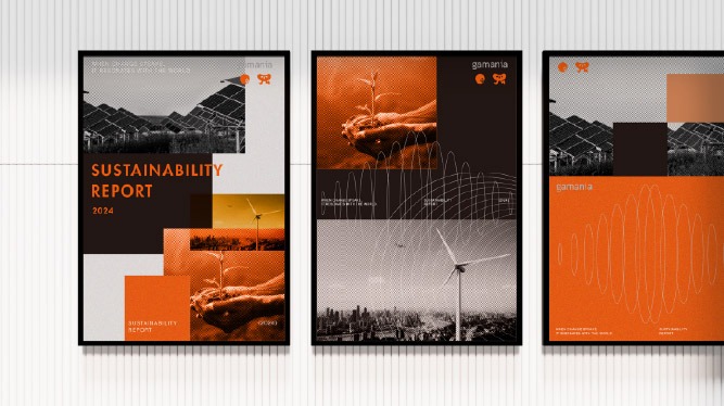
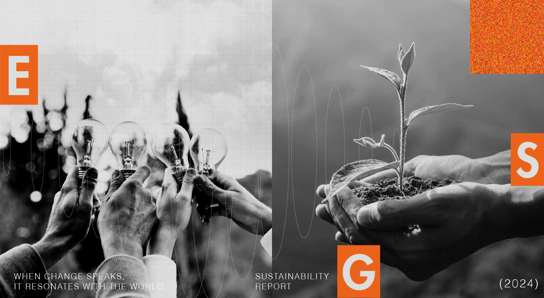
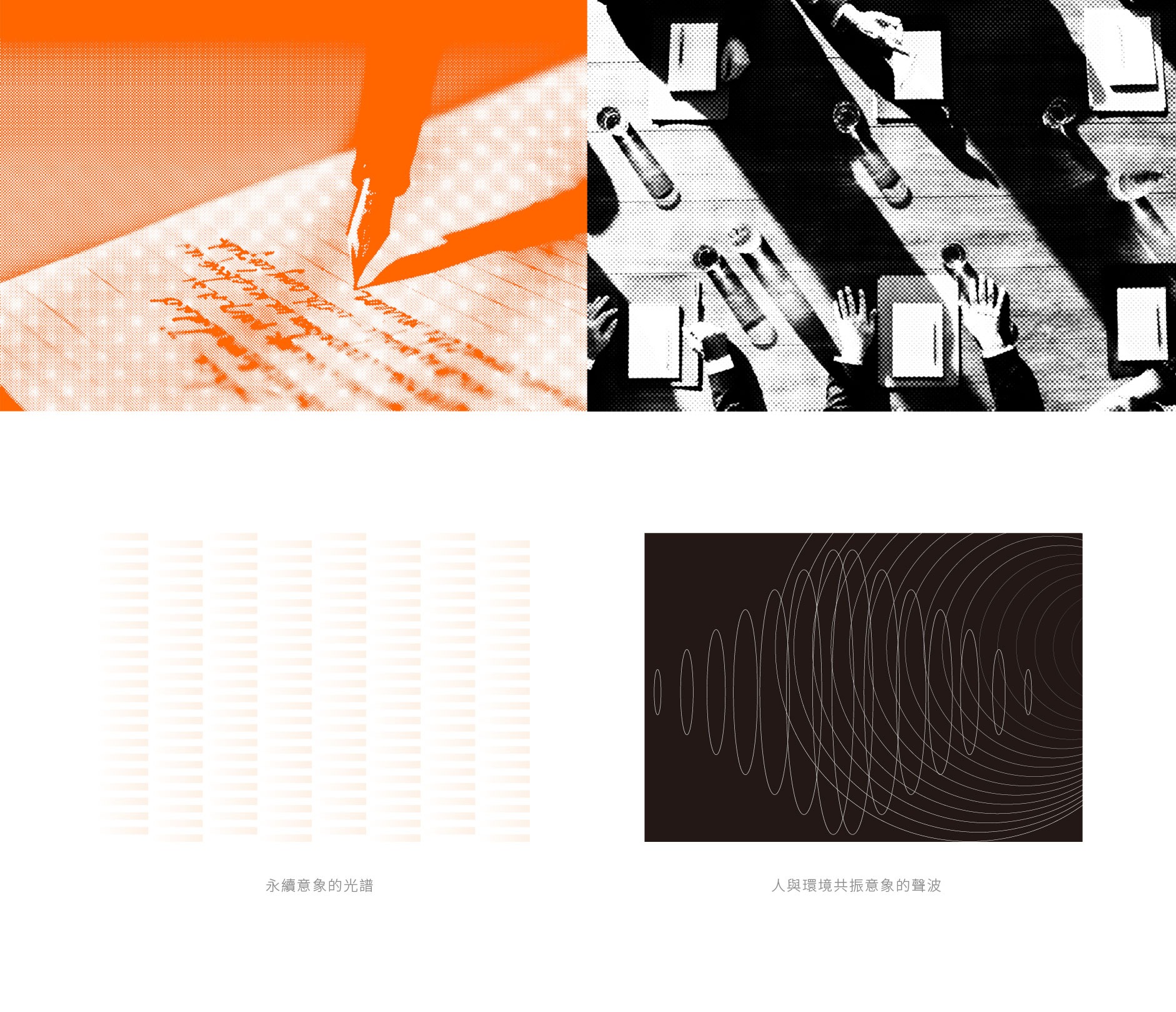
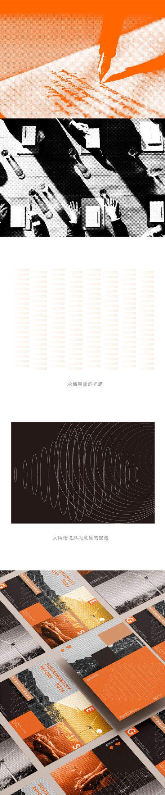
響應永續:以聲波傳遞企業動能
Echoing Sustainability: Amplifying Corporate Momentum through Soundwaves
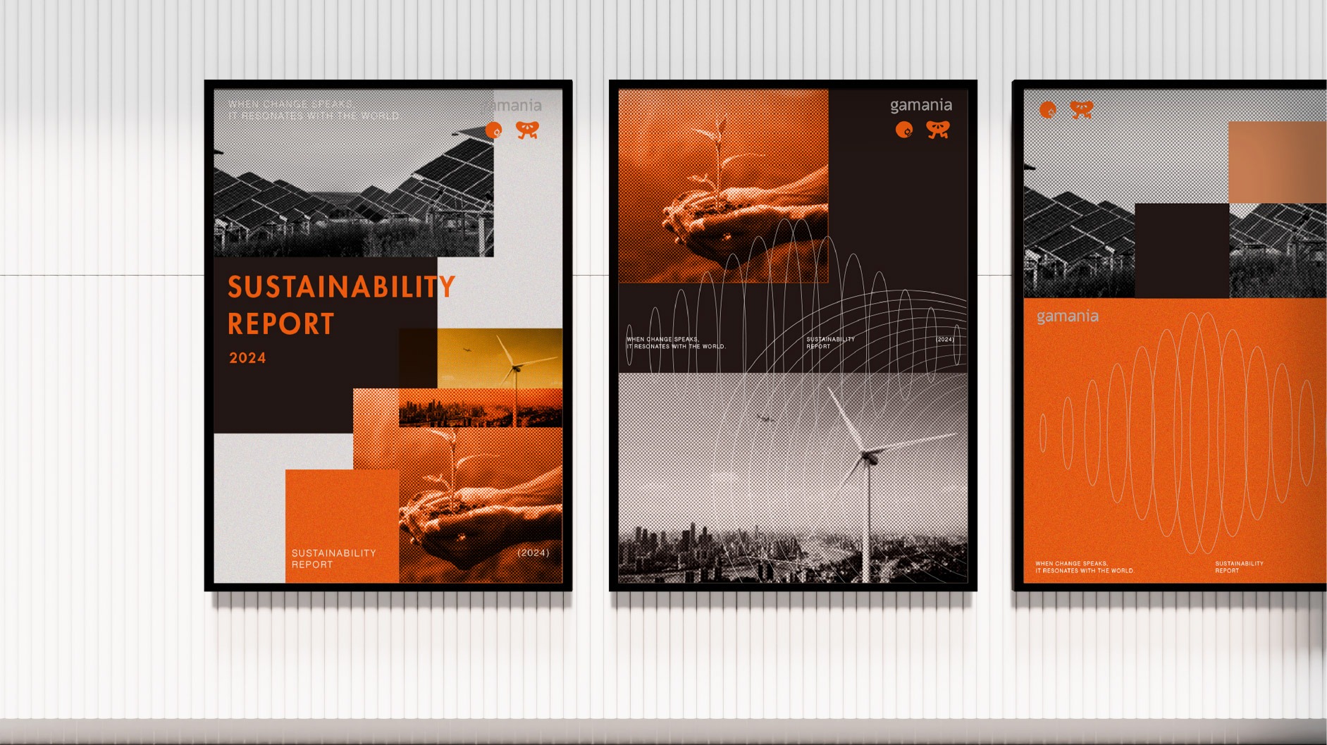
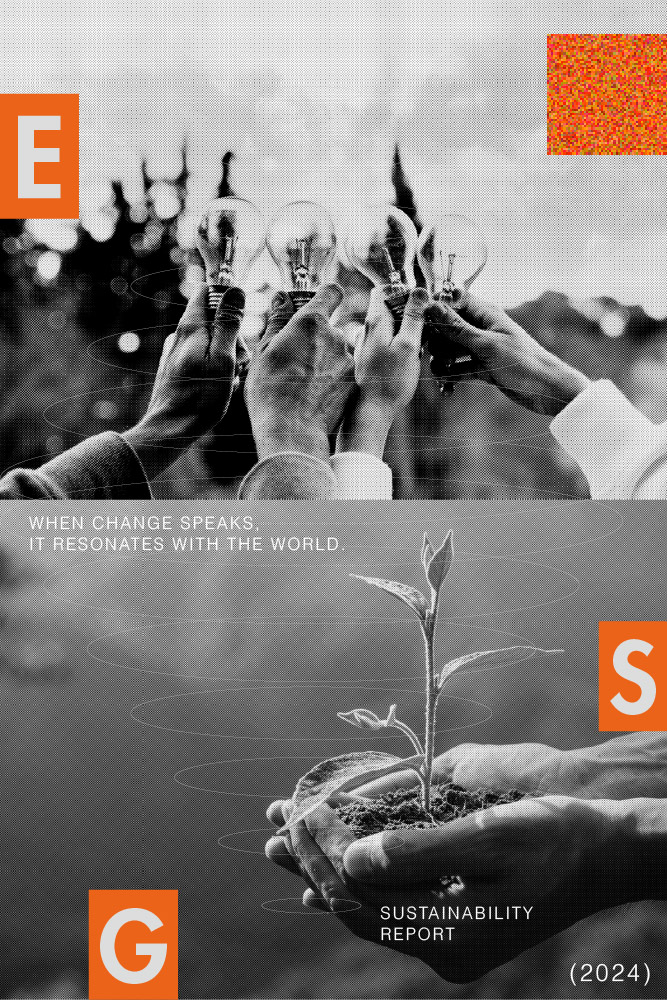
標誌性的「聲波」元素,象徵企業在環境、社會與治理(ESG)面向上的積極發聲。流動的線條不僅捕捉了行動的節奏,更隱喻影響力的擴散——從企業核心出發,像漣漪般向外輻射,與價值鏈上的夥伴共同傳遞永續發展的鮮明頻率。設計中進一步導入了「永續意象的連續光譜符號」,將破碎的行動整合為一道不間斷的能量長流。這道光譜不僅打破了單一議題的界線,更象徵企業從過去的承諾到未來的願景,皆處於一個動態平衡且持續進化的光譜之中。藉由這種具備方向感與包容性的視覺語言,我們與價值鏈上的夥伴共同傳遞永續發展的鮮明頻率,讓每一份努力都能在連續的時空維度中產生深遠迴響。
The iconic “soundwave” elements symbolize the company’s proactive voice across the realms of Environment, Social, and Governance (ESG). These fluid lines do more than just capture the rhythm of our actions; they serve as a metaphor for the expansion of our influence—radiating outward from the corporate core like ripples to transmit a distinct frequency of sustainable development alongside our value chain partners. Furthermore, the design integrates the “Continuous Spectrum Symbol of
Sustainable Imagery,” consolidating fragmented initiatives into an uninterrupted flow of energy. This spectrum transcends the boundaries of individual issues, symbolizing that the company—from past commitments to future visions—exists within a spectrum of dynamic balance and continuous evolution. Through this inclusive visual language that provides a sense of direction, we join our value chain partners in transmitting a distinct frequency of sustainable development, ensuring that every effort resonates deeply across a continuous dimension of time and space.
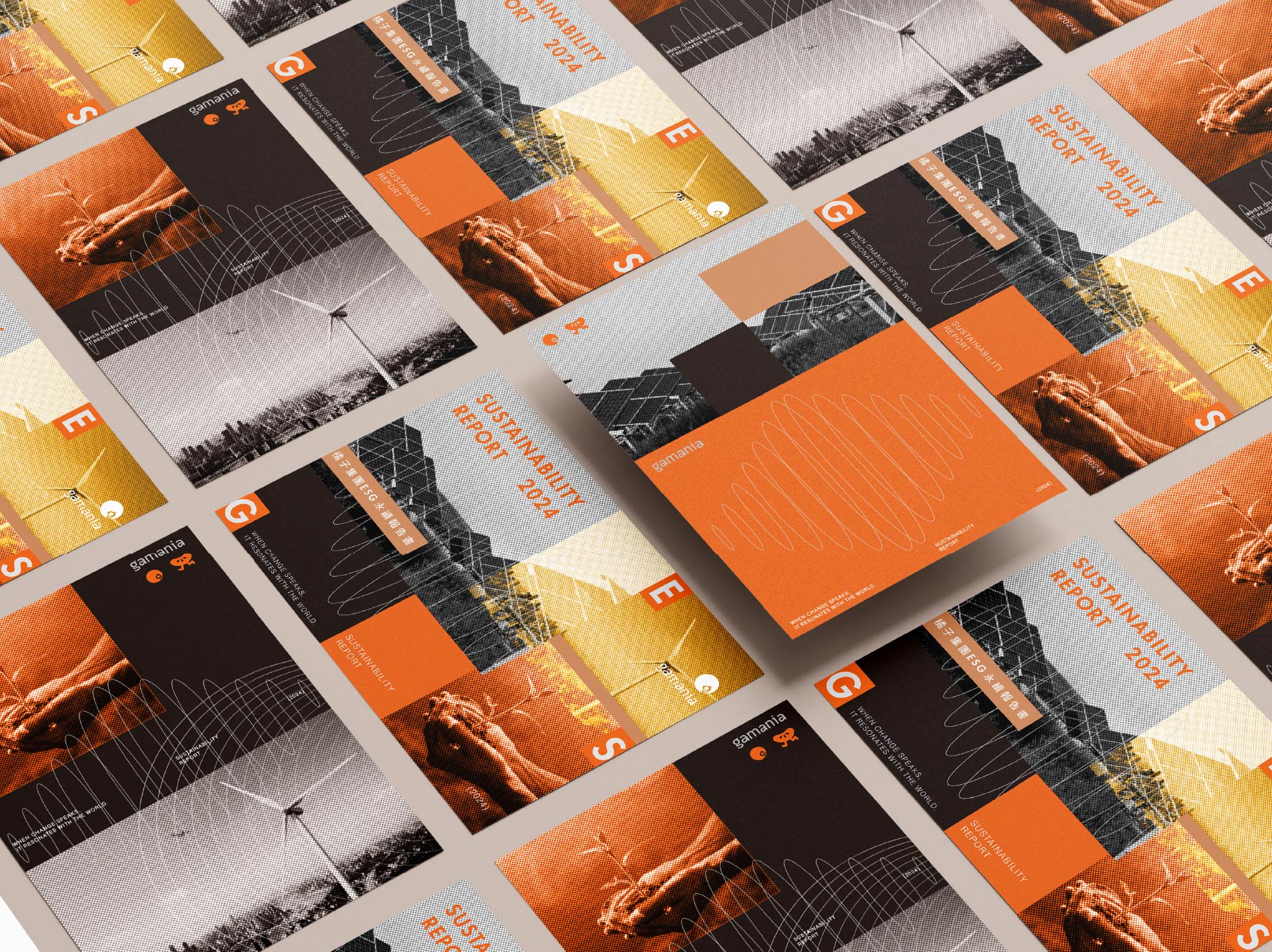
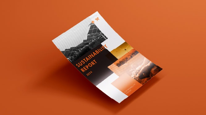
共振未來:黑橘交織的實踐力
Resonating with the Future: The Synergy of Black and Orange
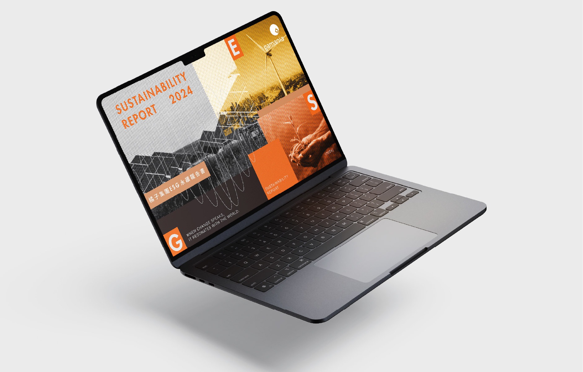
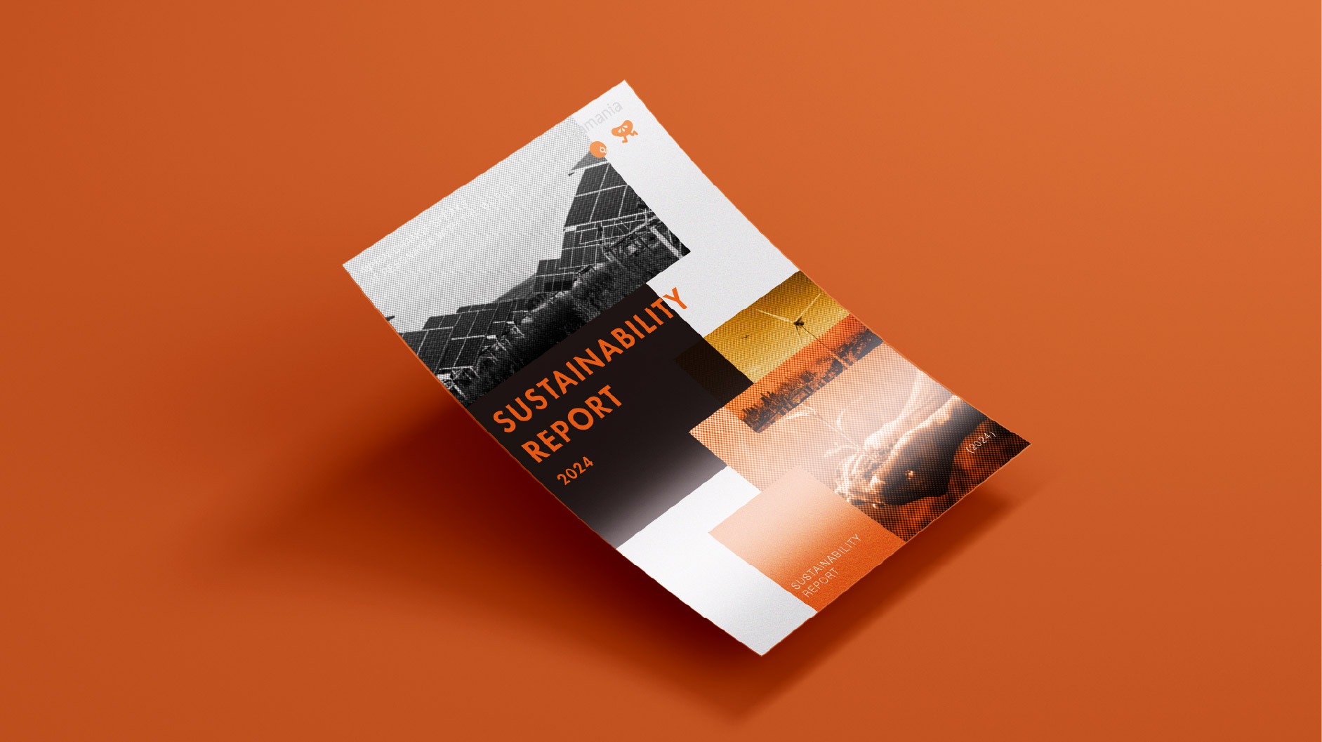
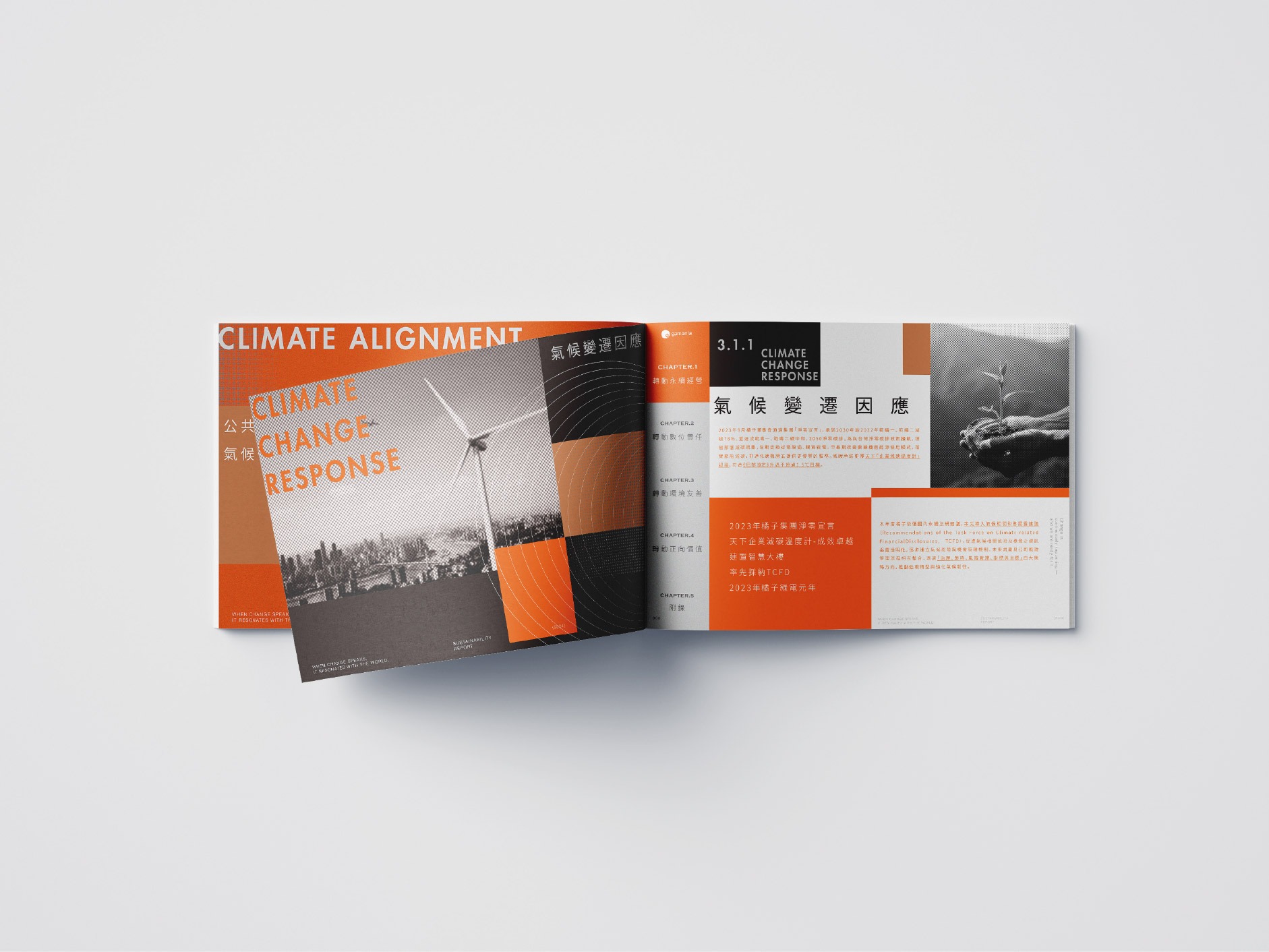
橘色象徵品牌沸騰的熱情與鮮香誘人的味覺張力,黑色則代表專業職人的沉穩底蘊與純粹品質,兩者相互映襯,展現貴方牛鳴在「感官享受」與「嚴謹製程」間的完美平衡。
The design boldly utilizes a striking contrast between “Vibrant Orange” and “Absolute Black,” imbuing the report with a high-end, professional aesthetic. Black represents the company’s deep-rooted foundation of governance and its unwavering original purpose, while orange ignites the passion for innovation and transformation. The visual “resonance” between these two colors demonstrates that while the enterprise safeguards its traditional values, it possesses the vigorous vitality to forge ahead, sketching a future blueprint filled with warmth and purpose.

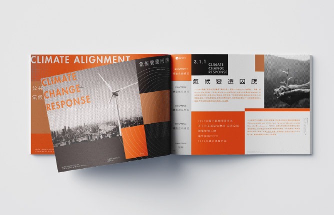
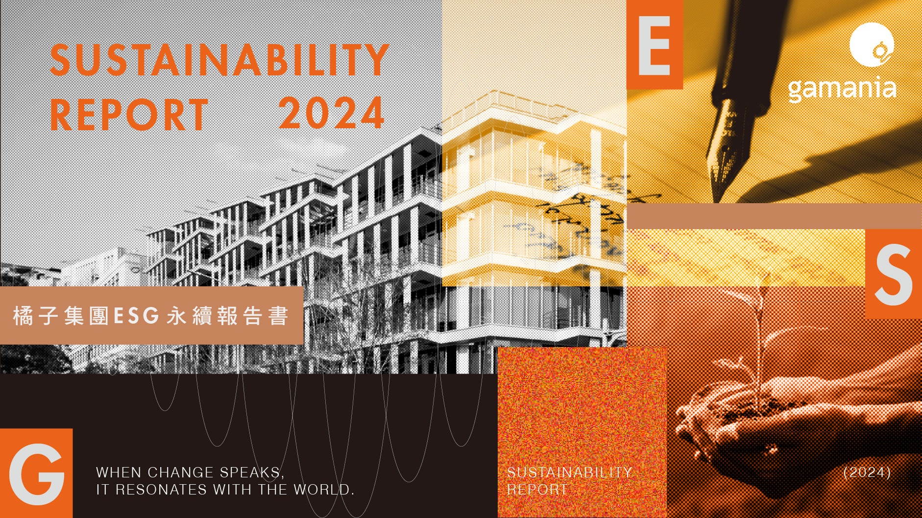
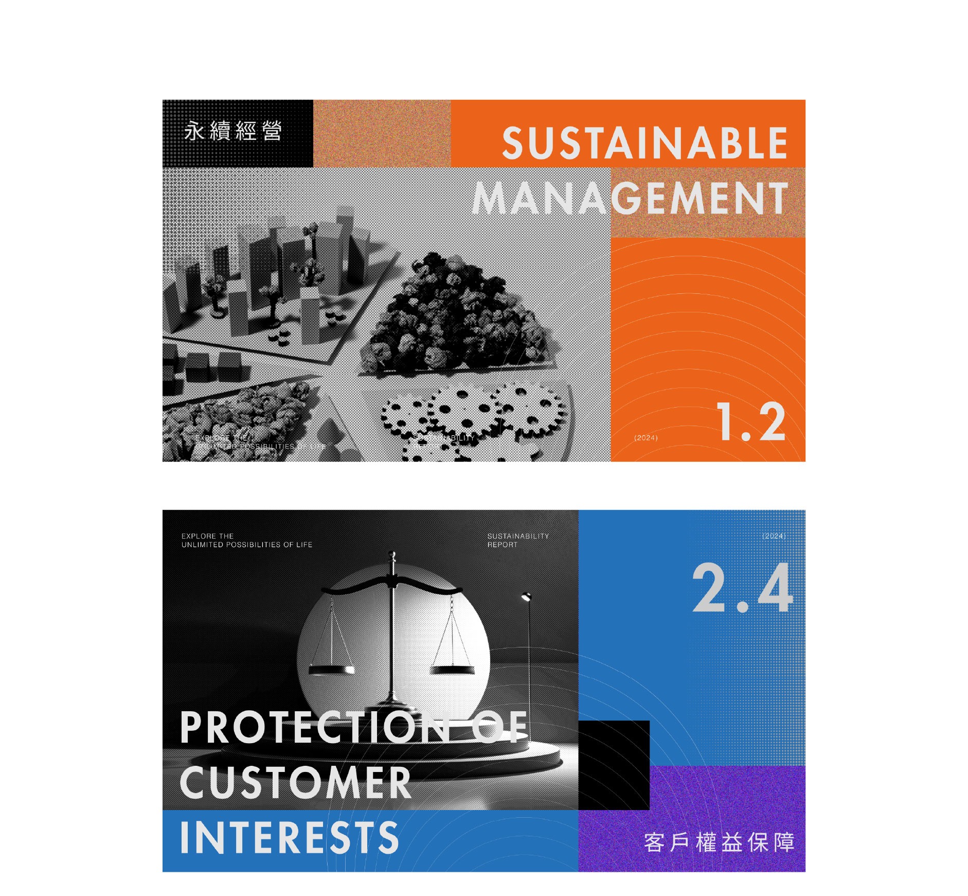
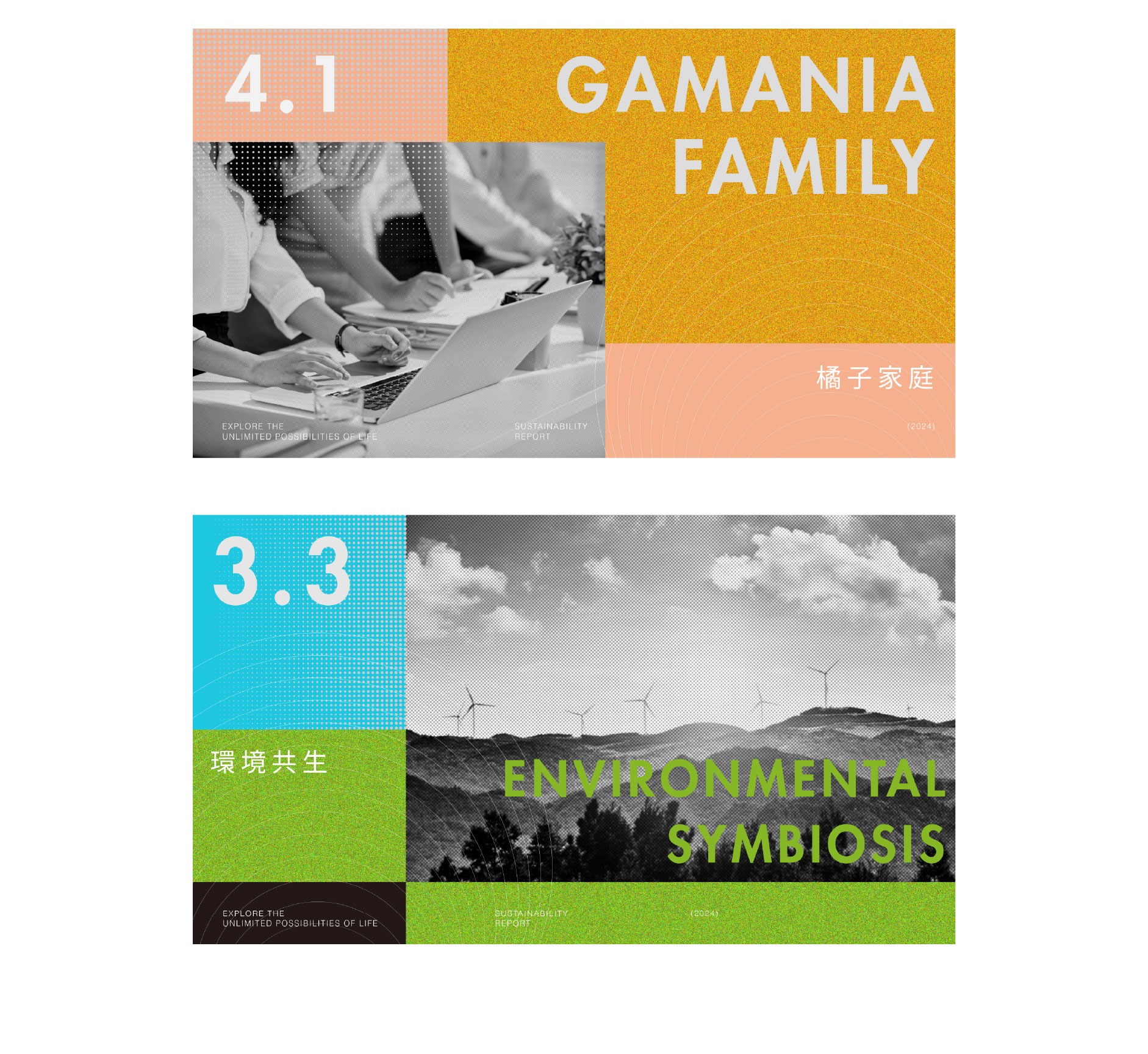
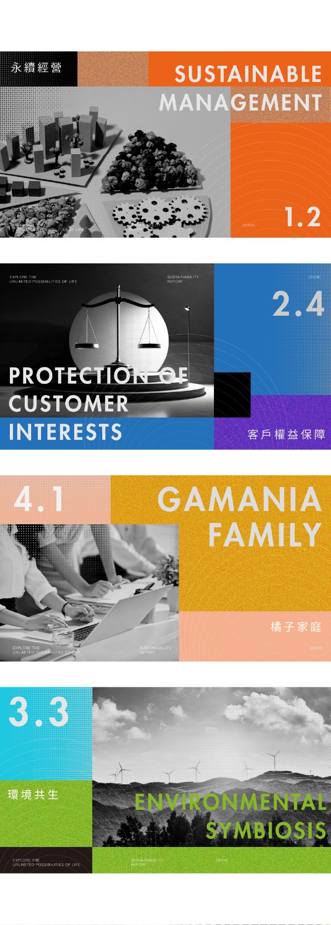
秩序美學:色塊切割下的透明治理
The Aesthetics of Order: Transparent Governance through Color-Block Segmentation
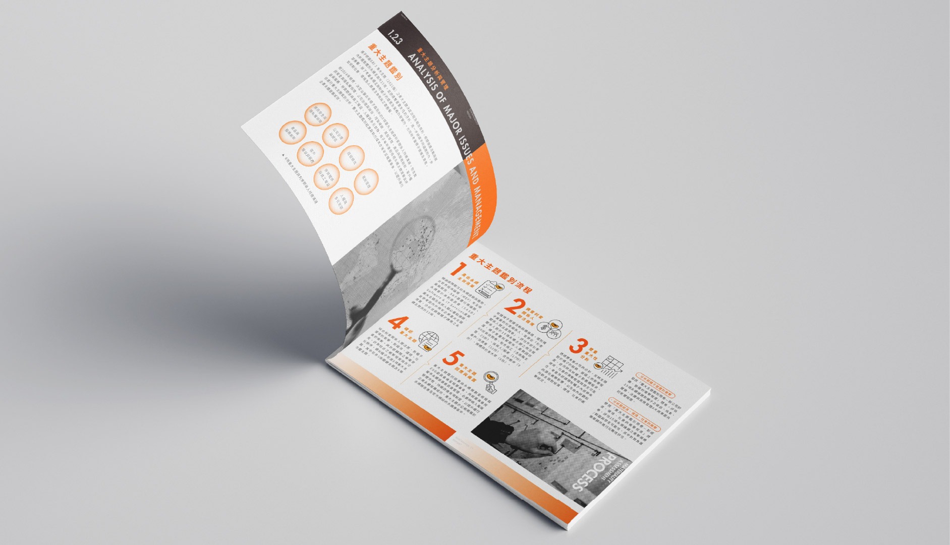
透過精準的「色塊切割」,將複雜的永續指標進行結構化重組。這種俐落的幾何語言,呼應了企業對於透明資訊與秩序治理的嚴謹要求。每一個切割面都代表一個關鍵議題,藉由明確的視覺層次,讓讀者在秩序感中快速洞察企業實踐社會責任的具體成果與前瞻視野。
Through precise “color-block segmentation,” complex sustainability indicators are systematically restructured. This sharp geometric language echoes the company’s rigorous standards for information transparency and orderly governance. Each segmented plane represents a key ESG issue; by establishing clear visual hierarchy, it allows readers to quickly gain insights into the concrete achievements and forward-looking vision of the enterprise’s social responsibility practices within a sense of structured order.
響應永續:以聲波傳遞企業動能
Echoing Sustainability: Amplifying Corporate Momentum through Soundwaves
標誌性的「聲波」元素,象徵企業在環境、社會與治理(ESG)面向上的積極發聲。流動的線條不僅捕捉了行動的節奏,更隱喻影響力的擴散——從企業核心出發,像漣漪般向外輻射,與價值鏈上的夥伴共同傳遞永續發展的鮮明頻率。設計中進一步導入了「永續意象的連續光譜符號」,將破碎的行動整合為一道不間斷的能量長流。這道光譜不僅打破了單一議題的界線,更象徵企業從過去的承諾到未來的願景,皆處於一個動態平衡且持續進化的光譜之中。藉由這種具備方向感與包容性的視覺語言,我們與價值鏈上的夥伴共同傳遞永續發展的鮮明頻率,讓每一份努力都能在連續的時空維度中產生深遠迴響。
The iconic “soundwave” elements symbolize the company’s proactive voice across the realms of Environment, Social, and Governance (ESG). These fluid lines do more than just capture the rhythm of our actions; they serve as a metaphor for the expansion of our influence—radiating outward from the corporate core like ripples to transmit a distinct frequency of sustainable development alongside our value chain partners. Furthermore, the design integrates the “Continuous Spectrum Symbol of
Sustainable Imagery,” consolidating fragmented initiatives into an uninterrupted flow of energy. This spectrum transcends the boundaries of individual issues, symbolizing that the company—from past commitments to future visions—exists within a spectrum of dynamic balance and continuous evolution. Through this inclusive visual language that provides a sense of direction, we join our value chain partners in transmitting a distinct frequency of sustainable development, ensuring that every effort resonates deeply across a continuous dimension of time and space.
共振未來:黑橘交織的實踐力
Resonating with the Future: The Synergy of Black and Orange
設計大膽採用「活力橘」與「極致黑」的強烈對比,賦予報告書精品般的專業質感。黑色代表企業深厚的治理根基與不變的初衷,橘色則點燃創新轉型的熱情。兩色在視覺上的「共振」,展現出企業在守護傳統價值之餘,亦有勇往直前的生命力,描繪出充滿溫度的未來藍圖。
The design boldly utilizes a striking contrast between “Vibrant Orange” and “Absolute Black,” imbuing the report with a high-end, professional aesthetic. Black represents the company’s deep-rooted foundation of governance and its unwavering original purpose, while orange ignites the passion for innovation and transformation. The visual “resonance” between these two colors demonstrates that while the enterprise safeguards its traditional values, it possesses the vigorous vitality to forge ahead, sketching a future blueprint filled with warmth and purpose.
秩序美學:色塊切割下的透明治理
The Aesthetics of Order: Transparent Governance through Color-Block Segmentation
透過精準的「色塊切割」,將複雜的永續指標進行結構化重組。這種俐落的幾何語言,呼應了企業對於透明資訊與秩序治理的嚴謹要求。每一個切割面都代表一個關鍵議題,藉由明確的視覺層次,讓讀者在秩序感中快速洞察企業實踐社會責任的具體成果與前瞻視野。
indicators are systematically restructured. This sharp geometric language echoes the company’s rigorous standards for information transparency and orderly governance. Each segmented plane represents a key ESG issue; by establishing clear visual hierarchy, it allows readers to quickly gain insights into the concrete achievements and forward-looking vision of the enterprise’s social responsibility practices within a sense of structured order.