品牌創研 BRAND 視覺設計 VISUAL DESIGN 平面攝影 PHOTOGRAPHY 動態廣告 FILM 社群行銷 SOCIAL MEDIA
一杯被定義為風格的白奶茶
A Milk Tea Defined as a Style
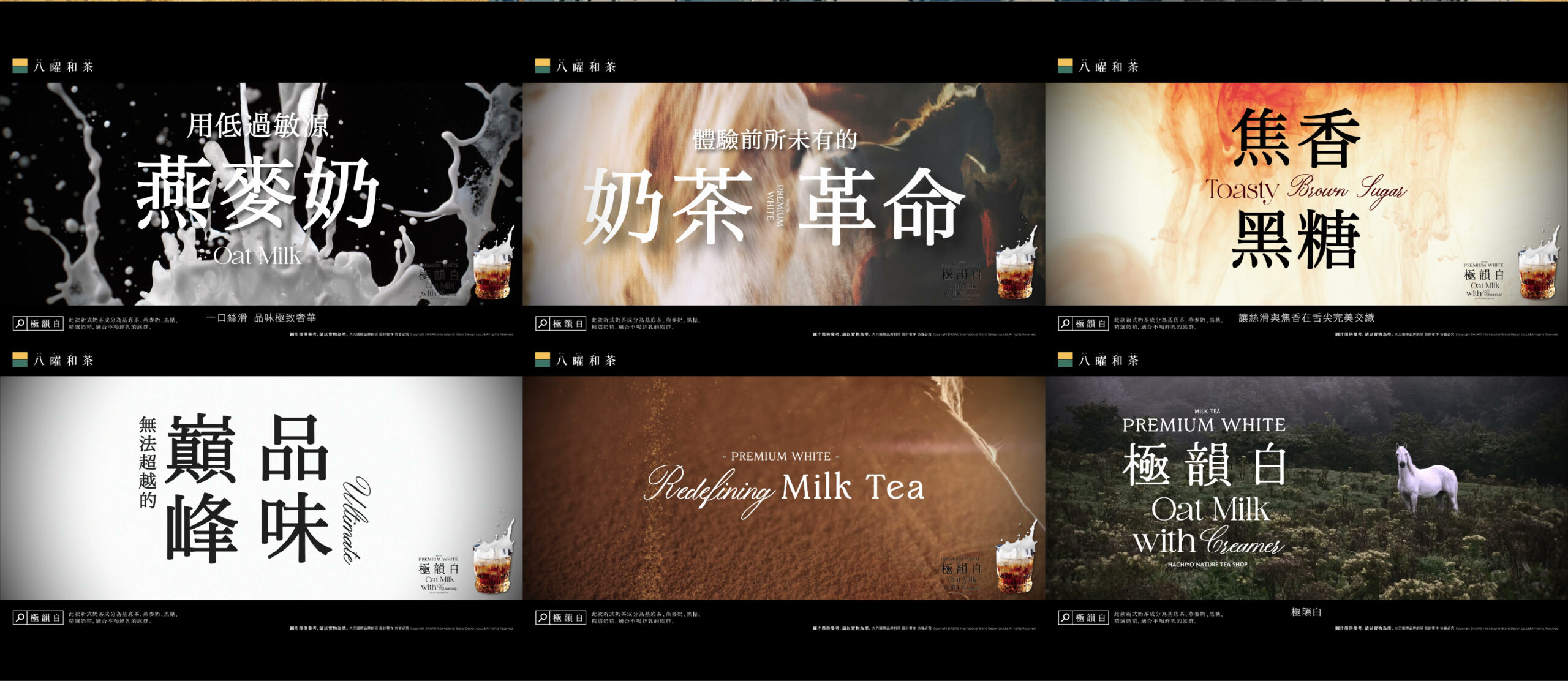
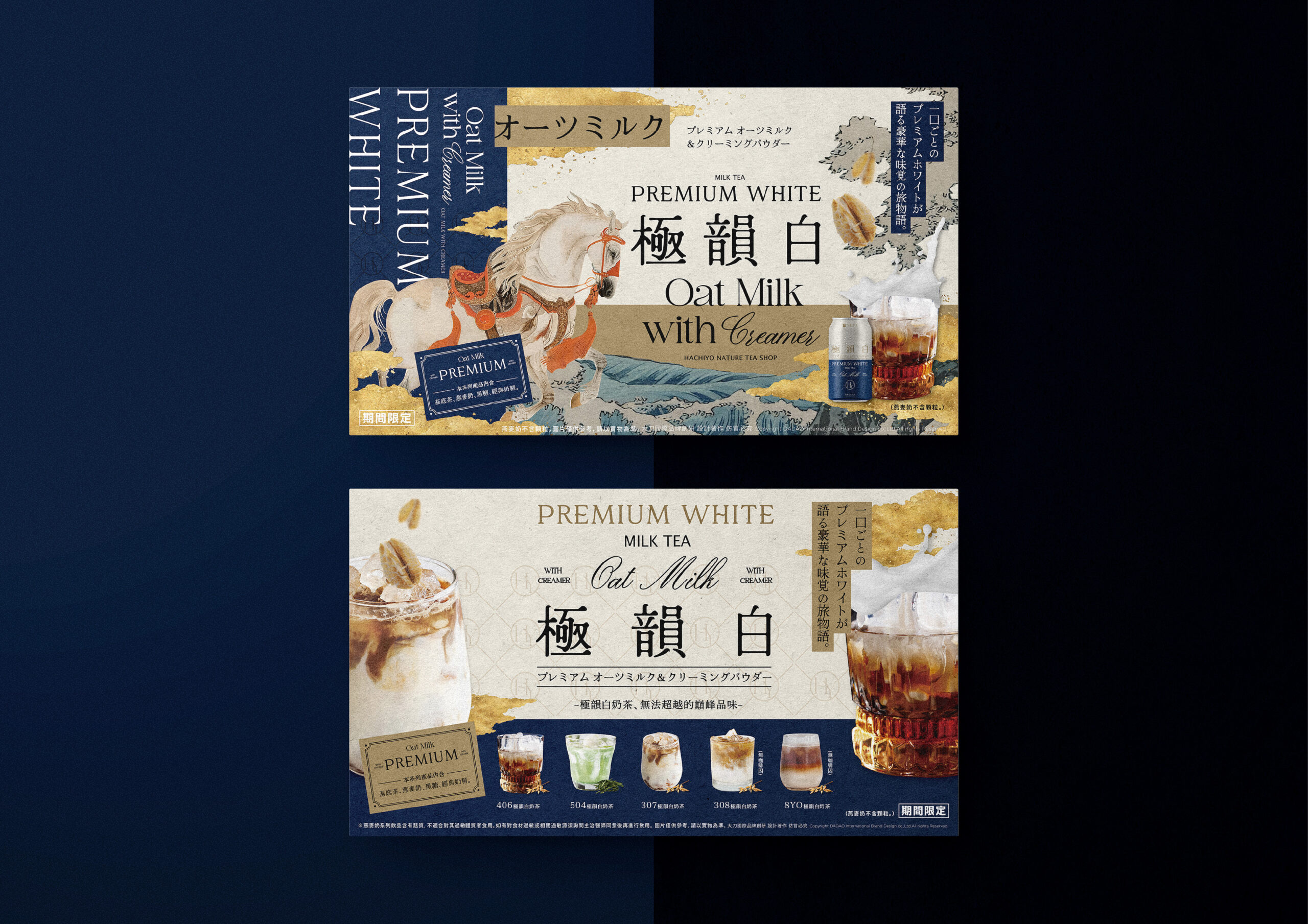
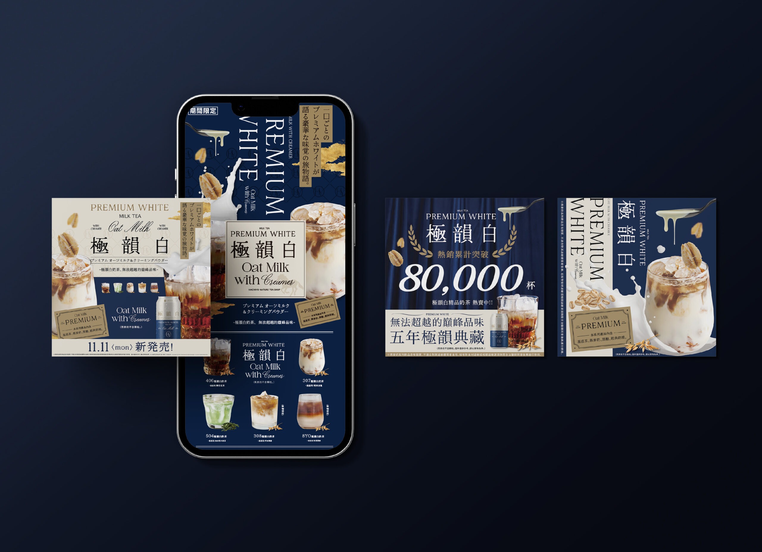
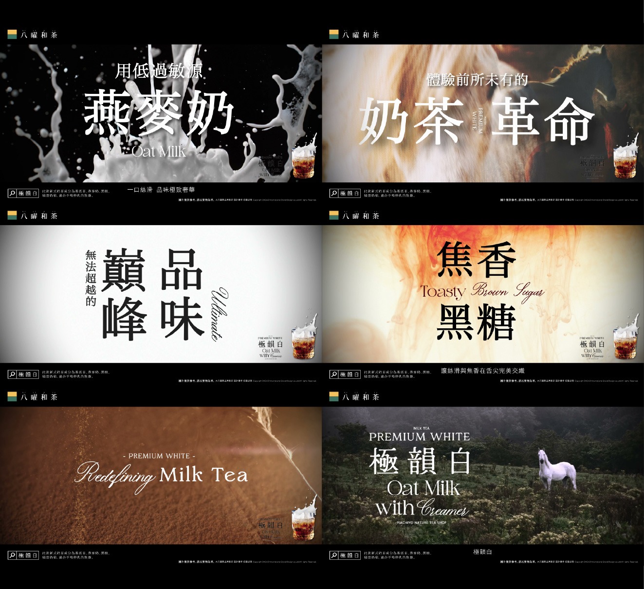
「極韻白」不只是風味命名,而是一種被風格化的飲品提案。我們以「柔順絲滑」作為核心體驗,重新定義白奶茶的價值——從日常解渴,轉化為可被感知的質地與記憶。其口感如絲緞般在口中流動,溫潤細膩、輕盈順滑,在柔和之中保有存在感,形塑出層次分明的飲用體驗。品牌將其定位為精品級的日常選擇,讓喝奶茶不只是習慣,而是一種風格表達。「極韻白」延續經典的熟悉,同時透過質地與氛圍升級,建立出高端語境。這不只是一杯飲料,而是一種關於質感生活的想像,讓每一次飲用,都成為優雅且輕盈的日常儀式。
“Premium White” is not merely a flavor name, but a stylized proposition of a beverage. Centered around the experience of “smooth and silky texture,” it redefines the value of white milk tea—from a daily refreshment into a sensory and memorable experience. Its texture flows like silk across the palate, delivering a delicate, refined, and lightweight smoothness while maintaining a distinct presence. This creates a layered drinking experience that is both gentle and expressive. The brand positions it as a premium everyday choice, transforming the act of drinking milk tea into a form of lifestyle expression. While rooted in familiarity, “Premium White” elevates the experience through texture and atmosphere, establishing a high-end narrative. It is not just a drink, but a refined interpretation of a quality lifestyle—where every sip becomes an elegant and effortless daily ritual.
當奶茶成為一件精品包裝作品
Design Approach|When Milk Tea Becomes a Luxury Packaging Object
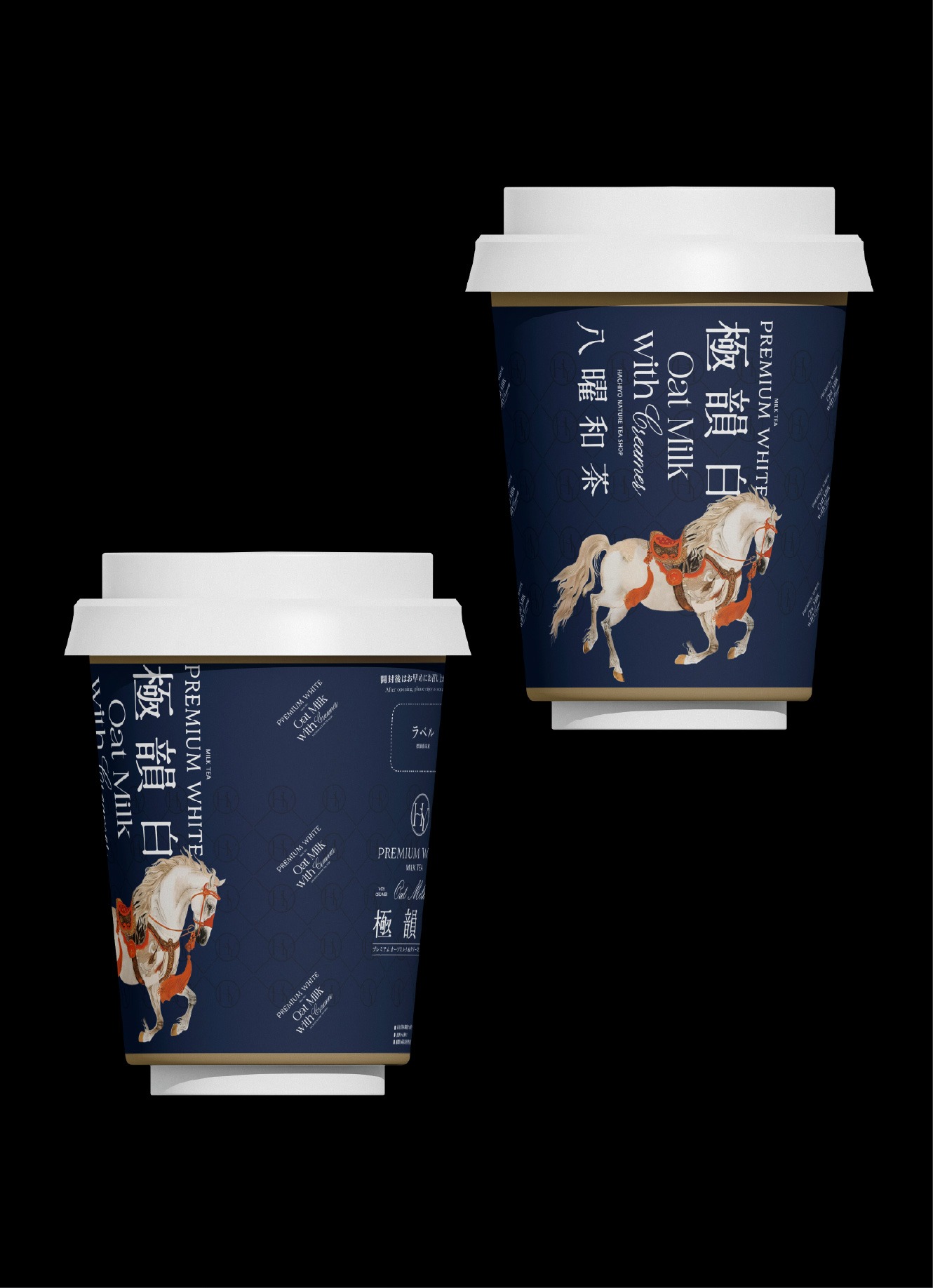
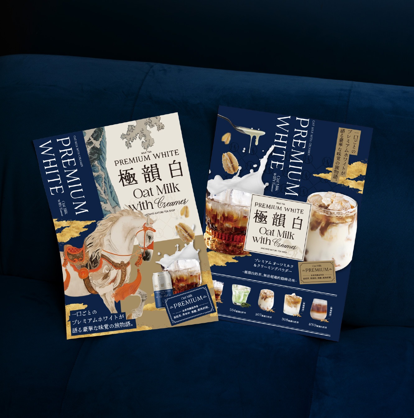
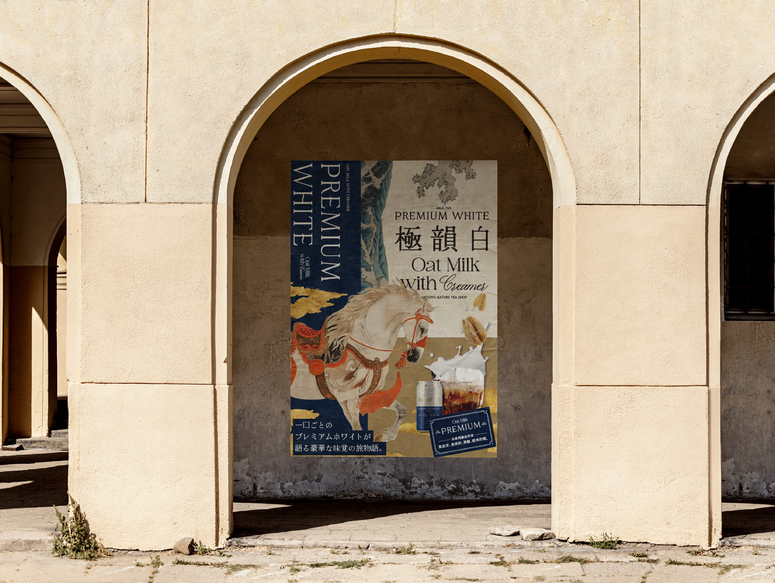
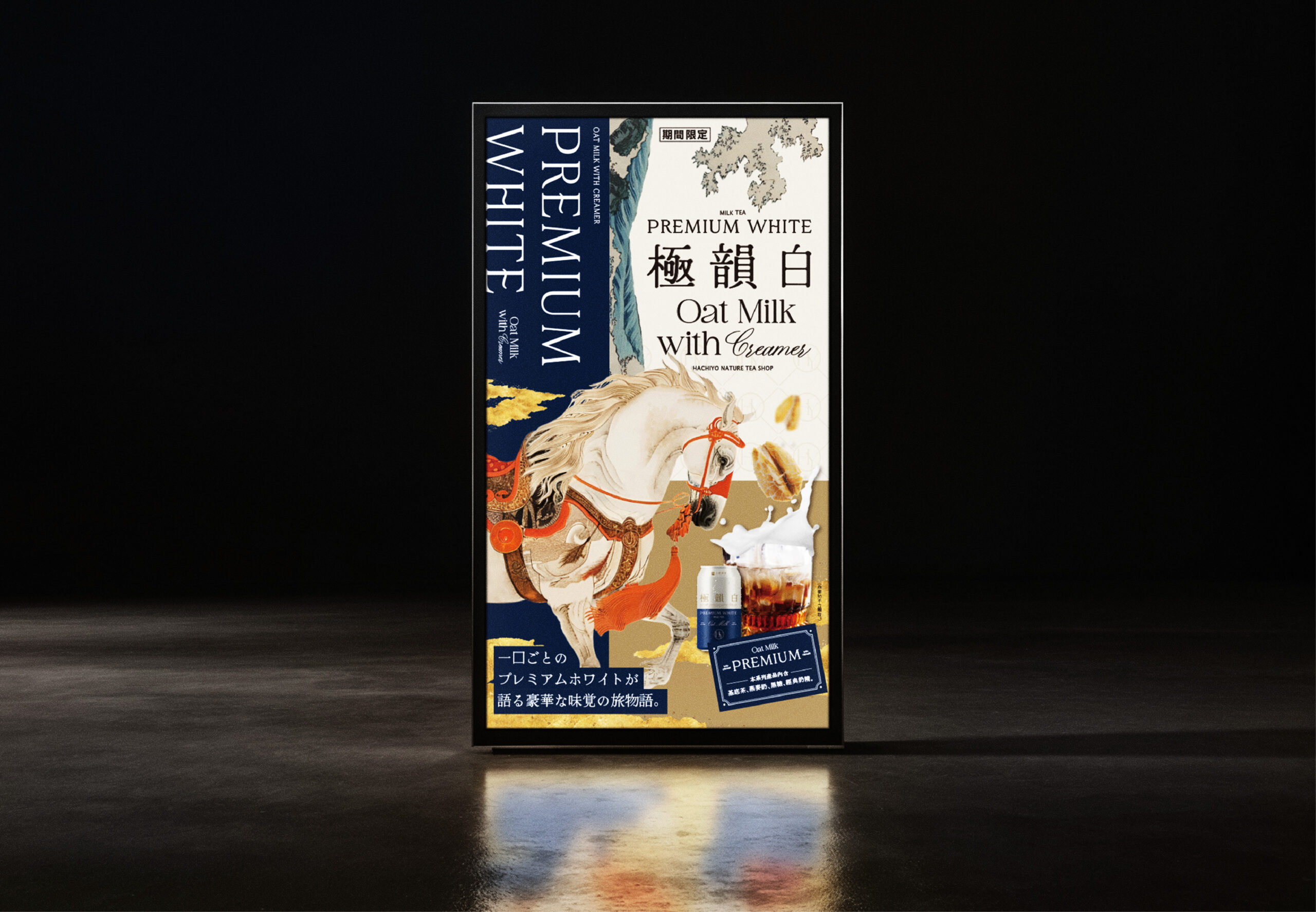
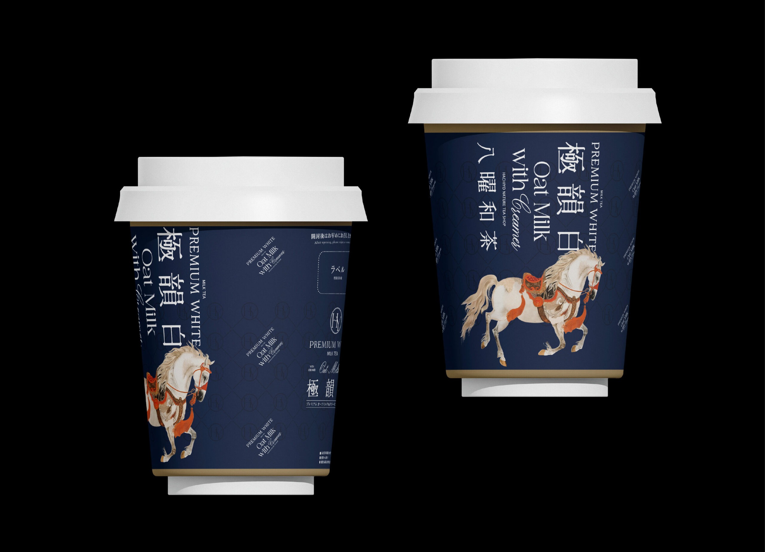
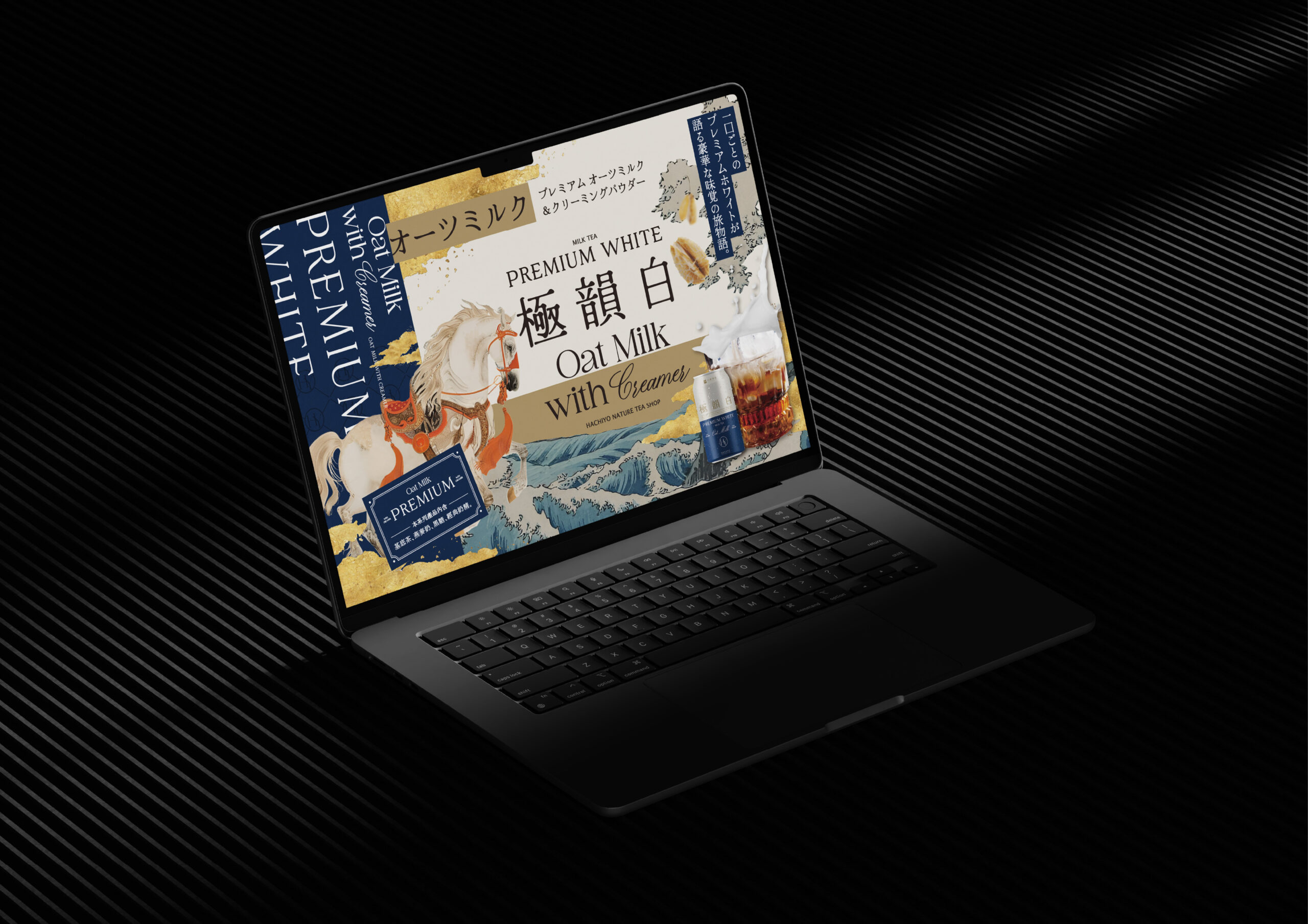
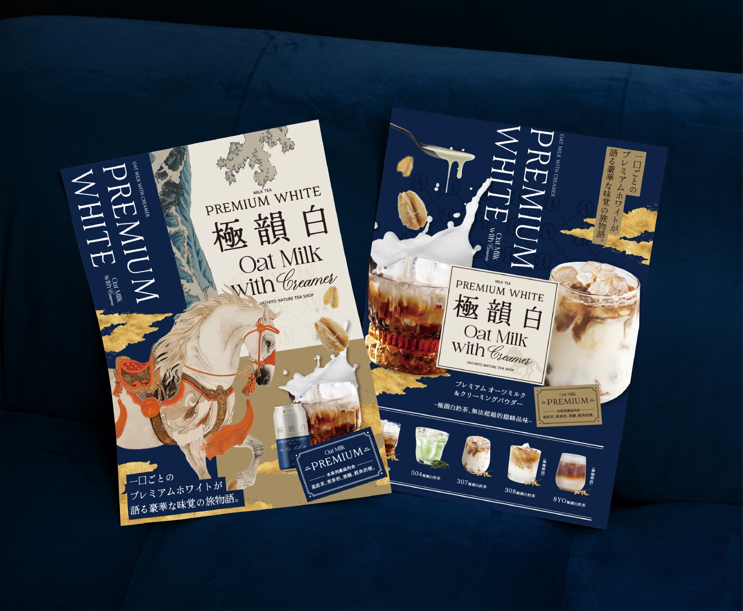
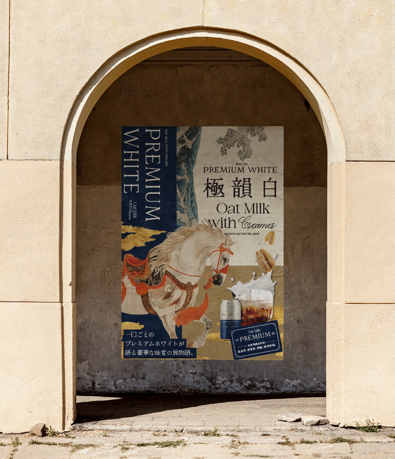
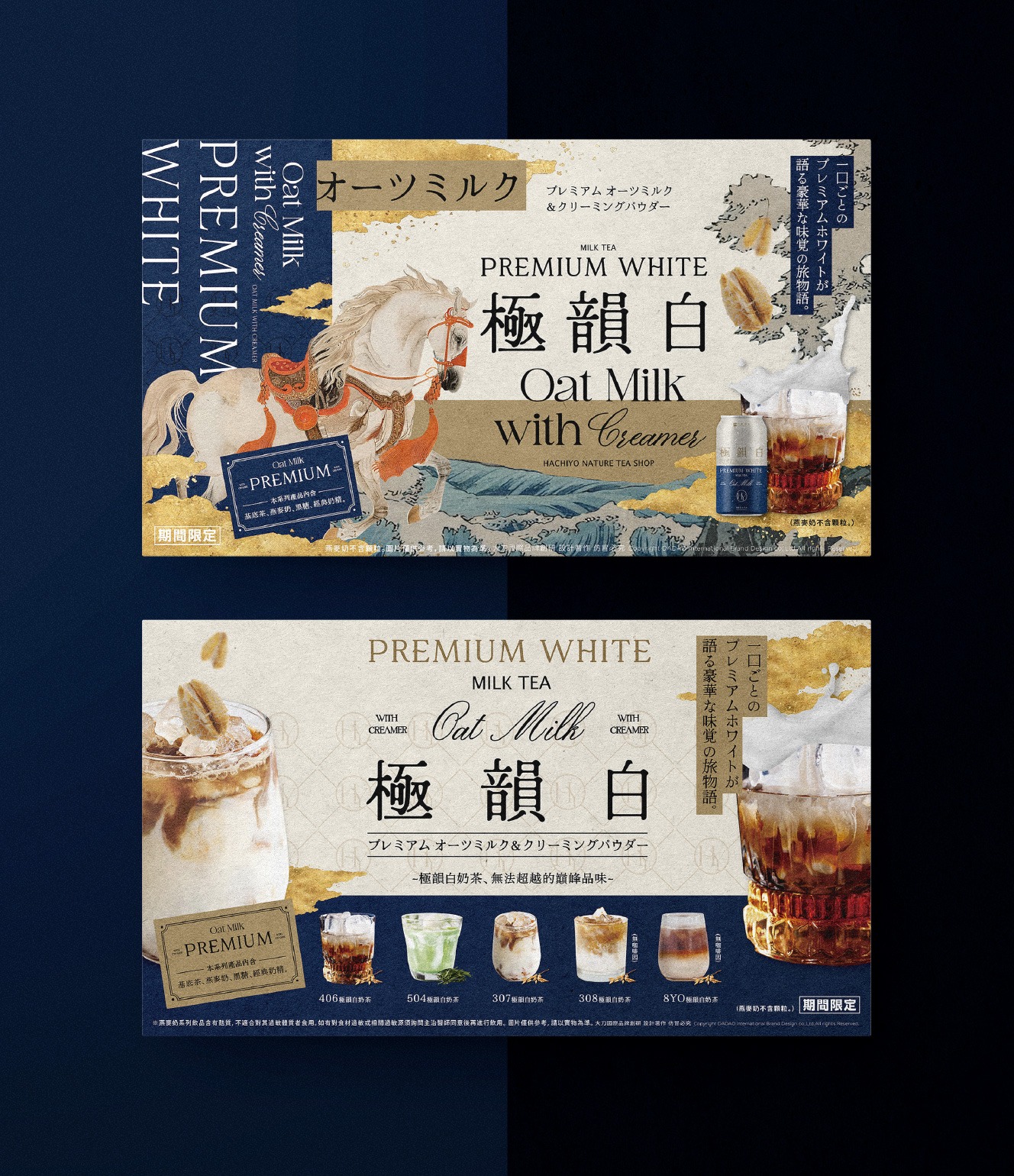
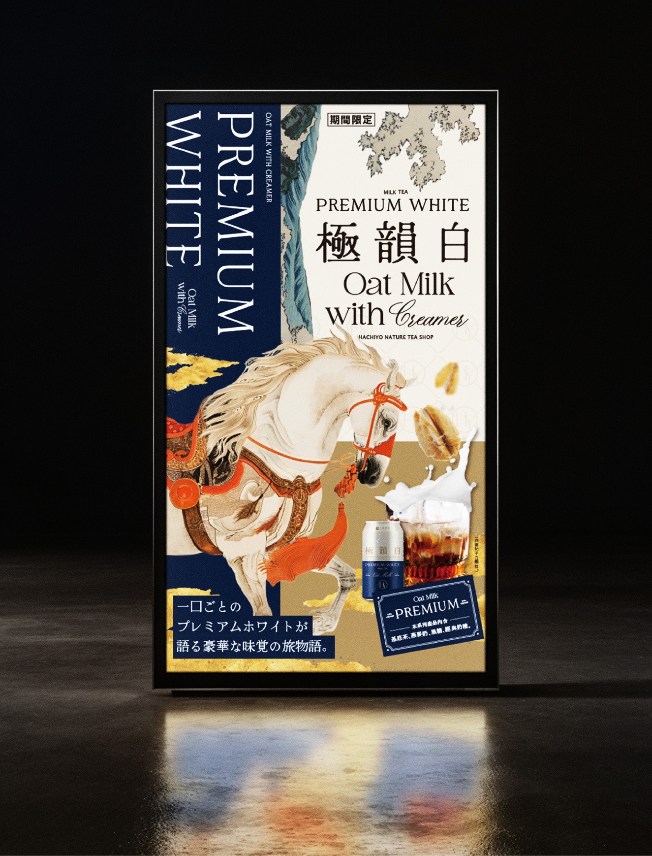
「極韻白」的視覺設計以高級時尚品牌包裝為靈感,透過拼貼式排版構築出如精品包裝紙般的畫面質感。色彩以低彩度象牙白與深沉經典藍為主,搭配金屬銀點綴,建立出「柔順 × 高貴」的雙重印象。畫面中的白色奔馬作為核心象徵,隱喻奶茶如絲緞般滑順的口感,同時展現溫柔與力量並存的美學。大面積深藍背景與層次拼貼構圖,強化整體穩定且經典的視覺語言,傳遞「經典即是永流傳」的品牌觀點。整體設計不僅呈現產品質感,更讓包裝本身成為具有記憶點與收藏價值的風格物件。
The visual design of “Premium White” draws inspiration from high-fashion packaging language, using collage-based composition to create a texture reminiscent of luxury wrapping paper. The palette is anchored in low-saturation ivory white and deep classic blue, accented with metallic silver to establish a dual impression of “smoothness and sophistication.” A white galloping horse serves as the central visual symbol, metaphorically expressing the silky texture of the milk tea while embodying both gentleness and strength. The dominant deep blue background, combined with layered collage composition, reinforces a sense of stability and timeless elegance, conveying the brand philosophy that “classics endure.” Ultimately, the design transcends packaging, transforming it into a distinctive object with strong memorability and collectible value.
一杯被定義為風格的白奶茶
A Milk Tea Defined as a Style
「極韻白」不只是風味命名,而是一種被風格化的飲品提案。我們以「柔順絲滑」作為核心體驗,重新定義白奶茶的價值——從日常解渴,轉化為可被感知的質地與記憶。其口感如絲緞般在口中流動,溫潤細膩、輕盈順滑,在柔和之中保有存在感,形塑出層次分明的飲用體驗。品牌將其定位為精品級的日常選擇,讓喝奶茶不只是習慣,而是一種風格表達。「極韻白」延續經典的熟悉,同時透過質地與氛圍升級,建立出高端語境。這不只是一杯飲料,而是一種關於質感生活的想像,讓每一次飲用,都成為優雅且輕盈的日常儀式。
“Premium White” is not merely a flavor name, but a stylized proposition of a beverage. Centered around the experience of “smooth and silky texture,” it redefines the value of white milk tea—from a daily refreshment into a sensory and memorable experience. Its texture flows like silk across the palate, delivering a delicate, refined, and lightweight smoothness while maintaining a distinct presence. This creates a layered drinking experience that is both gentle and expressive. The brand positions it as a premium everyday choice, transforming the act of drinking milk tea into a form of lifestyle expression. While rooted in familiarity, “Premium White” elevates the experience through texture and atmosphere, establishing a high-end narrative. It is not just a drink, but a refined interpretation of a quality lifestyle—where every sip becomes an elegant and effortless daily ritual.
當奶茶成為一件精品包裝作品
Design Approach|When Milk Tea Becomes a Luxury Packaging Object
「極韻白」的視覺設計以高級時尚品牌包裝為靈感,透過拼貼式排版構築出如精品包裝紙般的畫面質感。色彩以低彩度象牙白與深沉經典藍為主,搭配金屬銀點綴,建立出「柔順 × 高貴」的雙重印象。畫面中的白色奔馬作為核心象徵,隱喻奶茶如絲緞般滑順的口感,同時展現溫柔與力量並存的美學。大面積深藍背景與層次拼貼構圖,強化整體穩定且經典的視覺語言,傳遞「經典即是永流傳」的品牌觀點。整體設計不僅呈現產品質感,更讓包裝本身成為具有記憶點與收藏價值的風格物件。
The visual design of “Premium White” draws inspiration from high-fashion packaging language, using collage-based composition to create a texture reminiscent of luxury wrapping paper. The palette is anchored in low-saturation ivory white and deep classic blue, accented with metallic silver to establish a dual impression of “smoothness and sophistication.” A white galloping horse serves as the central visual symbol, metaphorically expressing the silky texture of the milk tea while embodying both gentleness and strength. The dominant deep blue background, combined with layered collage composition, reinforces a sense of stability and timeless elegance, conveying the brand philosophy that “classics endure.” Ultimately, the design transcends packaging, transforming it into a distinctive object with strong memorability and collectible value.