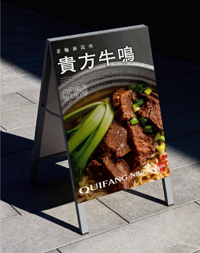
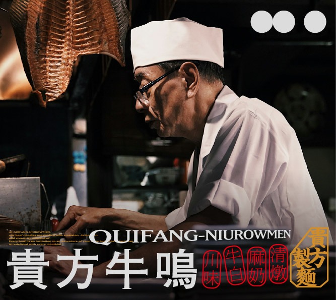
QUIFANG NIUROWMEN
品牌創研 BRAND 視覺設計 VISUAL DESIGN
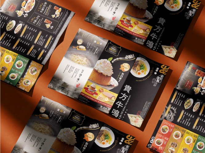
以風味為引,刻畫牛肉麵的味覺地圖
Mapping the Future of Beef Noodles through the Lens of Flavor
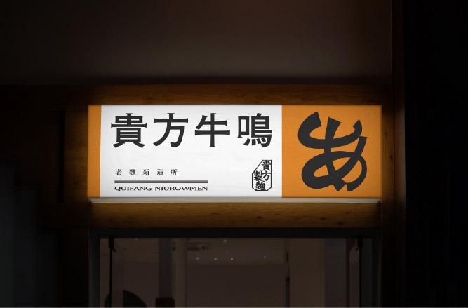
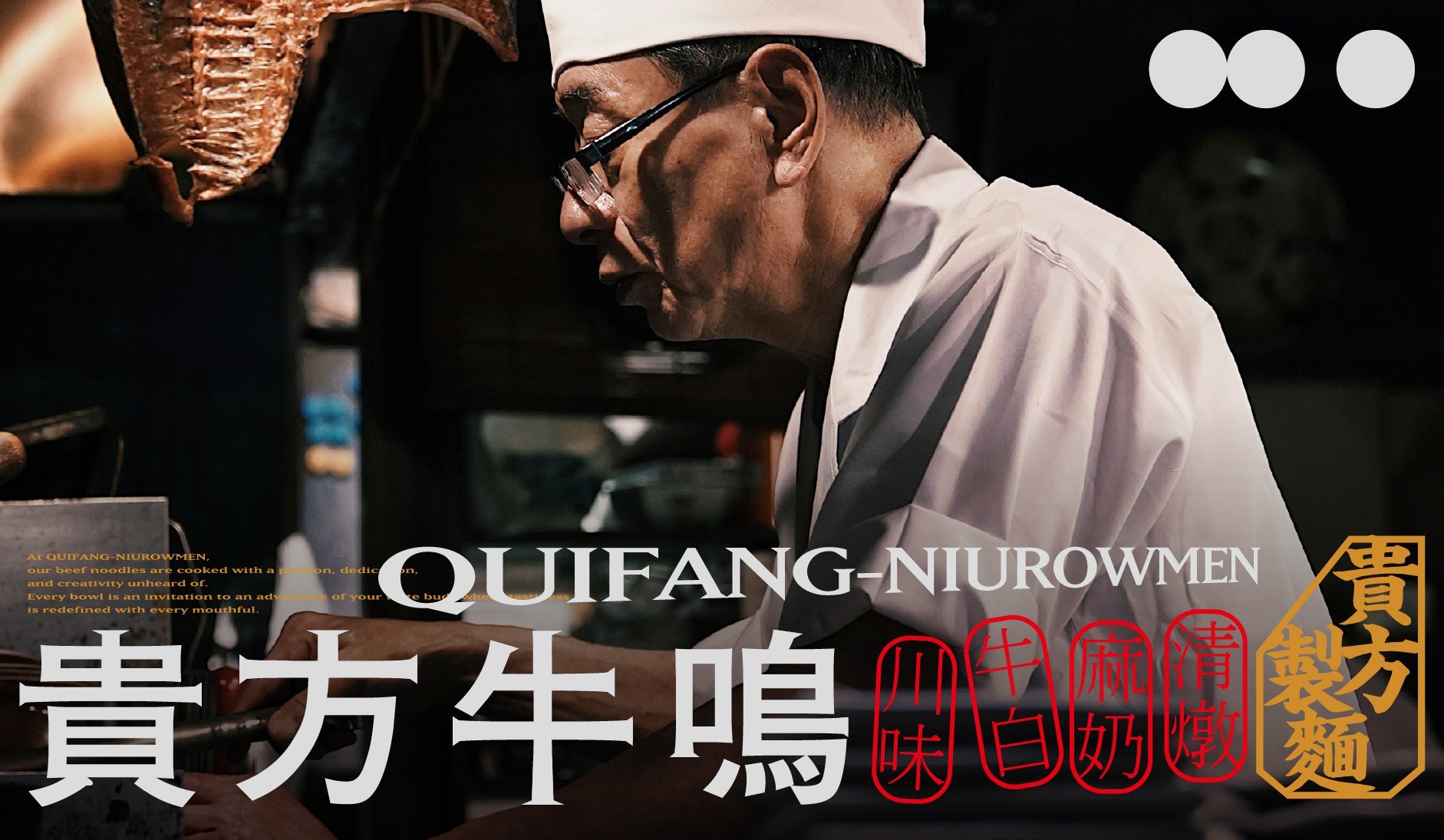
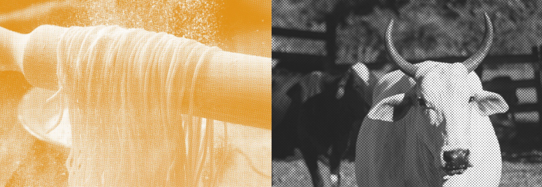
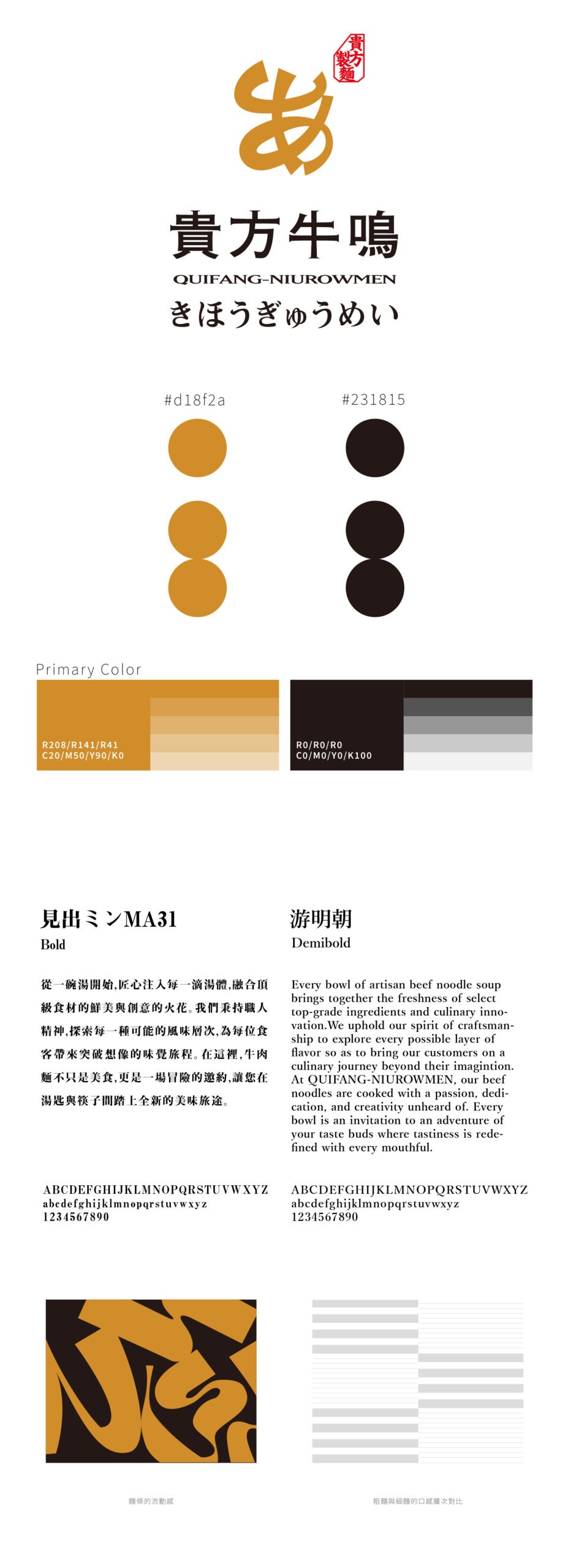
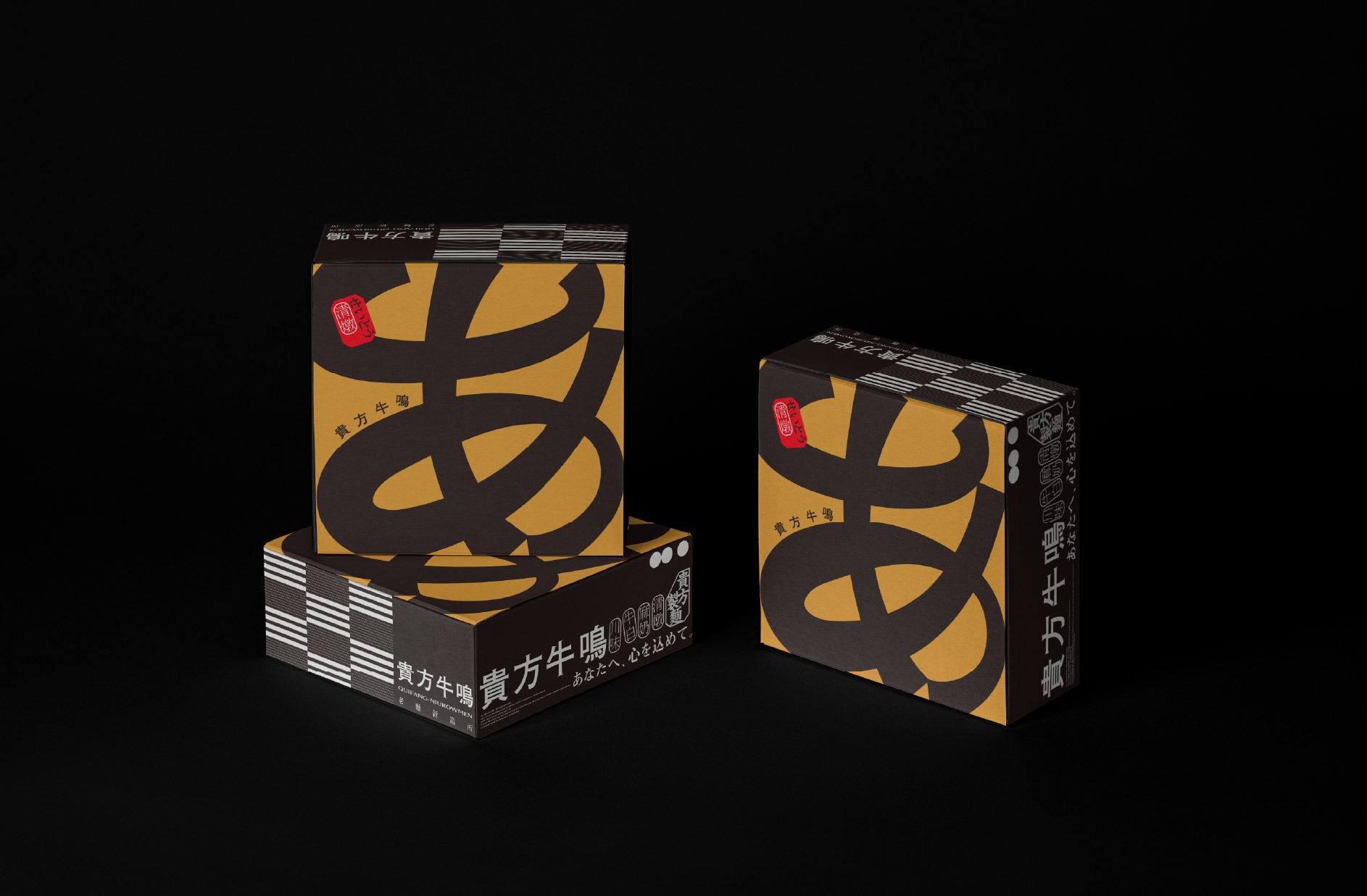
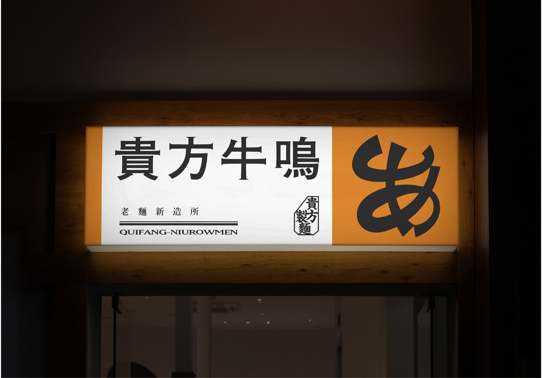
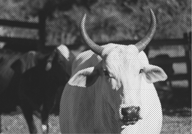
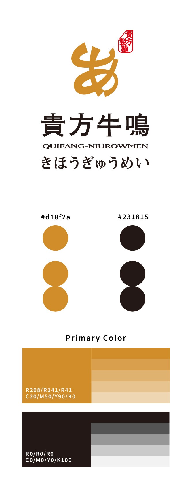
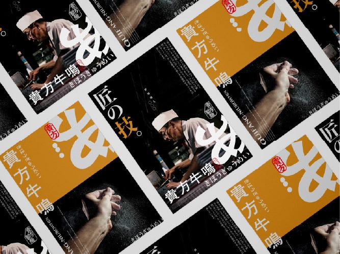
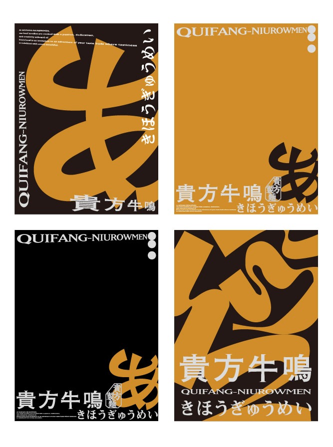
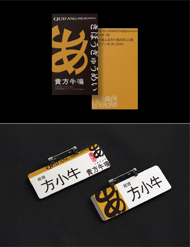
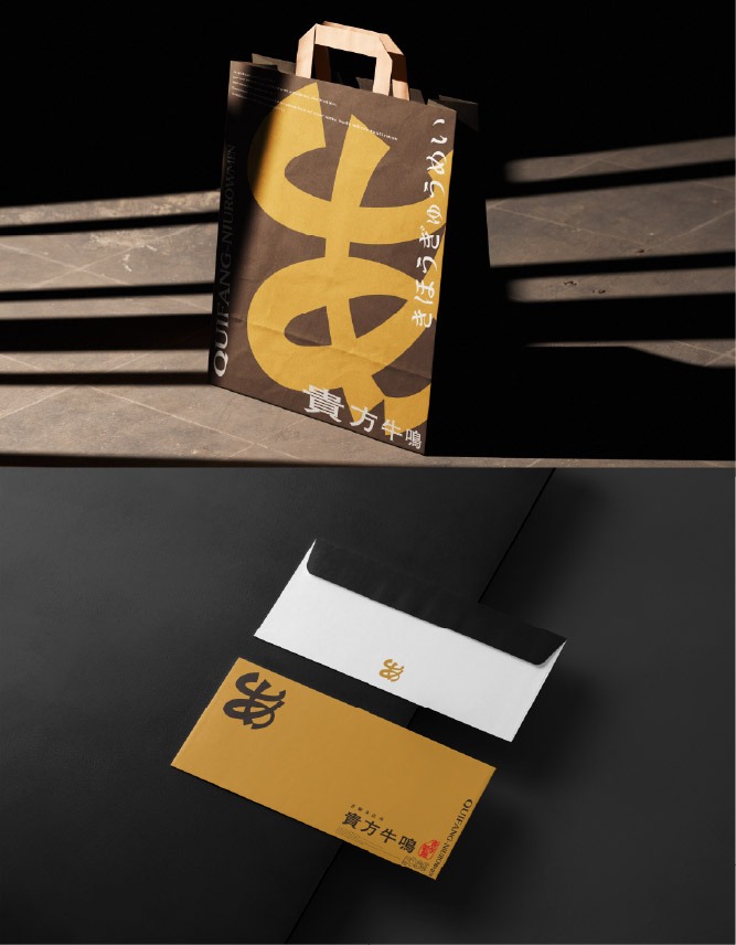
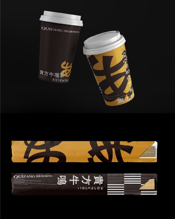
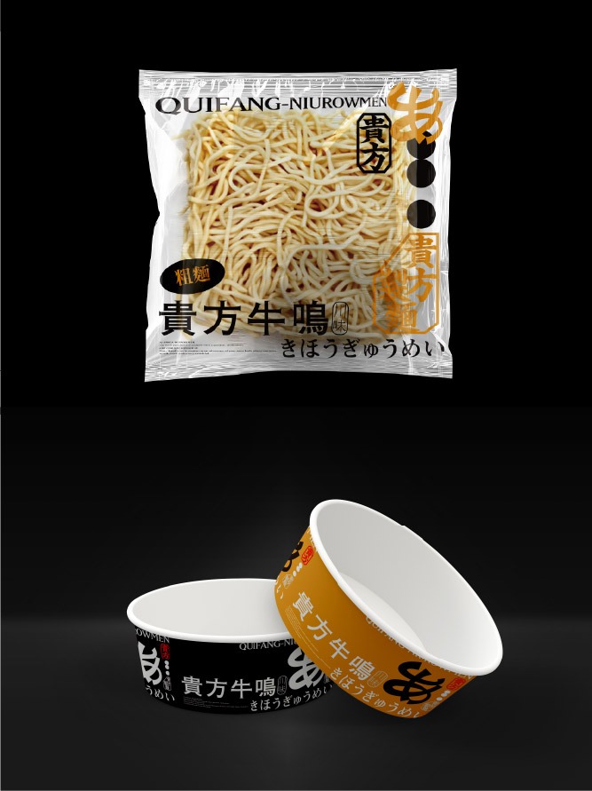
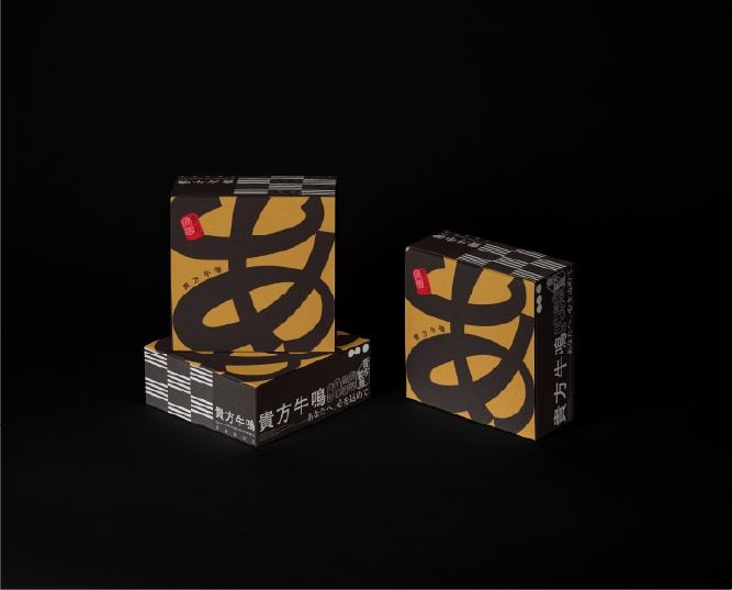
貴方牛鳴的品牌識別設計,將「傳統工藝」與「前衛探索」的元素巧妙融合,體現其深厚的職人底蘊與大膽的創新精神。標誌的靈感來源於「牛角剛勁」、「あ」及「麵條流動感」。這些元素不僅象徵著品牌對台灣經典麵食的致敬與傳承,也呼應了品牌致力於翻轉傳統、引領未來餐飲趨勢的願景。
The brand identity of QUIFANG-NIUROWMEN artfully weaves together elements of “traditional craftsmanship” and “avant-garde exploration,” embodying both a profound artisanal heritage and a spirit of bold innovation. The logo draws inspiration from the “strength of bull horns,” the Japanese character “あ (A),” and the “fluidity of noodles.” These elements not only pay homage to the classic Taiwanese beef noodle tradition but also resonate with the brand’s vision to transform convention and lead the future of culinary trends.
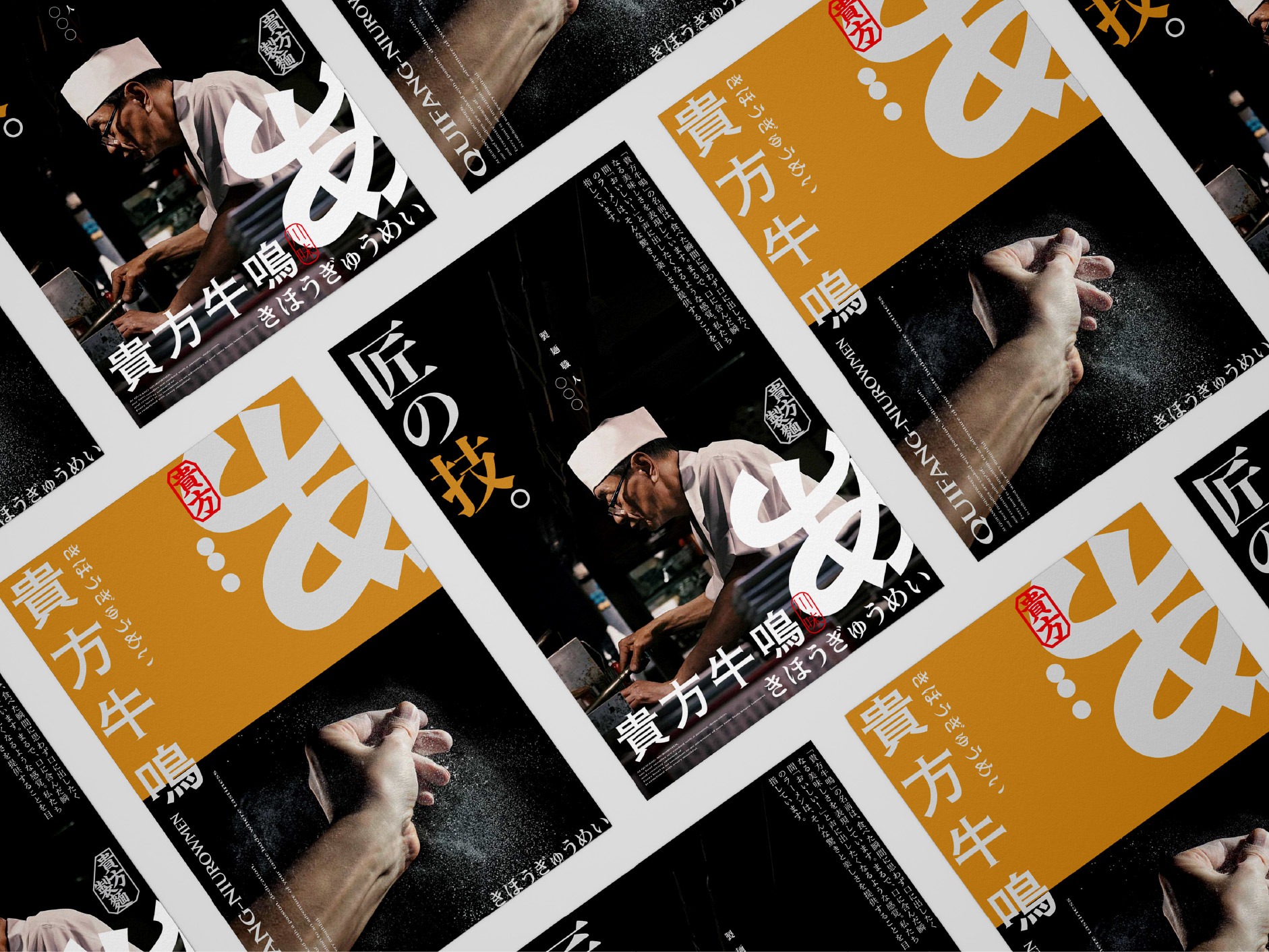
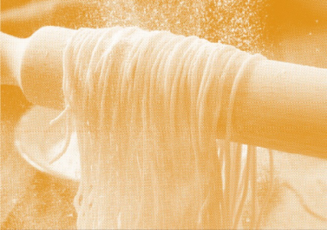
從勁道到流光,黑橘交織的味覺語言
From Robust Texture to Ethereal Flow: A Sensory Language of Black and Orange
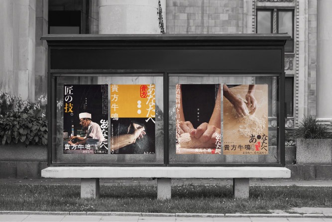
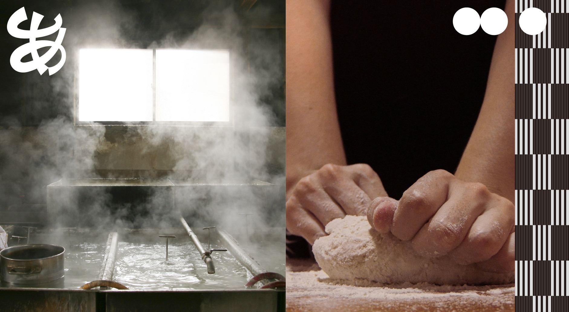
橘色象徵品牌沸騰的熱情與鮮香誘人的味覺張力,黑色則代表專業職人的沉穩底蘊與純粹品質,兩者相互映襯,展現貴方牛鳴在「感官享受」與「嚴謹製程」間的完美平衡。
Orange symbolizes the brand’s boiling passion and the vibrant, enticing tension of its flavors, while Black represents the steady heritage and pure quality of professional craftsmanship. Intertwining with one another, these colors showcase the perfect balance held by QUIFANG-NIUROWMEN between “sensory indulgence” and “rigorous preparation.”
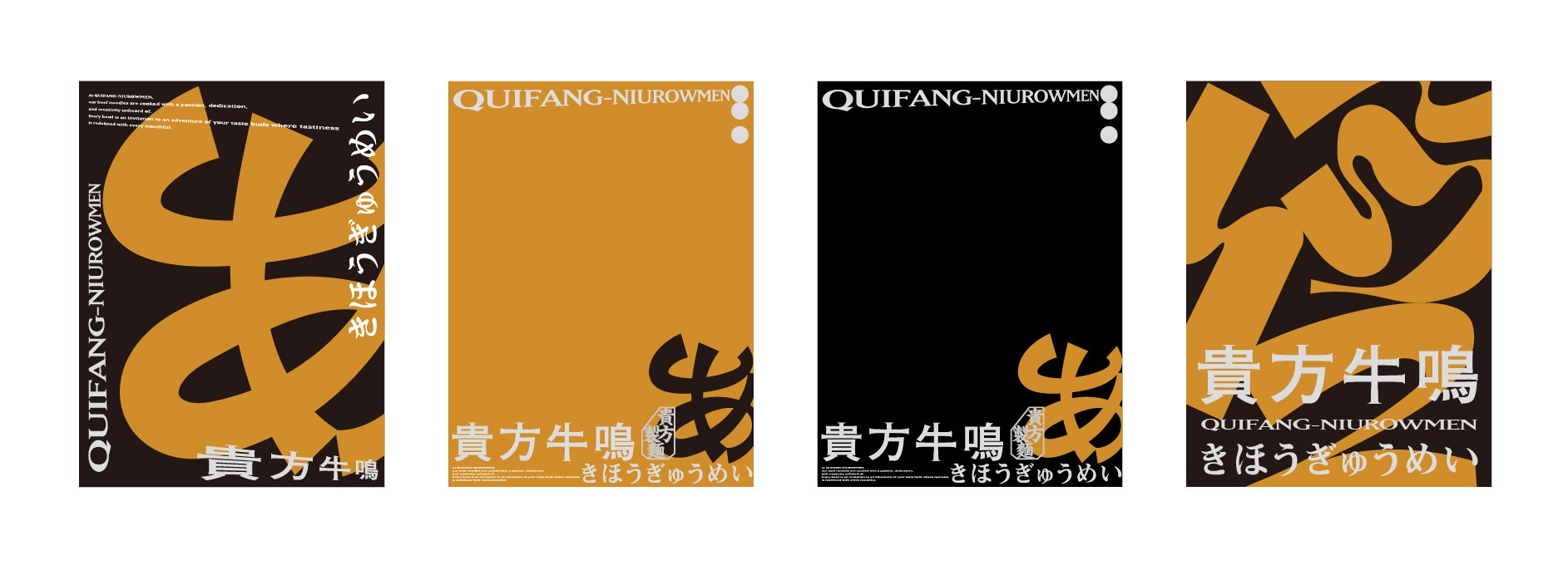
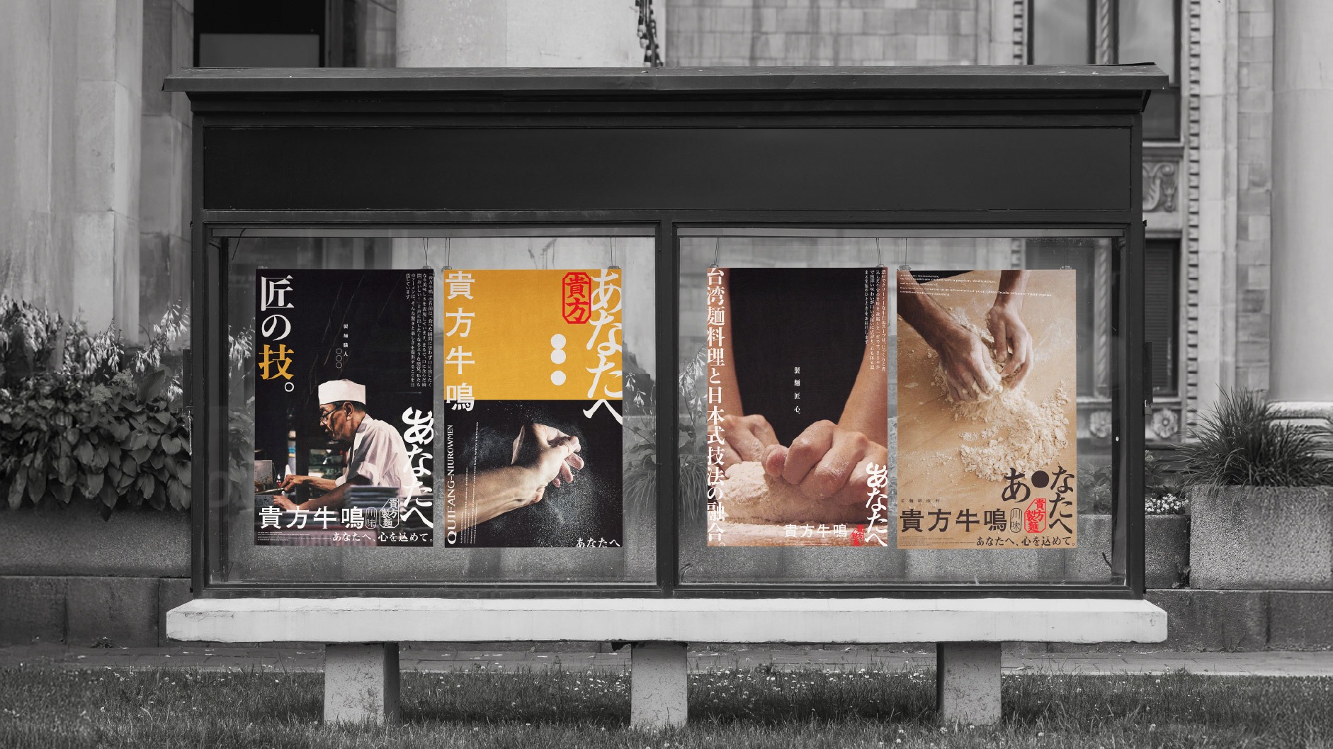
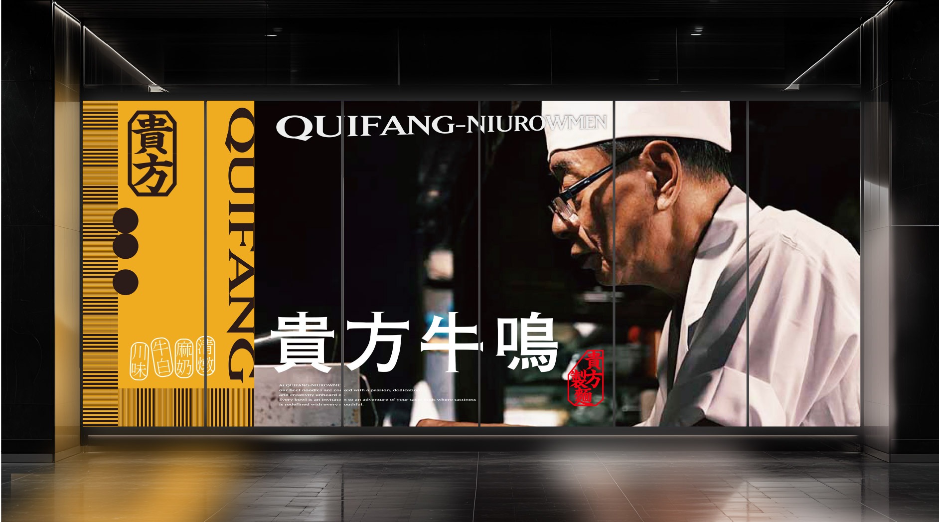
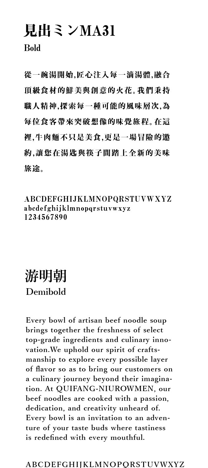
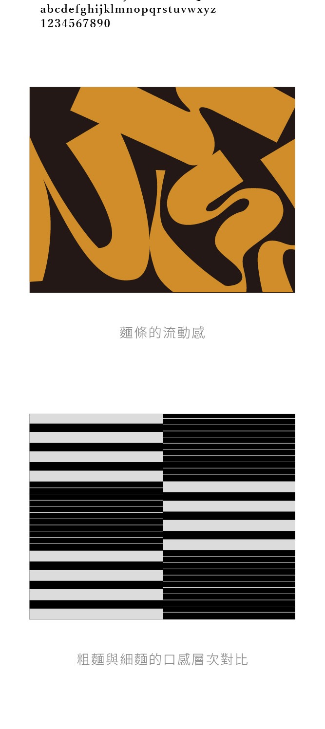
The design of the secondary graphics extends this concept: the “Bold Geometrics” utilize a stable and orderly structure to reinforce the modern aesthetics and brand backbone of the visual identity system. Meanwhile, the “Fluid Lines” echo the rhythmic movement of noodles and the richness of the broth, embodying the vitality and infinite possibilities within the brand’s flavor development. This conveys its professionalism and forward-looking vision as a pioneer in the future of beef noodle exploration.
味覺之外,傳遞的是一場感官的探險
Beyond Taste: Delivering a Sensory Expedition
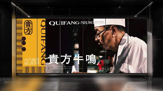
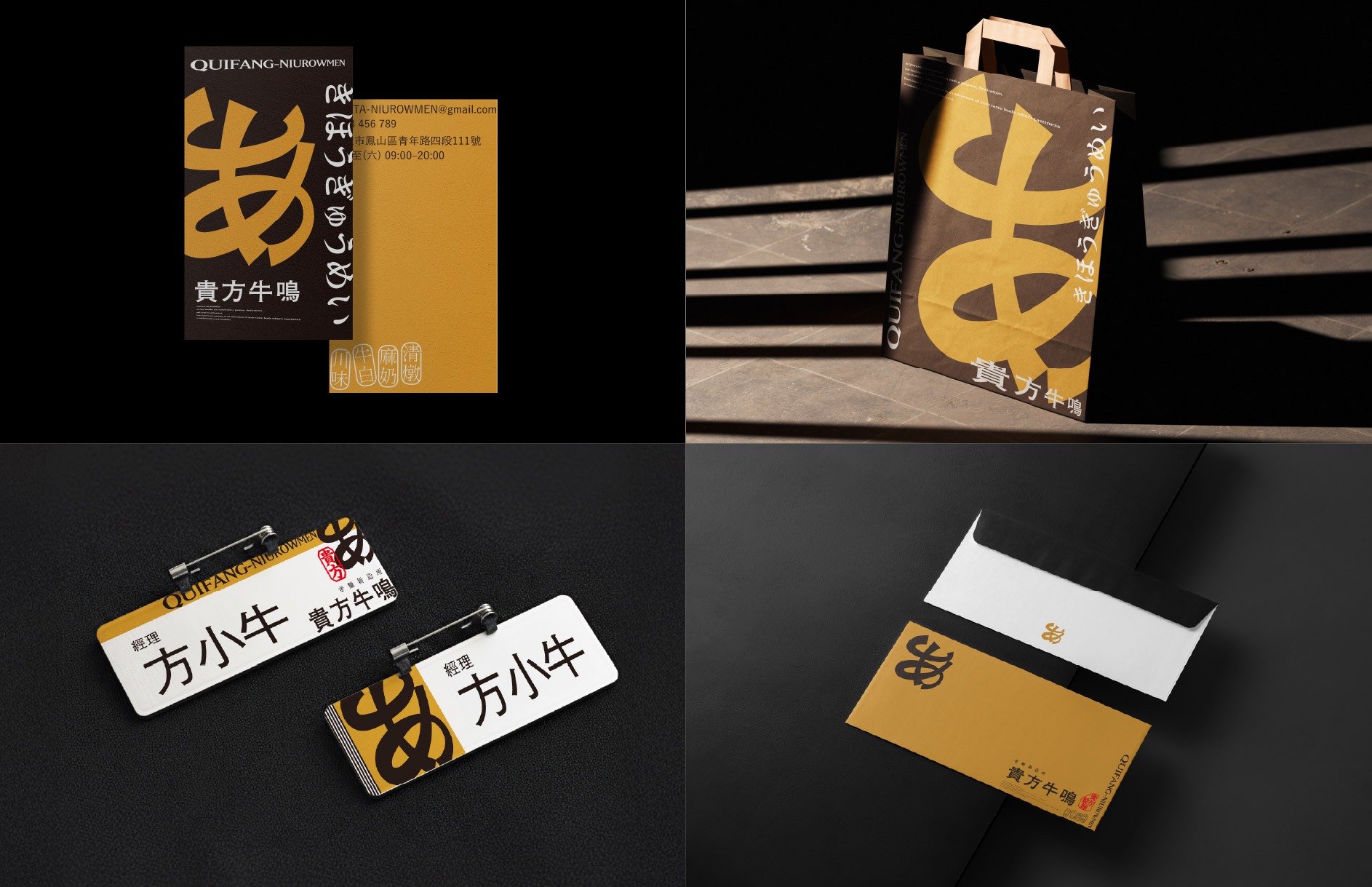
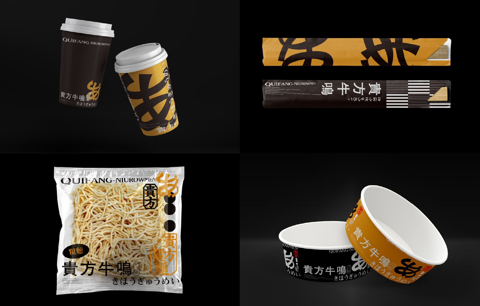
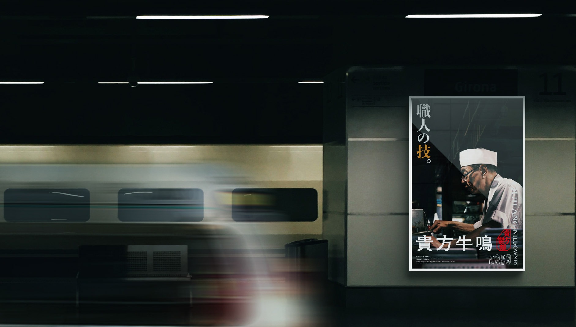
貴方牛鳴的品牌識別設計,精妙地融合了職人造詣與現代美學的視覺語彙,構築出一個既深邃又充滿爆發力的品牌意象。這一識別系統不僅彰顯了對台灣麵食工藝的極致追求,更突顯了其在創意料理與未來飲食潮流中的先驅地位。
每一個設計細節,從圖騰的剛勁到色彩的交織,從符號的轉化到構圖的韻律,都深刻傳遞了貴方牛鳴專業、大膽且追求極致的品牌精神。
The brand identity of QUIFANG-NIUROWMEN masterfully fuses artisanal mastery with the visual vocabulary of modern aesthetics, constructing a brand image that is both profound and explosive. This identity system not only honors the ultimate pursuit of Taiwanese noodle craftsmanship but also highlights the brand’s pioneering position within the realms of creative cuisine and future dining trends.
Every design detail—from the vigor of the motifs to the interplay of colors, and from the transformation of symbols to the rhythm of the composition—profoundly conveys the professional, bold, and perfection-seeking spirit of QUIFANG-NIUROWMEN.

以風味為引,刻畫牛肉麵的味覺地圖
Mapping the Future of Beef Noodles through the Lens of Flavor
貴方牛鳴的品牌識別設計,將「傳統工藝」與「前衛探索」的元素巧妙融合,體現其深厚的職人底蘊與大膽的創新精神。標誌的靈感來源於「牛角剛勁」、「あ」及「麵條流動感」。這些元素不僅象徵著品牌對台灣經典麵食的致敬與傳承,也呼應了品牌致力於翻轉傳統、引領未來餐飲趨勢的願景。
The brand identity of QUIFANG-NIUROWMEN artfully weaves together elements of “traditional craftsmanship” and “avant-garde exploration,” embodying both a profound artisanal heritage and a spirit of bold innovation. The logo draws inspiration from the “strength of bull horns,” the Japanese character “あ (A),” and the “fluidity of noodles.” These elements not only pay homage to the classic Taiwanese beef noodle tradition but also resonate with the brand’s vision to transform convention and lead the future of culinary trends.
從勁道到流光,黑橘交織的味覺語言
From Robust Texture to Ethereal Flow: A Sensory Language of Black and Orange
橘色象徵品牌沸騰的熱情與鮮香誘人的味覺張力,黑色則代表專業職人的沉穩底蘊與純粹品質,兩者相互映襯,展現貴方牛鳴在「感官享受」與「嚴謹製程」間的完美平衡。
Orange symbolizes the brand’s boiling passion and the vibrant, enticing tension of its flavors, while Black represents the steady heritage and pure quality of professional craftsmanship. Intertwining with one another, these colors showcase the perfect balance held by QUIFANG-NIUROWMEN between “sensory indulgence” and “rigorous preparation.”
The design of the secondary graphics extends this concept: the “Bold Geometrics” utilize a stable and orderly structure to reinforce the modern aesthetics and brand backbone of the visual identity system. Meanwhile, the “Fluid Lines” echo the rhythmic movement of noodles and the richness of the broth, embodying the vitality and infinite possibilities within the brand’s flavor development. This conveys its professionalism and forward-looking vision as a pioneer in the future of beef noodle exploration.
味覺之外,傳遞的是一場感官的探險
Beyond Taste: Delivering a Sensory Expedition
貴方牛鳴的品牌識別設計,精妙地融合了職人造詣與現代美學的視覺語彙,構築出一個既深邃又充滿爆發力的品牌意象。這一識別系統不僅彰顯了對台灣麵食工藝的極致追求,更突顯了其在創意料理與未來飲食潮流中的先驅地位。
每一個設計細節,從圖騰的剛勁到色彩的交織,從符號的轉化到構圖的韻律,都深刻傳遞了貴方牛鳴專業、大膽且追求極致的品牌精神。
The brand identity of QUIFANG-NIUROWMEN masterfully fuses artisanal mastery with the visual vocabulary of modern aesthetics, constructing a brand image that is both profound and explosive. This identity system not only honors the ultimate pursuit of Taiwanese noodle craftsmanship but also highlights the brand’s pioneering position within the realms of creative cuisine and future dining trends.
Every design detail—from the vigor of the motifs to the interplay of colors, and from the transformation of symbols to the rhythm of the composition—profoundly conveys the professional, bold, and perfection-seeking spirit of QUIFANG-NIUROWMEN.