WAGYU SHABU
品牌創研 BRAND 視覺設計 VISUAL DESIGN 空間設計 SPACE
延續熟悉識別,展開「涮、爽、玩」新節奏
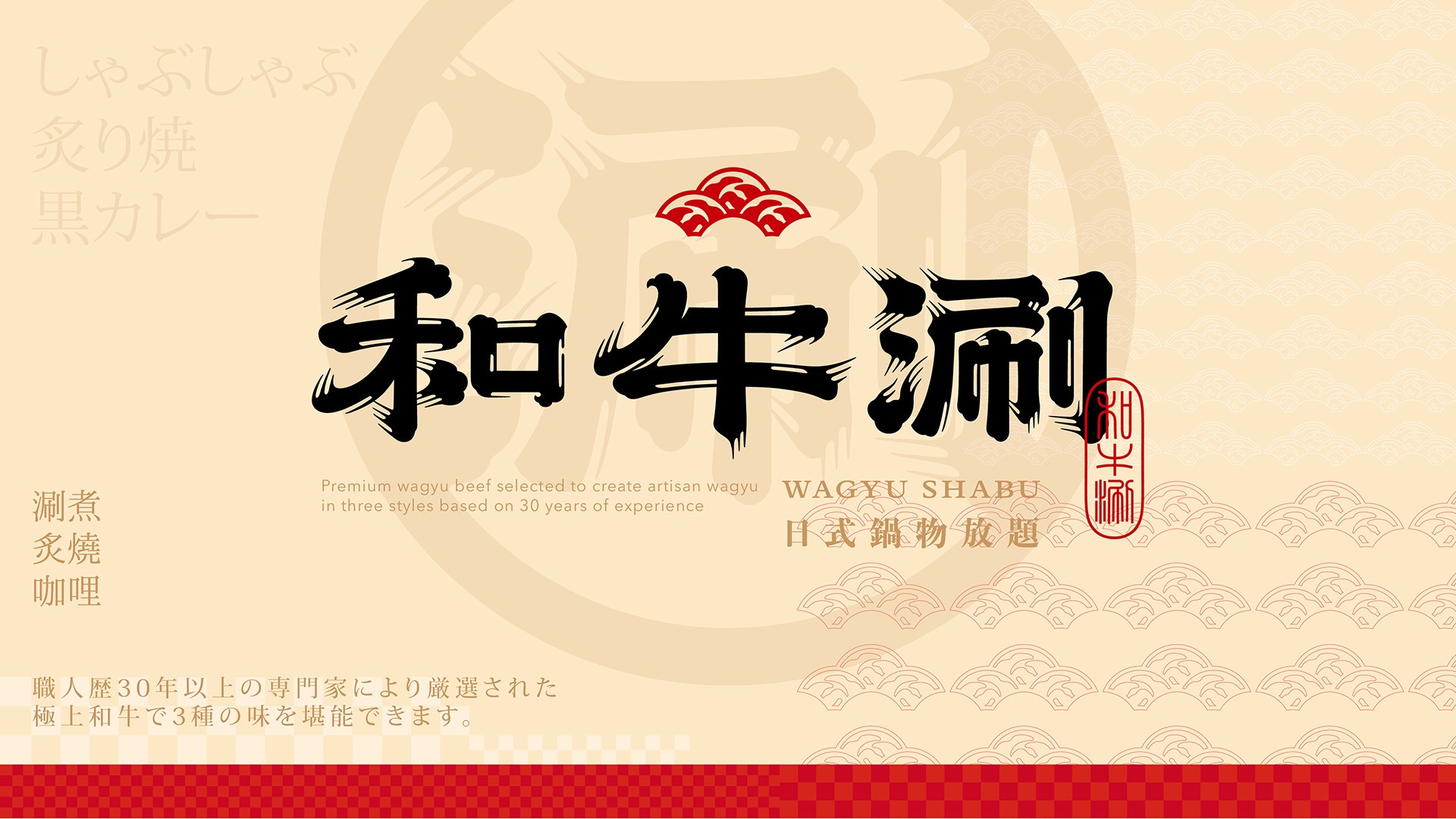
和牛涮是王品集團旗下,主打「和牛三吃」吃到飽體驗的日式火鍋品牌,讓消費者在熱鬧氛圍中盡情享受高CP值和牛饗宴。在不更動品牌既有核心識別的前提下,本次視覺升級從品牌原有的日式氛圍與「涮個痛快」主張出發,提煉出「涮、爽、玩」三項核心精神。「涮」代表和牛三吃與火鍋體驗,「爽」傳遞豐盛選擇與滿足感,「玩」則展現熱鬧、活潑的歡聚氣氛,讓品牌在延續既有辨識度的同時,轉化為更年輕、熱鬧且具國際感的全新面貌。
Wagyu Shabu is a Japanese-style hot pot brand under the Wowprime Group, known for its all-you-can-eat “Wagyu Three Ways” dining experience. It offers consumers a high-value wagyu feast within a lively and energetic atmosphere. Without altering the brand’s established core identity, this visual upgrade builds upon its existing Japanese character and the slogan “Shabu to Your Heart’s Content,” distilling the experience into three key ideas: “Shabu, Satisfaction, and Play.” “Shabu” represents the hot pot experience and Wagyu Three Ways; “Satisfaction” conveys abundance and fulfilment; and “Play” expresses a vibrant, spirited sense of gathering. The result preserves the brand’s recognisability while presenting a younger, more dynamic identity with greater international appeal.
涮個痛快,讓品牌精神遍布每個接觸點
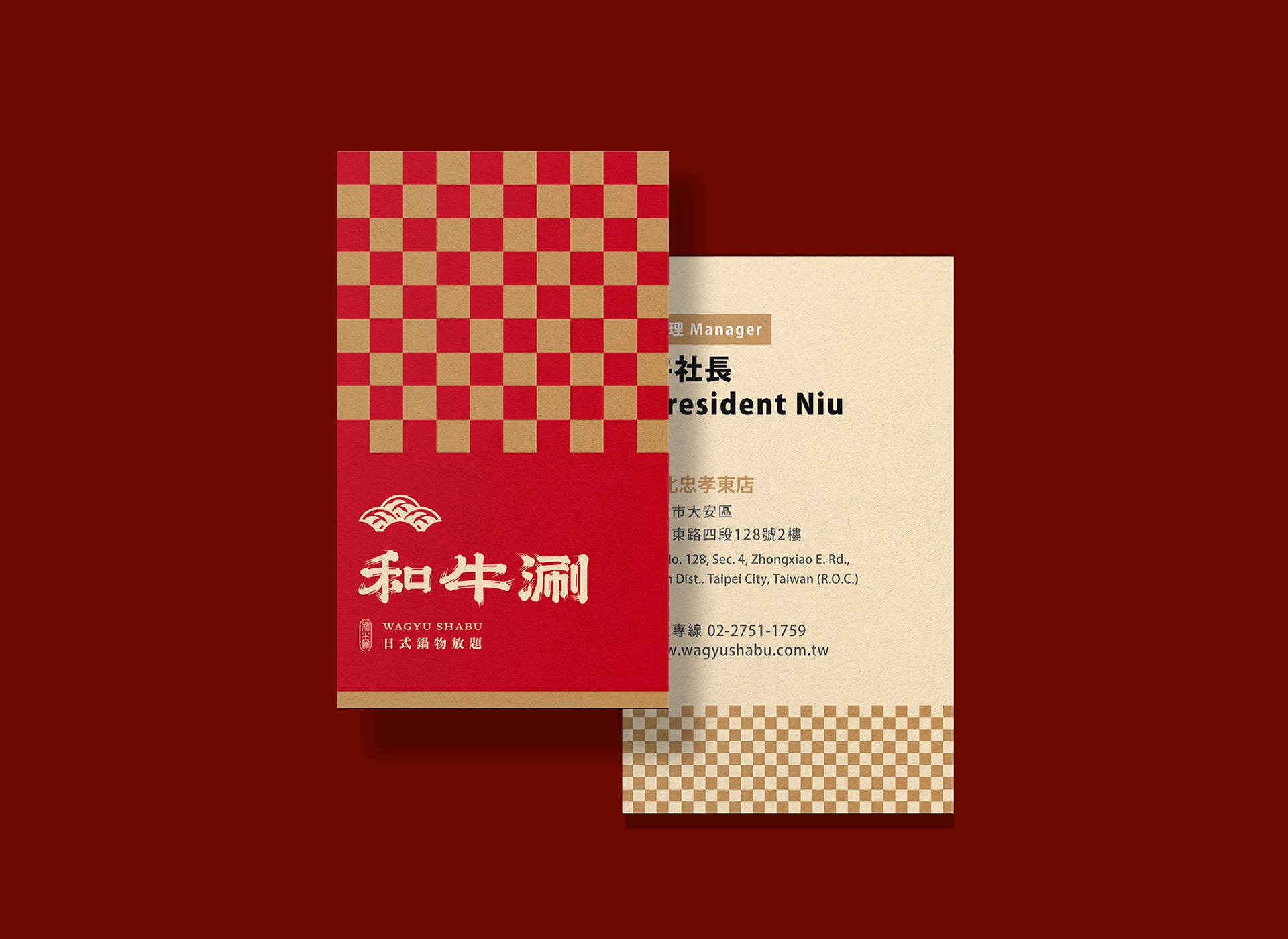
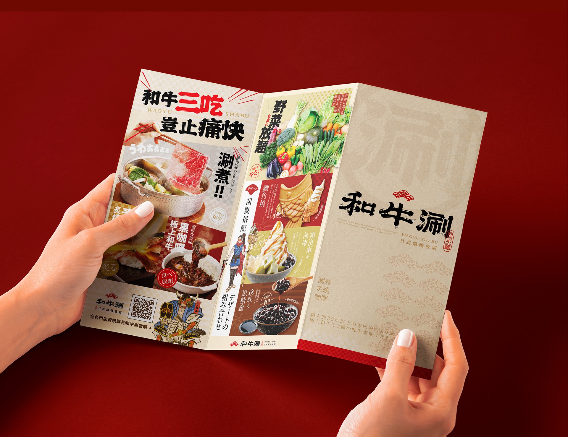
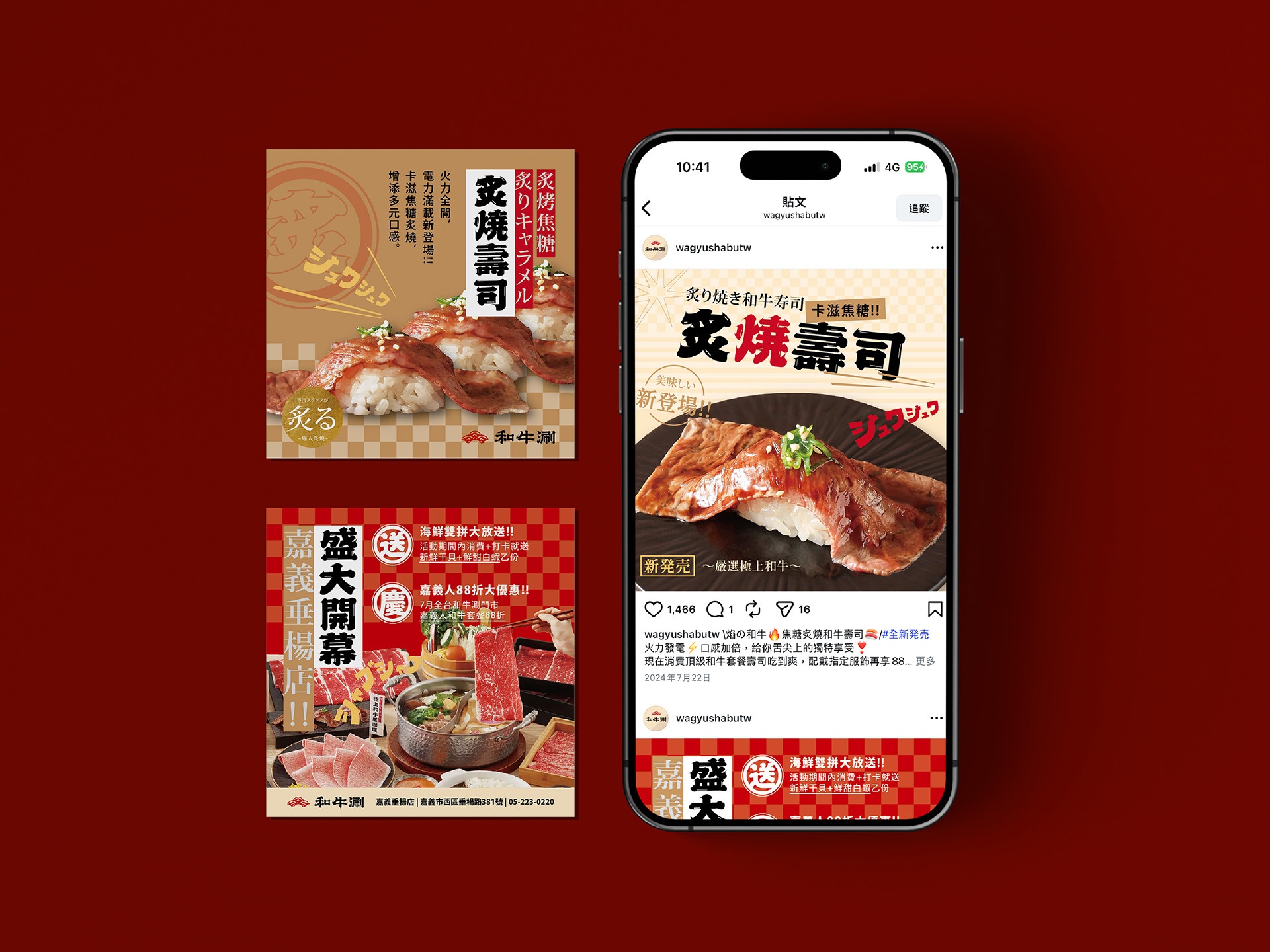
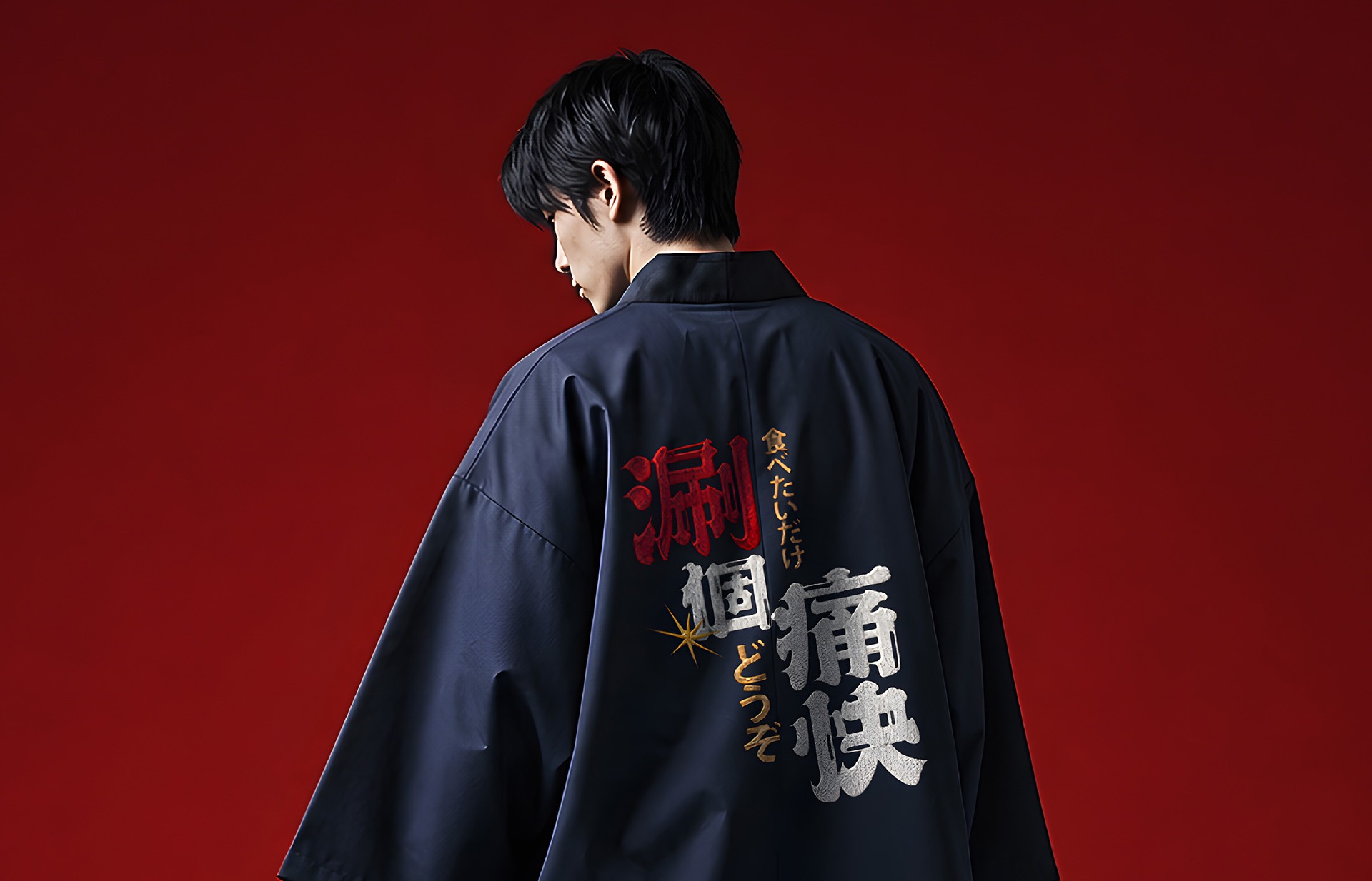
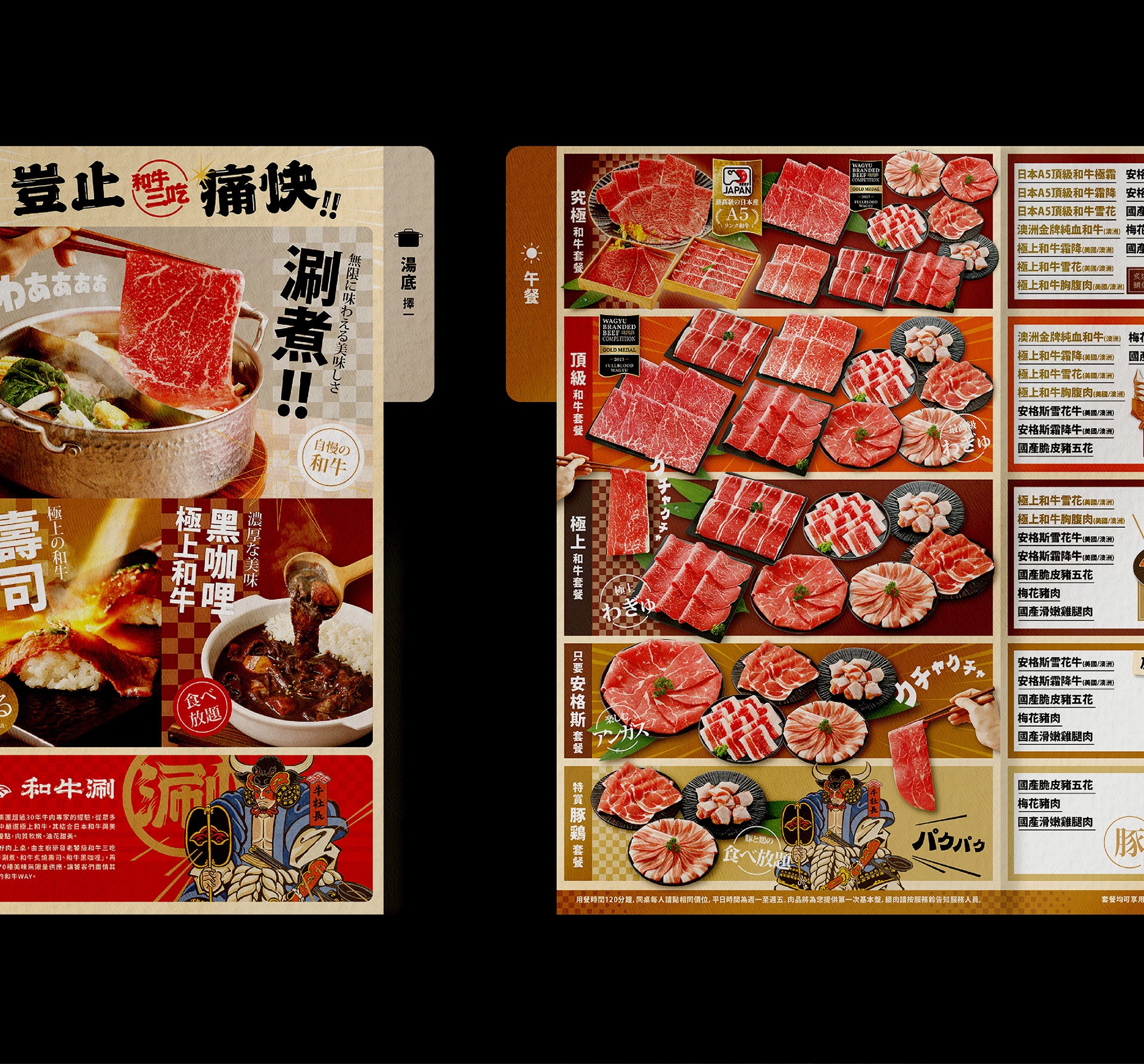
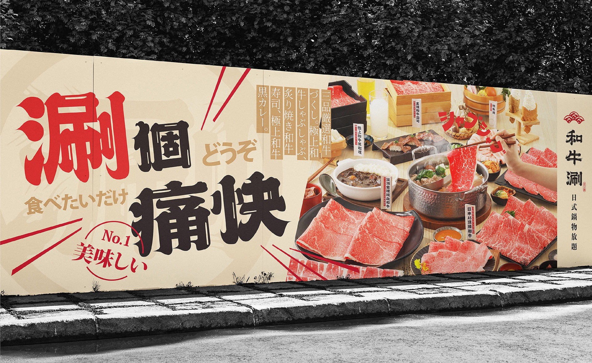
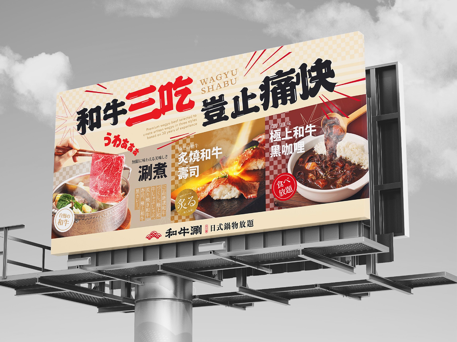
從標誌組合、輔助圖形與色彩系統,到菜單、店內營業用品與空間視覺,本次升級將「涮、爽、玩」落實於每一個品牌接觸點。「涮」聚焦餐點與產品特色,「爽」強化豐盛、暢快的消費感受,「玩」則創造熱鬧活潑的互動氛圍,使消費者從進入門市、選擇餐點到享用和牛,都能感受到和牛涮日系、鮮明、活潑且痛快的完整品牌體驗。
From logo configurations, supporting graphics and the colour system to menus, in-store operational materials and environmental graphics, the visual upgrade brings “Shabu, Satisfaction, and Play” into every brand touchpoint. “Shabu” focuses on the cuisine and key product features, “Satisfaction” heightens the sense of abundance and enjoyment, and “Play” creates an energetic and interactive atmosphere. From entering the restaurant and selecting a meal to enjoying the wagyu itself, consumers encounter a complete brand experience that is distinctly Japanese-inspired, vivid, lively and thoroughly satisfying.
讓品牌視覺走進空間,營造痛快熱鬧的日式饗宴
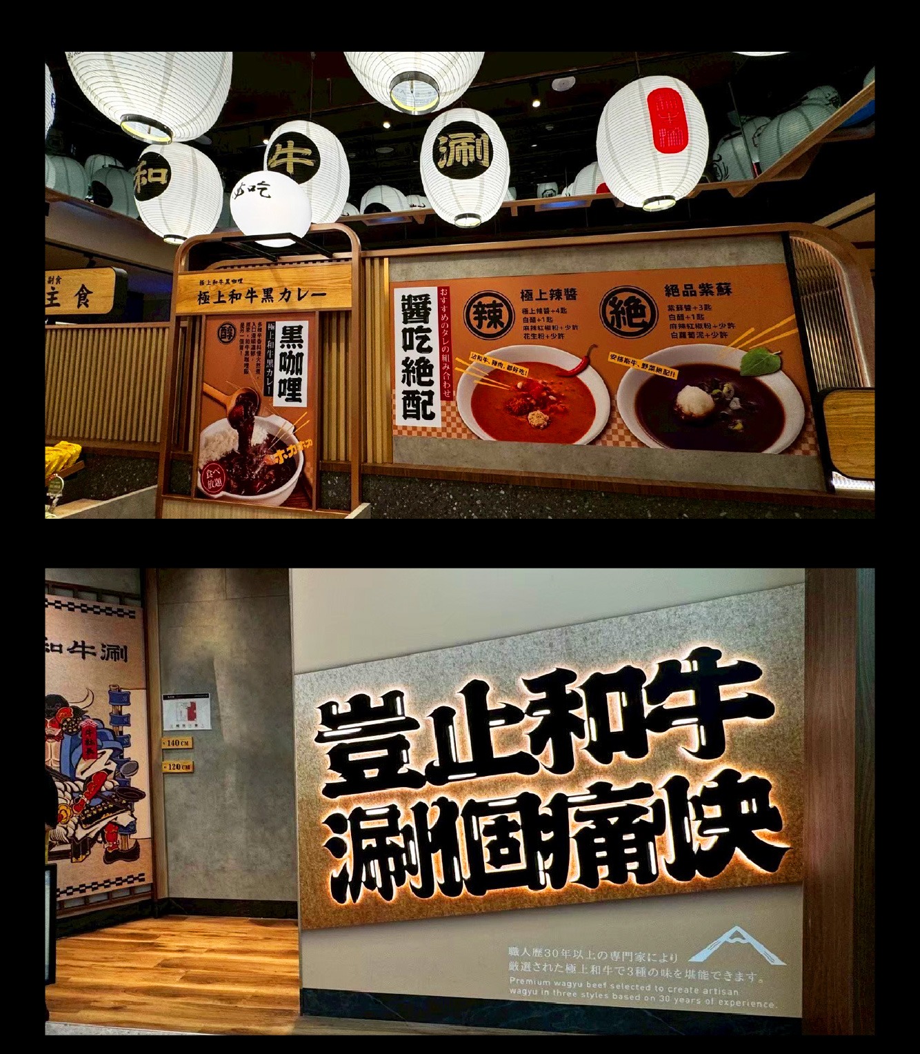
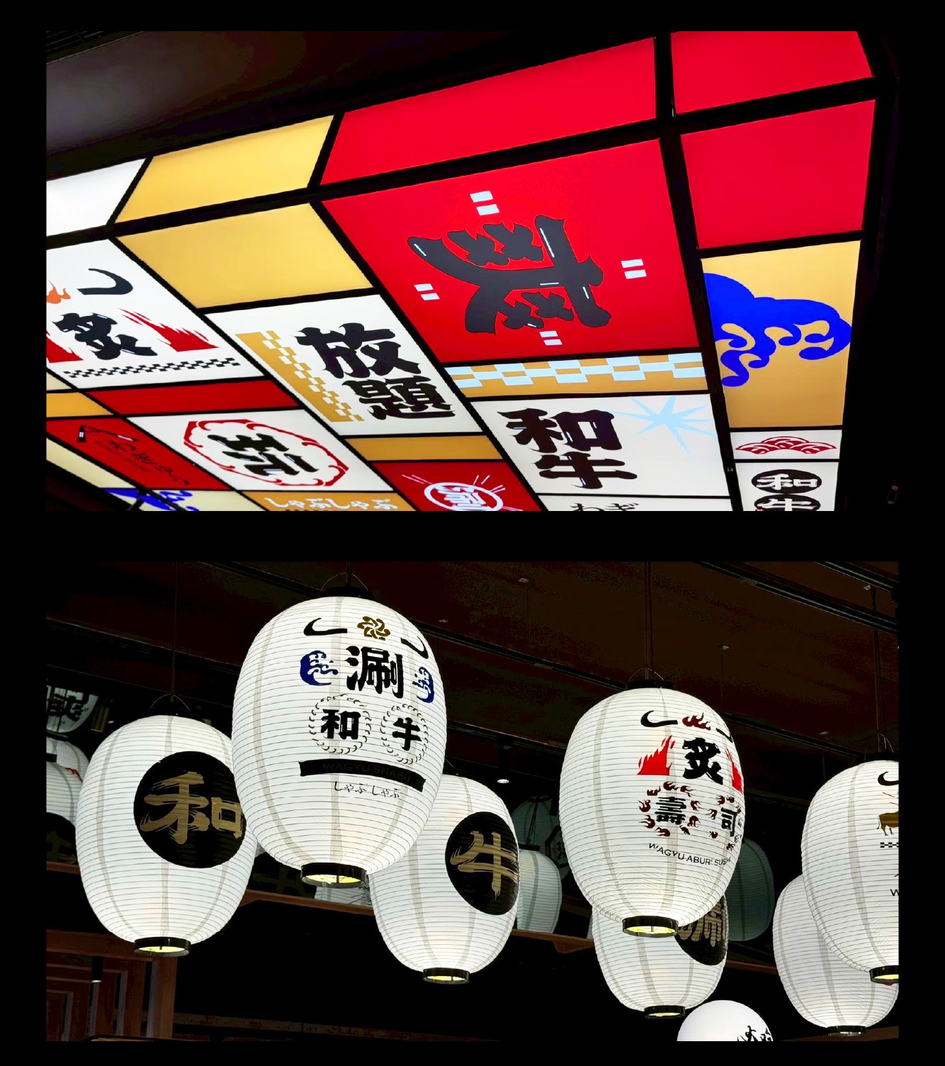
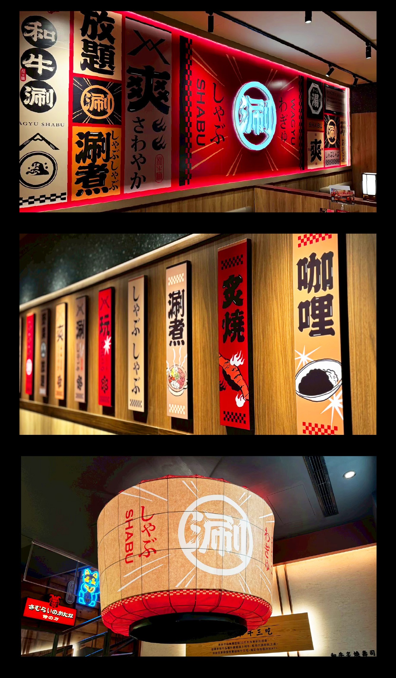
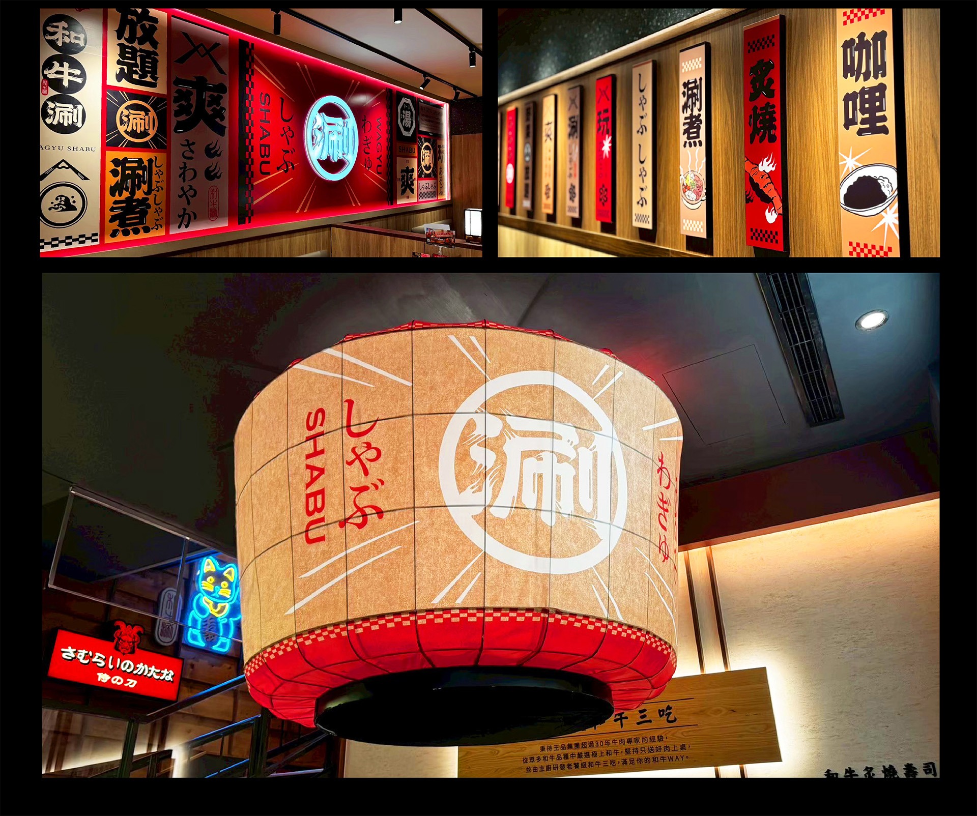
以升級後的品牌識別為基礎,針對既有店內空間進行平面視覺規劃,將日式文字、食材插畫、標章圖形與品牌標語,依照不同區域及展示載體重新編排。視覺內容圍繞「和牛三吃」、「涮爽玩」、「湯頭食材」與「LOGO標語牆」發展,並延伸至燈箱、燈籠、牆面圖像及裝飾面板等應用,使各區形成鮮明而連續的主題。透過色彩、字體、插畫與版面節奏的層層堆疊,以視覺設計手法營造兼具日式文化感、滿足感與熱絡氛圍的品牌場景。
Based on the upgraded brand identity, the project introduces a comprehensive environmental graphic system within the existing restaurant interior. Japanese typography, ingredient illustrations, badge graphics and brand slogans are recomposed according to the function, scale and display format of each area. The visual themes are developed around “Wagyu Three Ways,” “Shabu, Satisfaction, and Play,” broth ingredients and the logo slogan wall, then extended across lightboxes, lanterns, wall graphics and decorative panels. Through the layered use of colour, typography, illustration and rhythmic composition, the visual design transforms the existing space into a cohesive brand environment filled with Japanese cultural character, a sense of abundance and lively energy.

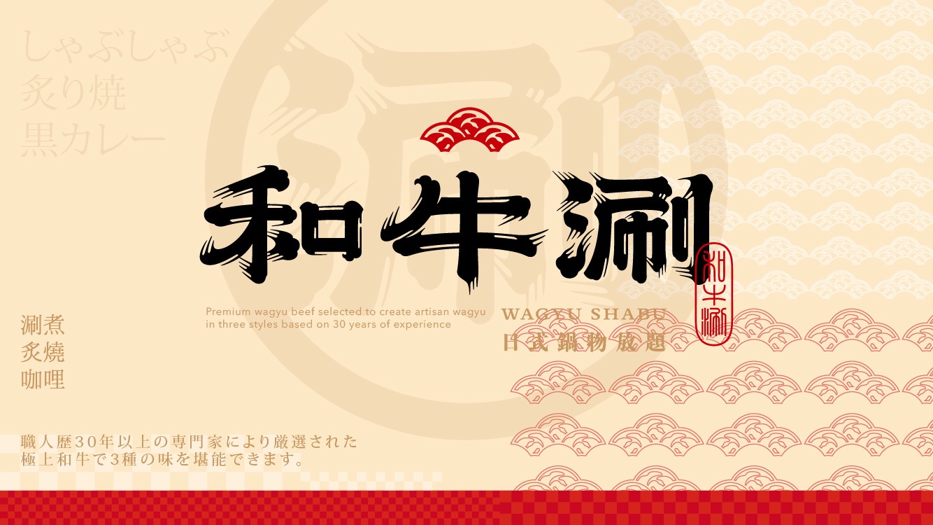
延續熟悉識別,展開「涮、爽、玩」新節奏
和牛涮是王品集團旗下,主打「和牛三吃」吃到飽體驗的日式火鍋品牌,讓消費者在熱鬧氛圍中盡情享受高CP值和牛饗宴。在不更動品牌既有核心識別的前提下,本次視覺升級從品牌原有的日式氛圍與「涮個痛快」主張出發,提煉出「涮、爽、玩」三項核心精神。「涮」代表和牛三吃與火鍋體驗,「爽」傳遞豐盛選擇與滿足感,「玩」則展現熱鬧、活潑的歡聚氣氛,讓品牌在延續既有辨識度的同時,轉化為更年輕、熱鬧且具國際感的全新面貌。
Wagyu Shabu is a Japanese-style hot pot brand under the Wowprime Group, known for its all-you-can-eat “Wagyu Three Ways” dining experience. It offers consumers a high-value wagyu feast within a lively and energetic atmosphere. Without altering the brand’s established core identity, this visual upgrade builds upon its existing Japanese character and the slogan “Shabu to Your Heart’s Content,” distilling the experience into three key ideas: “Shabu, Satisfaction, and Play.” “Shabu” represents the hot pot experience and Wagyu Three Ways; “Satisfaction” conveys abundance and fulfilment; and “Play” expresses a vibrant, spirited sense of gathering. The result preserves the brand’s recognisability while presenting a younger, more dynamic identity with greater international appeal.
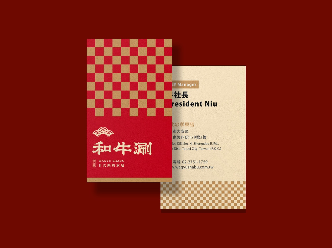
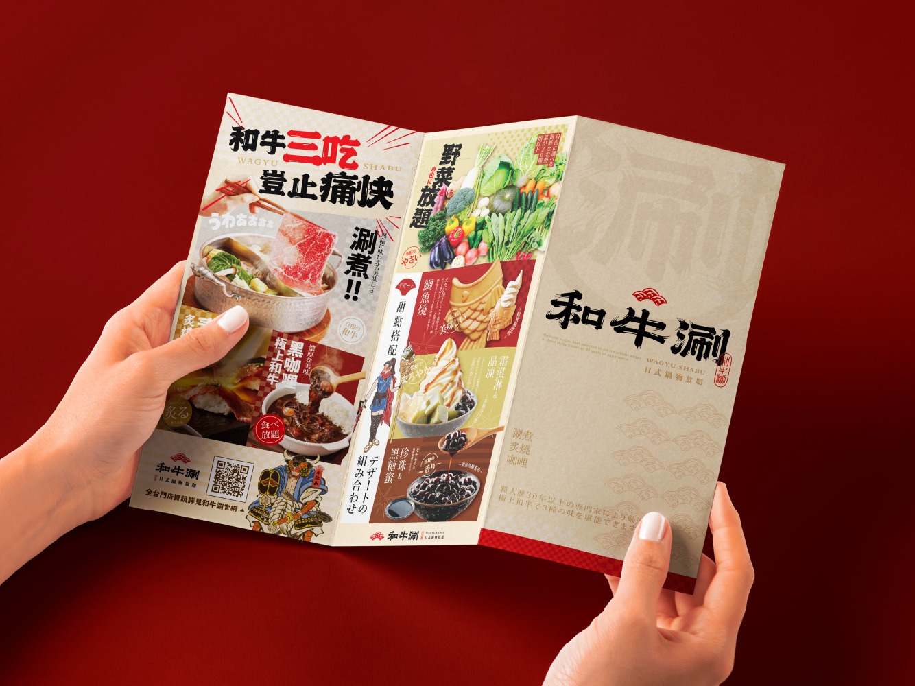
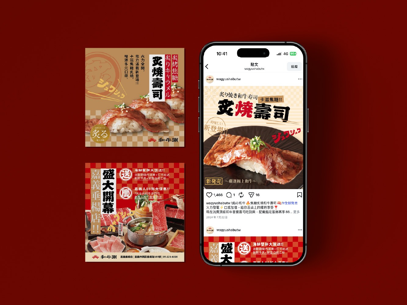
涮個痛快,讓品牌精神遍布每個接觸點
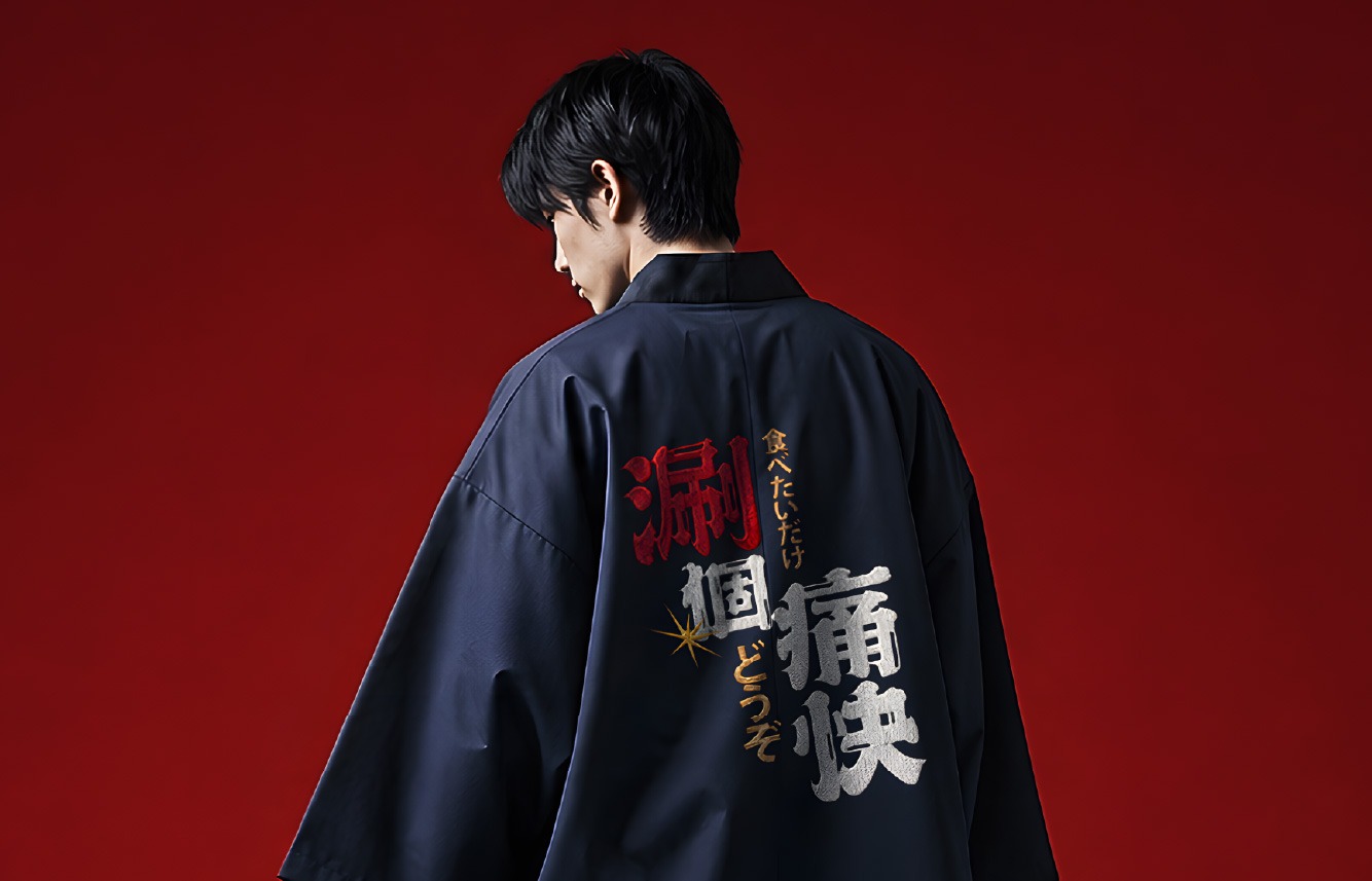
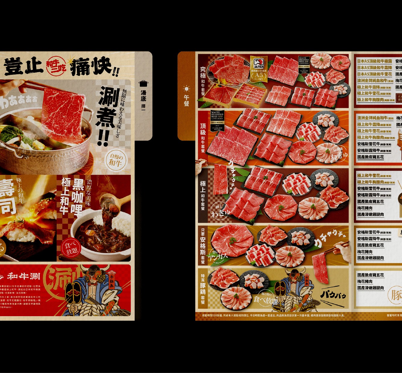
從標誌組合、輔助圖形與色彩系統,到菜單、店內營業用品與空間視覺,本次升級將「涮、爽、玩」落實於每一個品牌接觸點。「涮」聚焦餐點與產品特色,「爽」強化豐盛、暢快的消費感受,「玩」則創造熱鬧活潑的互動氛圍,使消費者從進入門市、選擇餐點到享用和牛,都能感受到和牛涮日系、鮮明、活潑且痛快的完整品牌體驗。
From logo configurations, supporting graphics and the colour system to menus, in-store operational materials and environmental graphics, the visual upgrade brings “Shabu, Satisfaction, and Play” into every brand touchpoint. “Shabu” focuses on the cuisine and key product features, “Satisfaction” heightens the sense of abundance and enjoyment, and “Play” creates an energetic and interactive atmosphere. From entering the restaurant and selecting a meal to enjoying the wagyu itself, consumers encounter a complete brand experience that is distinctly Japanese-inspired, vivid, lively and thoroughly satisfying.
讓品牌視覺走進空間,營造痛快熱鬧的日式饗宴
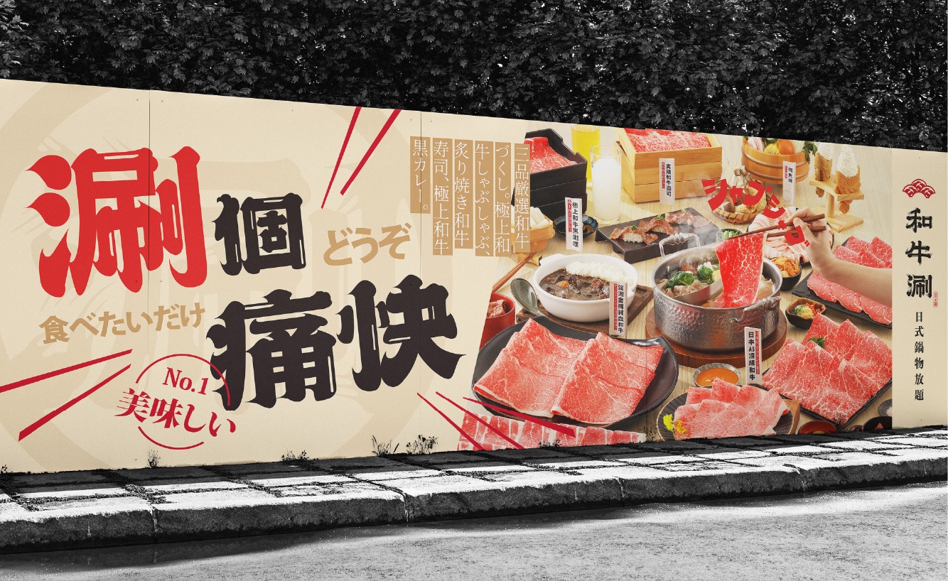
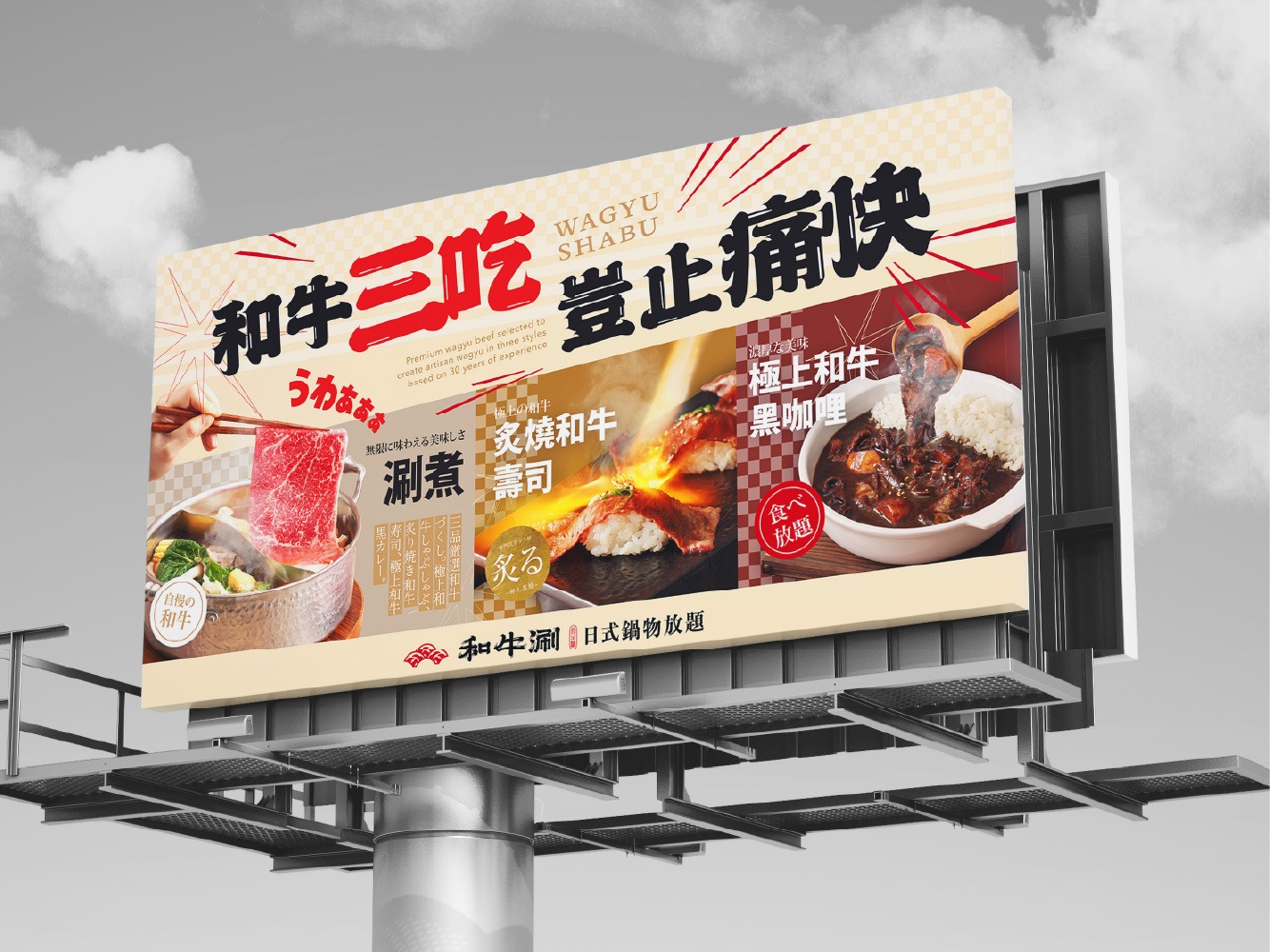
以升級後的品牌識別為基礎,針對既有店內空間進行平面視覺規劃,將日式文字、食材插畫、標章圖形與品牌標語,依照不同區域及展示載體重新編排。視覺內容圍繞「和牛三吃」、「涮爽玩」、「湯頭食材」與「LOGO標語牆」發展,並延伸至燈箱、燈籠、牆面圖像及裝飾面板等應用,使各區形成鮮明而連續的主題。透過色彩、字體、插畫與版面節奏的層層堆疊,以視覺設計手法營造兼具日式文化感、滿足感與熱絡氛圍的品牌場景。
Based on the upgraded brand identity, the project introduces a comprehensive environmental graphic system within the existing restaurant interior. Japanese typography, ingredient illustrations, badge graphics and brand slogans are recomposed according to the function, scale and display format of each area. The visual themes are developed around “Wagyu Three Ways,” “Shabu, Satisfaction, and Play,” broth ingredients and the logo slogan wall, then extended across lightboxes, lanterns, wall graphics and decorative panels. Through the layered use of colour, typography, illustration and rhythmic composition, the visual design transforms the existing space into a cohesive brand environment filled with Japanese cultural character, a sense of abundance and lively energy.